0

Using the below dataset, I would like to create the image pasted below. I tried the following code but it returned a plot that is not even close to the plot I need.

My data

structure(list(UWLE = structure(c(0.600000023841858, 0.600000023841858, 
0.800000011920929, 0.699999988079071, 0.899999976158142, 0.300000011920929, 
0.400000005960464, 0.400000005960464, 0.400000005960464, 0.5, 
0.400000005960464, 0.400000005960464, 0.5, 0.5, 0.600000023841858, 
0.699999988079071, 0.699999988079071, 0.899999976158142, 0.800000011920929, 
1), format.stata = "%9.0g"), HWLE = structure(c(10.1999998092651, 
9.89999961853027, 9.39999961853027, 10.8000001907349, 12.3999996185303, 
5, 4.90000009536743, 4.5, 5.30000019073486, 6.5, 7.59999990463257, 
7.40000009536743, 7, 8.10000038146973, 9.5, 10.5, 10.3000001907349, 
9.69999980926514, 11.1000003814697, 12.8999996185303), format.stata = "%9.0g"), 
    OWLE = structure(c(10.1999998092651, 10, 10, 9.89999961853027, 
    10.8999996185303, 9.10000038146973, 8.89999961853027, 8.80000019073486, 
    9, 10.1999998092651, 11.5, 11.1999998092651, 11.3000001907349, 
    11.3000001907349, 12.3999996185303, 9.89999961853027, 9.80000019073486, 
    9.80000019073486, 9.69999980926514, 10.6000003814697), format.stata = "%9.0g"), 
    OBLE = structure(c(10.1999998092651, 10.8999996185303, 10.3000001907349, 
    9.89999961853027, 9.10000038146973, 14.6000003814697, 15.3000001907349, 
    14.5, 14.3000001907349, 13.8000001907349, 13.1000003814697, 
    13.8000001907349, 13.1000003814697, 12.8000001907349, 12, 
    9.69999980926514, 10.3000001907349, 9.80000019073486, 9.39999961853027, 
    8.60000038146973), format.stata = "%9.0g"), TLE = structure(c(31.1000003814697, 
    31.3999996185303, 30.3999996185303, 31.2999992370605, 33.2000007629395, 
    29, 29.3999996185303, 28.2000007629395, 29, 31.1000003814697, 
    32.5999984741211, 32.9000015258789, 32, 32.7000007629395, 
    34.5, 30.8999996185303, 31.1000003814697, 30.1000003814697, 
    31, 33.0999984741211), format.stata = "%9.0g"), birth_place = structure(c(0, 
    1, 2, 3, 4, 0, 1, 2, 3, 4, 0, 1, 2, 3, 4, 0, 1, 2, 3, 4), format.stata = "%10.0g", class = c("haven_labelled", 
    "vctrs_vctr", "double"), labels = c(Northeast = 0, Midwest = 1, 
    South = 2, West = 3, Foreign = 4)), race = structure(c(0, 
    0, 0, 0, 0, 1, 1, 1, 1, 1, 2, 2, 2, 2, 2, 3, 3, 3, 3, 3), format.stata = "%18.0g", class = c("haven_labelled", 
    "vctrs_vctr", "double"), labels = c(`non-Hispanic White` = 0, 
    `non-Hispanic Black` = 1, Hispanic = 2, `non-Hispanic Other` = 3
    ))), class = c("tbl_df", "tbl", "data.frame"), row.names = c(NA, 
-20L))

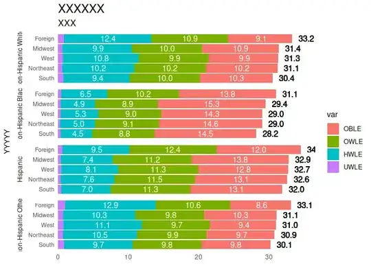
Plot I want from the data above

enter image description here

Code I tried

library(ggplot2)

# Convert labeled variables to factors
stack_data_G1$birth_place <- as.factor(stack_data_G1$birth_place)
stack_data_G1$race <- as.factor(stack_data_G1$race)

# Create the stacked horizontal bar plot
ggplot(stack_data_G1, aes(x = UWLE + HWLE + OWLE + OBLE, y = reorder(birth_place, -(UWLE + HWLE + OWLE + OBLE)), fill = race)) +
  geom_col() +
  coord_flip() +
  labs(x = NULL, y = NULL, title = "XXXXXX", subtitle = "XXX", yaxis = "YYYY") +
  scale_y_discrete(labels = c("UWLE", "HWLE", "OWLE", "OBLE")) +
  theme_minimal() +
  theme(
    axis.text.y = element_text(size = 8),
    axis.title.y = element_text(size = 10),
    plot.title = element_text(size = 16),
    plot.subtitle = element_text(size = 12),
    panel.grid = element_blank()
  )
neilfws
  • 32,751
  • 5
  • 50
  • 63
Nader Mehri
  • 514
  • 1
  • 5
  • 21
  • 1
    instead of `aes(x = UWLE + HWLE + OWLE + OBLE, ...)`, you will need to reshape your data from wide (four such variables) to long, see https://stackoverflow.com/q/2185252/3358272, https://stackoverflow.com/q/68058000/3358272 – r2evans Jun 07 '23 at 00:42
  • 2
    Here's a _start_, missing several components of what you want (using `tidyr` and `dplyr`): `pivot_longer(stack_data_G1, -c(birth_place, race)) %>% filter(name != "TLE") %>% ggplot(aes(fill = name, x = birth_place, y = value)) + geom_col() + coord_flip() + facet_grid(race ~ .) + theme(legend.position = "bottom")` – r2evans Jun 07 '23 at 01:38

1 Answers1

2

Prepare the data

library(haven)
library(ggplot2)
library(dplyr)
library(tidyr)

# Convert haven labeled variables to factors
stack_data_G1$birth_place <- as_factor(stack_data_G1$birth_place)
stack_data_G1$race <- as_factor(stack_data_G1$race)

# create proper data
graph_data <- stack_data_G1 |>
  pivot_longer(cols = c(UWLE, HWLE, OWLE, OBLE), names_to = "var",
               values_to = "value") |>
  # assign levels order of var for graph
  mutate(var = factor(var, levels = c("OBLE", "OWLE", "HWLE", "UWLE"))) |>
  arrange(race, birth_place, desc(var)) |>
  group_by(race, birth_place) |>
  mutate(label_pos = cumsum(value) - value / 2,
         # label text only applicable for big enough value to plot
         label_text = if_else(value < 4, "", format(value, nsmall = 1)),
         tle_pos = sum(value) + 2, # this value may need manual adjustment
         tle_label = format(TLE, nsmall = 1)) |>
  ungroup()
# data that well organized for graph
graph_data
#> # A tibble: 80 × 9
#>      TLE birth_place race    var    value label_pos label_text tle_pos tle_label
#>    <dbl> <fct>       <fct>   <fct>  <dbl>     <dbl> <chr>        <dbl> <chr>    
#>  1  31.1 Northeast   non-Hi… UWLE   0.600     0.300 ""            33.2 31.1     
#>  2  31.1 Northeast   non-Hi… HWLE  10.2       5.70  "10.2"        33.2 31.1     
#>  3  31.1 Northeast   non-Hi… OWLE  10.2      15.9   "10.2"        33.2 31.1     
#>  4  31.1 Northeast   non-Hi… OBLE  10.2      26.1   "10.2"        33.2 31.1     
#>  5  31.4 Midwest     non-Hi… UWLE   0.600     0.300 ""            33.4 31.4     
#>  6  31.4 Midwest     non-Hi… HWLE   9.90      5.55  " 9.9"        33.4 31.4     
#>  7  31.4 Midwest     non-Hi… OWLE  10        15.5   "10.0"        33.4 31.4     
#>  8  31.4 Midwest     non-Hi… OBLE  10.9      25.9   "10.9"        33.4 31.4     
#>  9  30.4 South       non-Hi… UWLE   0.800     0.400 ""            32.5 30.4     
#> 10  30.4 South       non-Hi… HWLE   9.40      5.50  " 9.4"        32.5 30.4     
#> # ℹ 70 more rows

Now the graph

# Create the stacked horizontal bar plot
ggplot(graph_data) +
  geom_col(aes(x = value,
               y = reorder(birth_place, TLE), # order by TLE
               fill = var)) +
  geom_text(aes(x = label_pos, y = birth_place, label = label_text),
            color = "white") +
  geom_text(aes(x = tle_pos, y = birth_place, label = tle_label)) +
  facet_grid(race ~ ., switch = "y") +
  labs(title = "XXXXXX", subtitle = "XXX") +
  xlab(NULL) + ylab("YYYYY") +
  scale_x_continuous(expand = c(0, 0)) +
  theme_minimal() +
  theme(
    axis.text.y = element_text(size = 8),
    axis.title.y = element_text(size = 10),
    plot.title = element_text(size = 16),
    plot.subtitle = element_text(size = 12),
    panel.grid = element_blank(),
    strip.placement = "outside"
  )

Created on 2023-06-07 with reprex v2.0.2

Sinh Nguyen
  • 4,277
  • 3
  • 18
  • 26
  • Thanks for your helpful solution! I wonder how to customize the plot such that both legends and bars appear in the order of UWLE, HWLE, OWLE, OBLE. Also, is there any way to add TLE at the top of each bar (e.g., TLE=31.1)? And one last thing, how the places can be ordered based on TLEs? – Nader Mehri Jun 07 '23 at 02:16
  • 1
    I updated the answer to cover your additional questions ;) it is use `factors` & `reorder` – Sinh Nguyen Jun 07 '23 at 02:42
  • Thanks SO much! I think I was not clear enough in my comment. I please need the TLE data as a label at the top of its corresponding bar. In other words, I just need to label each place by its TLE figure not as a separate bar. Sorry for any inconvenience this may cause. – Nader Mehri Jun 07 '23 at 02:46
  • I have made some customizations on my end! Could you advise how the race/ethnicity can be bolder or bigger size-wise? – Nader Mehri Jun 07 '23 at 03:48
  • 1
    You can learn more about `theme()` in `ggplot2` to adjust the plot markup - something like `theme(axis.text.y = element_text(...), strip.text.y = element_text(...))` for your specific needs. – Sinh Nguyen Jun 07 '23 at 04:59
  • Great! Thanks! When the RStudio's Plot window resizes the position of the labels on the top of the bars change. Is there any way to keep their position fixed? Please let me know if I need to post a new question. – Nader Mehri Jun 07 '23 at 14:52
  • It's nature of RStudio plot panel. Depend on where you export your graph `ggsave` have `height` & `width` param, other export to powerpoint or Shiny app/document have options to set width & hight accordingly. – Sinh Nguyen Jun 08 '23 at 00:20