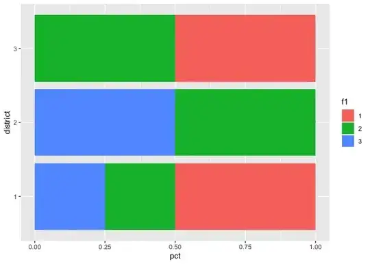
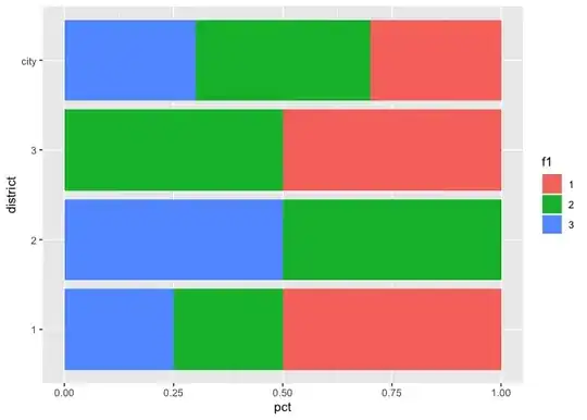
I'm currently analzing a dataset and I need help with basic data preparation and showing data in a rather complex barplot. The diagram should look similar to the attached image, but ofcourse with different variables.
lets just use a mock data set for illustration:
df <- data.frame(id=c(1,2,3,4,5,6,7,8,9,10),
                         district=c("1","1","2","3","2","1","1","2","3","2"),
                         f1=c("1","2","3","1","2","3","1","2","2","3")
)
district = The city has 3 different districts f1 = First question of the survey with 3 different categories
I want to show the percantage for each categorie per district and plot it similar to the plot in the image. First I want do display the overall percantage (for the city), and then per district. In the same plot!
I'm grateful for every help. Thanks alot
