5

I am creating a new figure containing a choropleth map for the Asian continent, but want to add bar charts above each country. Ideally, I would like to create something like this: https://forum.generic-mapping-tools.org/t/how-to-plot-bar-charts-on-world-map/959

enter image description here

I know this has been asked several times before, but the questions seem to be older and make use of packages that are not supported anymore. My approach is replicating this question.

I downloaded the shape file from Eurostat, and successfully calculated the centroids of each country within the shape file map:

library(sf)
library(tidyverse)

map <- read_sf(dsn = "C:/Users/Adrian/Desktop/PhD/Data/ne_50m_admin_0_countries", 
               layer = "ne_50m_admin_0_countries")


asia <- map[  map$CONTINENT %in% "Asia", ]

asia <- asia %>% mutate(centroids = st_centroid(st_geometry(.))) 
asia <- asia %>% mutate(long = unlist(map(asia$centroids,1)) ,
                        lat = unlist(map(asia$centroids, 2)))

ggplot(data = asia) +
  geom_sf() + coord_sf() +
  geom_point(data = asia, aes(x = long, y = lat) , 
              size = 2 )

Giving:

enter image description here

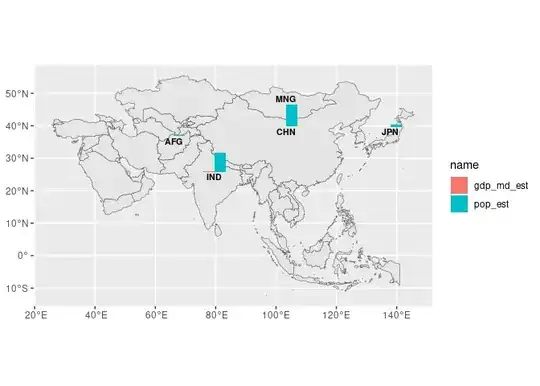
But I don't know how to proceed. I would like to add a bar chart on or close to each central point on the map (avoiding any overlap), with a small label denoting the country.

Something like this:

library(reshape2)

data <- as.data.frame(asia)
data <- data %>%
  select(GU_A3 , POP_EST , GDP_MD)

data <- melt(data)

ggplot(data %>% filter(GU_A3 == "JPN"), aes(x=GU_A3, y=value, fill=variable)) +
  geom_bar(stat='identity', position='dodge') + ggtitle("JPN") +
  theme(plot.title = element_text(hjust = 0.5))

Giving:

enter image description here

How can I add these charts on the map? I appreciate any help.

Adrian
  • 791
  • 1
  • 5
  • 15
  • This is an interesting problem and I will follow with interest; I have had good experience with `{scatterpie}` in a similar context (but I appreciate the difference between a bar and pie chart) – Jindra Lacko Jun 07 '23 at 10:16

1 Answers1

3

A very good question. It used to be a package named ggsubplot but now it is not in CRAN any more (see RG#87: histogram / bar chart over map). Hopefully Michael Koohafkan published a post on this: A ggsubplot revival.

I adapted the latter approach (i.e. creating each bar chart as an independent plot and add it to the main plot with annotate_custom()) as:

library(sf)
library(tidyverse)
library(rnaturalearth)

# I use rnaturalearth package, that should be the same source than your
# downloaded shapefile
asia <- ne_countries(scale = 50, continent = "Asia", returnclass = "sf") %>%
  st_make_valid()


# We need to fake the legend on the main plot, using this...
fakelegend <- asia %>%
  filter(iso_a3 == "JPN") %>%
  select(pop_est, gdp_md_est) %>%
  pivot_longer(pop_est:gdp_md_est)


# Create base (main plot)
my_plot <- ggplot(asia) +
  # We create here a fake legend
  geom_sf(data = fakelegend, aes(fill = name), color = NA) +
  # But we overlay the result with a blank map, so only legend is visible
  geom_sf()

# My base plot
my_plot


# Get centroids

centroids <- bind_cols(asia, st_coordinates(st_centroid(asia,
  of_largest_polygon = TRUE
))) %>%
  st_drop_geometry() %>%
  select(gu_a3, pop_est, gdp_md_est, lon = X, lat = Y) %>%
  pivot_longer(pop_est:gdp_md_est)
#> Warning: st_centroid assumes attributes are constant over geometries


centroids
#> # A tibble: 106 × 5
#>    gu_a3   lon   lat name           value
#>    <chr> <dbl> <dbl> <chr>          <dbl>
#>  1 AFG    65.9  33.8 pop_est     28400000
#>  2 AFG    65.9  33.8 gdp_md_est     22270
#>  3 ARE    54.3  23.9 pop_est      4798491
#>  4 ARE    54.3  23.9 gdp_md_est    184300
#>  5 ARM    44.9  40.3 pop_est      2967004
#>  6 ARM    44.9  40.3 gdp_md_est     18770
#>  7 AZE    47.7  40.3 pop_est      8238672
#>  8 AZE    47.7  40.3 gdp_md_est     77610
#>  9 BGD    90.2  23.9 pop_est    156050883
#> 10 BGD    90.2  23.9 gdp_md_est    224000
#> # ℹ 96 more rows

# Common y scales on each subplot, we need this value
# to adjust it
maxy <- max(asia$pop_est)

# Select some countries
cntr_sel <- c("JPN", "CHN", "AFG", "MNG", "IND")

# Offset for positions close to the centroid
offs <- 5

# We create subplots on a loop
for (cnt in cntr_sel) {

  # Create subplot on loop
  sub_data <- centroids %>% filter(gu_a3 == cnt)

  # Subplot
  sub_plot <- ggplot(sub_data, aes(x = gu_a3, y = value, fill = name)) +
    geom_bar(stat = "identity", position = "dodge", show.legend = FALSE) +
    xlab(cnt) +
    # Common y scale here
    ylim(c(0, maxy)) +
    theme_void() +
    theme(axis.title.x = element_text(hjust = 0.5, size = 8, face = "bold"))

  # Add it here to the main plot
  my_plot <- my_plot +
    # As a grob
    annotation_custom(ggplotGrob(sub_plot),
      # Position of the annotation, based on the centroid info
      xmin = sub_data$lon[1] - offs,
      xmax = sub_data$lon[1] + offs,
      ymin = sub_data$lat[1],
      ymax = sub_data$lat[1] + offs * 2
    )
}

# And the final result
my_plot

Created on 2023-06-07 with reprex v2.0.2

dieghernan
  • 2,690
  • 8
  • 16
  • Hello, thank you for your answer! This is what I'm looking for. Just one question, is the position of the annotations custom? I'm worried that the annotations might overlap if the countries are small. I know that there is a function called "geom_sf_label_repel()" that could help – Adrian Jun 07 '23 at 14:41
  • Positions is based on a offset of 5 in the example (`offs <- 5`) around the centroid (`sub_data$lon, sub_data$lat`). Overlapping can happen, you would need to solve this manually on the countries where overlapping is observed (maybe modifying `sub_data` values or increasing the offset). I am not aware of a computational method to achieve this, and `geom_sf_label_repel()` is not suitable for this case since it adjust a label, but you want to place plots, no labels – dieghernan Jun 07 '23 at 15:15
  • Much appreciated! – Adrian Jun 08 '23 at 15:48