1

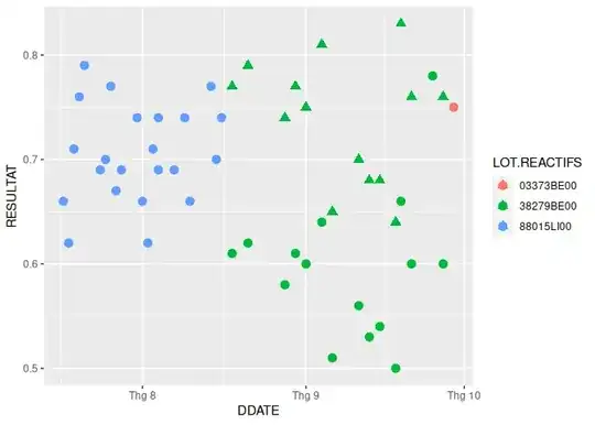
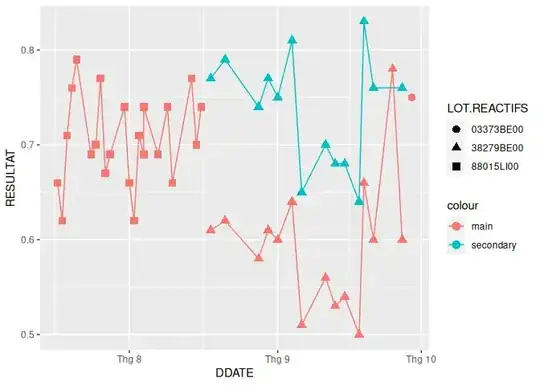
I ploted a Levey-jennnings plot using a main data and i want to plot a seccondary y-axis using ggplot2 from date 18.08.22 to 27.09.22 of this data frame :

structure(list(DDATE = c("27.09.22", "21.09.22", "19.09.22", 
"18.09.22", "15.09.22", "13.09.22", "11.09.22", "06.09.22", "04.09.22", 
"01.09.22", "30.08.22", "28.08.22", "21.08.22", "18.08.22", NA
), LOT.REACTIFS = c("38279BE00", "38279BE00", "38279BE00", "38279BE00", 
"38279BE00", "38279BE00", "38279BE00", "38279BE00", "38279BE00", 
NA), RESULTAT = c(0.76, 0.76, 0.83, 0.64, 0.68, 0.68, 0.7, 0.65, 
0.81, 0.75, 0.77, 0.74, 0.79, 0.77, NA)), row.names = c("1", 
"2", "3", "4", "5", "6", "7", "8", "9", "10", "11", "12", "13", 
"14", "NA"), class = "data.frame")

On the main data frame :

structure(list(DDATE = c("17.07.22", "18.07.22", "19.07.22", 
"20.07.22", "21.07.22", "24.07.22", "25.07.22", "26.07.22", "27.07.22", 
"28.07.22", "31.07.22", "01.08.22", "02.08.22", "03.08.22", "04.08.22", 
"04.08.22", "07.08.22", "09.08.22", "10.08.22", "14.08.22", "15.08.22", 
"16.08.22", "18.08.22", "21.08.22", "28.08.22", "30.08.22", "01.09.22", 
"04.09.22", "06.09.22", "11.09.22", "13.09.22", "15.09.22", "18.09.22", 
"19.09.22", "21.09.22", "25.09.22", "27.09.22", "29.09.22"), 
    LOT.REACTIFS = c("88015LI00", "88015LI00", "88015LI00", "88015LI00", 
    "88015LI00", "88015LI00", "88015LI00", "88015LI00", "88015LI00", 
    "88015LI00", "88015LI00", "88015LI00", "88015LI00", "88015LI00", 
    "88015LI00", "88015LI00", "88015LI00", "88015LI00", "88015LI00", 
    "88015LI00", "88015LI00", "88015LI00", "38279BE00", "38279BE00", 
    "38279BE00", "38279BE00", "38279BE00", "38279BE00", "38279BE00", 
    "38279BE00", "38279BE00", "38279BE00", "38279BE00", "38279BE00", 
    "38279BE00", "38279BE00", "38279BE00", "03373BE00"), RESULTAT = c(0.66, 
    0.62, 0.71, 0.76, 0.79, 0.69, 0.7, 0.77, 0.67, 0.69, 0.74, 
    0.66, 0.62, 0.71, 0.69, 0.74, 0.69, 0.74, 0.66, 0.77, 0.7, 
    0.74, 0.61, 0.62, 0.58, 0.61, 0.6, 0.64, 0.51, 0.56, 0.53, 
    0.54, 0.5, 0.66, 0.6, 0.78, 0.6, 0.75)), row.names = 10:47, class = "data.frame")

thank you

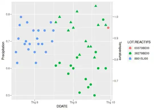
I'm using the following codes :

library(ggplot2)
library(ggthemes)
# Basic scatter plot
Plot3 = ggplot(PSAT, aes(x=temp1, y=DATO2$value))+geom_line( color="grey") +  geom_point(shape=21, color="black", fill="#69b3a2", size=1)+
  geom_point(mapping = aes(x = temp1, y = DATO2$value, color = DATO2$LOT.REACTIFS))+ 
  scale_y_continuous("Precipitation", sec.axis = sec_axis(~ .*17142/13553, name = "Temperature" ))
Plot3
Axeman
  • 32,068
  • 8
  • 81
  • 94
Mo Kh
  • 11
  • 2
  • 1
    The field names in your data don't match your code. Additionally, it looks like you're trying to use two different data frames in the same `ggplot` layer. That's only possible with `annotate` layer, but the datasets have to be the same size. It would really help if you edited your answer so that the columns you're calling in your plot match up with the names used in your data. What is `temp1`? What is `value`? What are you trying to put on the graph x and y? What do you want as the secondary y? – Kat Jun 10 '23 at 23:09

1 Answers1

0

After reviewing your data I don't think you need a 2nd Y axis. You just need a way to differentiate data from 2nd data with main data

I used your dput data provided just put them separately here (https://pastes.io/1s2shfxqzz)

1st I convert the DDATE to date for more readable x-Axis

main_data <- main_data |>
  mutate(DDATE = as.Date(DDATE, format = "%d.%m.%y"))
data_2 <- data_2 |>
  mutate(DDATE = as.Date(DDATE, format = "%d.%m.%y"))

As the two value are the same you just need to plot them without any transformation & 2nd y-axis markup

## Without  2nd axis  
ggplot() +
  geom_point(data = main_data,
             aes(x = DDATE, y = RESULTAT, color = LOT.REACTIFS), size = 3,
             shape = "circle") + # main data is circle
  geom_point(data = data_2,
             aes(x = DDATE, y = RESULTAT, color = LOT.REACTIFS), size = 3,
             shape = "triangle") # 2nd data is triagle

When added the 2nd y-axis code you share in your question it look confusing.

## With 2nd axis  
ggplot() +
  geom_point(data = main_data,
             aes(x = DDATE, y = RESULTAT, color = LOT.REACTIFS), size = 3,
             shape = "circle") + # main data is circle
  geom_point(data = data_2,
             aes(x = DDATE, y = RESULTAT, color = LOT.REACTIFS), size = 3,
             shape = "triangle") + # 2nd data is triagle
scale_y_continuous("Precipitation", sec.axis = sec_axis(~ .*17142/13553, 
                                                        name = "Temperature" ))
#> Warning: Removed 1 rows containing missing values (`geom_point()`).

Created on 2023-06-11 with reprex v2.0.2

Further explain about 2nd y-axis in ggplot2

2nd y-axis in ggplot2 is not really related to the data that is being plot. It is just a decorative with breaks & values that input. That is why you need to have a formula for it which will convert the value of the main y-axis into the markup value on 2nd y-axis.

This is only applicable when you want to graph two metric that are very different like the code in your question is about rain amount in mm & temperature in Celsius. The rain amount can reach 150 for example while the daily temperature can reach maximum like 60 maybe? so it hard to graph and make sense of the graph without some adjsutment.

You can learn more about 2nd in one of my answer on ggplot 2nd y-axis here

How I can correctly overlap bar and linechart together

scale_y_continuous("Precipitation", sec.axis = sec_axis(~ .*17142/13553, 
                                                        name = "Temperature" ))

Update with alternative connected line for main/2nd data

What you can do is playaround with color/shape to differentiate data and added geom_line as below to connect certain dot together.

ggplot() +
  geom_point(data = main_data,
             aes(x = DDATE, y = RESULTAT, shape = LOT.REACTIFS,
                 color = "main"), size = 3) + # main data is circle +
  geom_line(data = main_data, aes(x = DDATE, y = RESULTAT,
                                  color = "main")) +
  geom_point(data = data_2,
             aes(x = DDATE, y = RESULTAT, shape = LOT.REACTIFS,
                 color = "secondary"), size = 3) +
  geom_line(data = data_2, aes(x = DDATE, y = RESULTAT, color = "secondary"))
#> Warning: Removed 1 rows containing missing values (`geom_point()`).
#> Warning: Removed 1 row containing missing values (`geom_line()`).

Created on 2023-06-13 with reprex v2.0.2

Sinh Nguyen
  • 4,277
  • 3
  • 18
  • 26