0

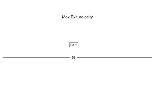
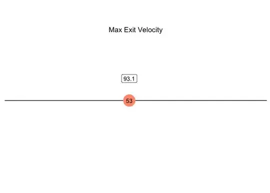
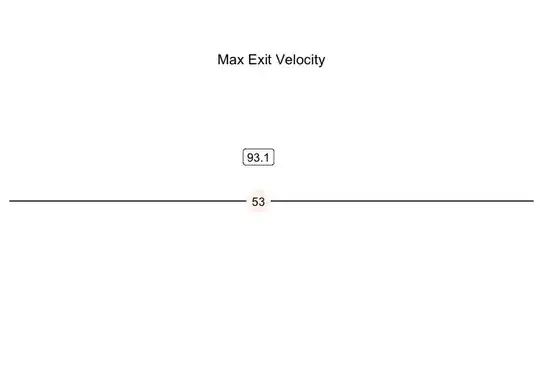
I am trying to make something similar to the Percentile Ranking on Baseball Savant but I can't get the color change to work. Currently the ggplot correctly ranks hitters based on their max exit velocity but the points color always gets stuck on the "mid" color regardless of the location of the point.

test_df <- data.frame(
  Batter = c("Player 1", "Player 2", "Player 3", "Player 4"),
  MaxExitVelo = c(105, 107, 102, 108),
  rank = c(1, 2, 3, 4)
)
test_df %>% 
  filter(Batter == "Player 2") %>% #Manually change Batter name to calculate ranking
  ggplot(aes(x = rank, y = "")) +
  geom_point(size = 10, aes(color = rank)) +
  geom_text(aes(label = rank)) +
  geom_label(aes(label = round(MaxExitVelo, digits = 1)), nudge_x = 0, nudge_y = 0.15) +
  ggtitle("Max Exit Velocity") +
  scale_x_reverse(expand = c(0,0.5), limits = c(max_rank + 1,  0)) +
  scale_color_gradient2(low = "blue", mid = "white", high = "red") + 
  theme_linedraw(base_line_size = 5) +
  theme(legend.position = "none",
         panel.border = element_rect(color = "white"),
         panel.grid.major.x = element_blank(),
         panel.grid.minor.x = element_blank(),
         axis.ticks.y = element_blank(),
         axis.text.y = element_blank(),
         axis.title.y = element_blank(),
         axis.ticks.x = element_blank(),
         axis.text.x = element_blank(),
         axis.title.x = element_blank(),
        plot.title = element_text(hjust = 0.5, vjust = -15)
  )

Current ggplot

norcal
  • 1
  • 1
  • 2
    Welcome to SO! It would be easier to help you if you provide [a minimal reproducible example](https://stackoverflow.com/questions/5963269/how-to-make-a-great-r-reproducible-example) including a snippet of your data or some fake data so that we can run your code, reproduce your issue and figure out a solution. – stefan Jun 13 '23 at 22:10

1 Answers1

0

The issue is that your data contains only one obs. As a result the limits of the fill scale collapse to one point.

max_exit_velo <- data.frame(
  rank = 53,
  MaxExitVelo = 93.1
)

max_rank <- 100

library(ggplot2)

p <- ggplot(max_exit_velo, aes(x = rank, y = "")) +
  geom_point(size = 10, aes(color = rank)) +
  geom_text(aes(label = rank)) +
  geom_label(aes(label = round(MaxExitVelo, digits = 1)), nudge_x = 0, nudge_y = 0.15) +
  ggtitle("Max Exit Velocity") +
  scale_x_reverse(expand = c(0, 0.5), limits = c(max_rank + 1, 0)) +
  theme_linedraw(base_line_size = 5) +
  theme(
    legend.position = "none",
    panel.border = element_rect(color = "white"),
    panel.grid.major.x = element_blank(),
    panel.grid.minor.x = element_blank(),
    axis.ticks.y = element_blank(),
    axis.text.y = element_blank(),
    axis.title.y = element_blank(),
    axis.ticks.x = element_blank(),
    axis.text.x = element_blank(),
    axis.title.x = element_blank(),
    plot.title = element_text(hjust = 0.5, vjust = -15)
  )

p + scale_color_gradient2(low = "blue", mid = "white", high = "red")

To fix that set the limits of the fill scale to reflect the range of your ranks:

p + scale_color_gradient2(low = "blue", mid = "white", high = "red", limits = c(0, 100))

Additionally, you probably want a different midpoint than the default one which is zero:

p + scale_color_gradient2(low = "blue", mid = "white", high = "red", midpoint = 50, limits = c(0, 100))

stefan
  • 90,330
  • 6
  • 25
  • 51