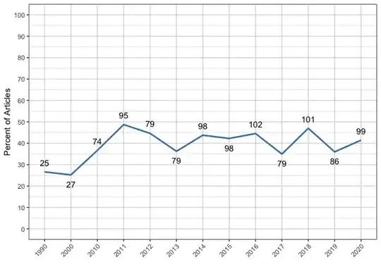
I wanted to create a line plot based on the data MIA_YEAR. It already looks quite good but I want to move those data points under the plot that (almost) touch the line. Or in mathematial terms: If the slope increases the data points should be under the line plot and if the slope decreases the data points should be over the plot instead of having all data points over the line. that is how it looks like until now -->.
MIA_Year %>%
  ggplot(aes(x = YEAR, y = Percent)) +
  geom_line(group=1, color = "steelblue", linewidth = 1) + #group = 1 needed when x is a factor
  geom_text(data = MIA_Year, aes(label=n), vjust = -0.9) +
  scale_y_continuous(limits = c(0, 100), breaks = seq(0, 100, by = 10)) +
  labs(x = "", y = "Percent of Articles") +
  theme(axis.text.x = element_text(angle = 45, hjust = 1), panel.border = element_rect(fill = NA), panel.background = element_rect(fill = "white"), panel.grid = element_line(colour = "grey85"))
This is my code. I tried including something like this
vjust = ifelse(diff(Percent) < 0, -0.9, 0.9),
but it did not work with ggplot, I got this error, although the object definitely is inside of MIA_YEAR: (Error in diff(y = Percent) : object 'Percent' not found)
(maybe you could also explain to me, why it does not work?)
Thanks a lot for your help!
Edit 1. Here is the data (I hope I got the point with the copying right)
structure(list(YEAR = structure(1:13, .Label = c("1990", "2000",
"2010", "2011", "2012", "2013", "2014", "2015", "2016", "2017",
"2018", "2019", "2020"), class = "factor"), n = c(25L, 27L, 74L,
95L, 79L, 79L, 98L, 98L, 102L, 79L, 101L, 86L, 99L), Percent = c(26.6,
25.23, 36.63, 48.72, 44.63, 36.24, 43.75, 42.24, 44.54, 34.96,
46.98, 35.98, 41.42)), class = c("grouped_df", "tbl_df", "tbl",
"data.frame"), row.names = c(NA, -13L), groups = structure(list(
    YEAR = structure(1:13, .Label = c("1990", "2000", "2010",
    "2011", "2012", "2013", "2014", "2015", "2016", "2017", "2018",
    "2019", "2020"), class = "factor"), .rows = structure(list(
        1L, 2L, 3L, 4L, 5L, 6L, 7L, 8L, 9L, 10L, 11L, 12L, 13L), ptype = integer(0), class = c("vctrs_list_of",
    "vctrs_vctr", "list"))), class = c("tbl_df", "tbl", "data.frame"
), row.names = c(NA, -13L), .drop = TRUE))