The length of geom_boxplot() whisker shrinks when changing the y-axis scale and removing outliers. How can I make sure the whiskers do not shrink?
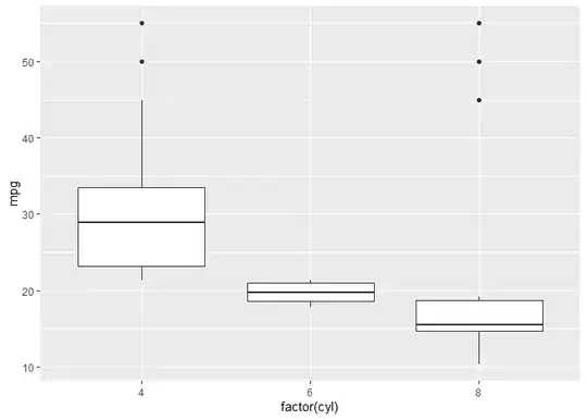
In the example below, the first plot shows all the data, inclusive of outliers. For cyl = 4, the upper whisker extends to mpg = 45. Similarly, the lower whisker for cyl = 8 extends to mpg = 11
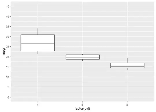
In the second plot, the outliers are removed using outlier.shape = NA and the y-axis range is reduced. However, for cyl = 4 the upper whisker is now mpg = 34 and the lower whisker for cyl = 8 is now mpg = 13. I would expect the upper whisker for cyl = 4 to still be mpg = 45 and the lower whisker for cyl = 8 to still be mpg = 11.
library(ggplot2)
#> Warning: package 'ggplot2' was built under R version 4.2.3
library(dplyr)
#> Warning: package 'dplyr' was built under R version 4.2.3
#>
#> Attaching package: 'dplyr'
#> The following objects are masked from 'package:stats':
#>
#>     filter, lag
#> The following objects are masked from 'package:base':
#>
#>     intersect, setdiff, setequal, union

# Load the mtcars dataset
data(mtcars)

data <- mtcars %>%
  select(mpg,cyl)

# Add outliers to specific groups
outliers <- data.frame(
  mpg = c(45,50,55,45,50,55),
  cyl = c(4,4,4,8,8,8))

# Create example dataset
data <- rbind(data, outliers)

# Upper whisker length for cyl = 4 is at 45 mpg
# Lower whisker length for cyl = 8 is at 11 mpg
data %>%
  ggplot(aes(x = factor(cyl), y = mpg)) +
  geom_boxplot()
# Remove outliers and reduce y-axis scale
# Upper whisker length for cyl = 4 is at 34 mpg
# Lower whisker length for cyl = 8 is at 13 mpg
data %>%
  ggplot(aes(x = factor(cyl), y = mpg)) +
  geom_boxplot(outlier.shape = NA) +
  scale_y_continuous(breaks = seq(0,45,5), limits = c(0,45))
#> Warning: Removed 4 rows containing non-finite values (`stat_boxplot()`).
Created on 2023-06-21 with reprex v2.0.2