0

I am trying to plot two histograms from two different datasets and each one has a different weight variable and dimension. I do not know how to do it, given that for example in the ggplot2 options, you have to rbind the datasets first and then create the histograms as grouped variables. Also, I tried with the usual hist command but it does not have the weight option. I was trying to use the library weights but I don´t know how to plot them in the same. This is a way of my actual code with simulate it data:

install.packages("weights")
library(weights)

w1 <- seq(1,500)
v1 <- sort(runif(500))

w2 <- seq(1,1000)
v2 <- sort(runif(1000))

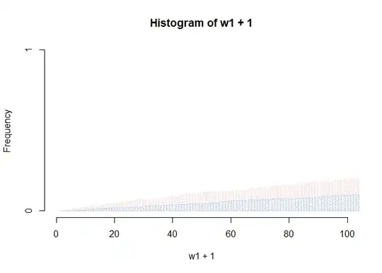
p1<-wtd.hist(w1+1, weight=v1, density = 30, breaks= 1000, xlim=c(0, 100), col = "red")
p2<-wtd.hist(w2, weight=v2, density = 30, breaks= 1000, xlim=c(0, 100), col = "blue")

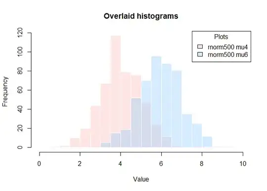
I am trying to get something like this:

enter image description here

LuLuGaGa
  • 13,089
  • 6
  • 49
  • 57
Luis M. García
  • 123
  • 2
  • 9
  • To (somewhat more) easily add transparency to colors (by color names) in base R, see also @thelatemail 's comment to this answer: https://stackoverflow.com/a/23533244/20513099 – I_O Jun 22 '23 at 08:05

1 Answers1

2

The plot you illustrate is a base R plot. Here's an example for plotting overlain histograms using base R which may help.

See below for response to using OP's example data with weights.

set.seed(1)
hist(rnorm(500, mean = 4), 
     col = rgb(1, 0.8, 0.8, 0.5), 
     border = "white",
     xlim = c(0, 10),
     xlab = "Value",
     main = "Overlaid histograms")
hist(rnorm(500, mean = 6), 
     col = rgb(0.6, 0.8, 1, 0.4), 
     border = "white", 
     add = TRUE)
legend("topright",
       legend = c("rnorm500 mu4", "rnorm500 mu6"),
       fill = c(rgb(1, 0.8, 0.8, 0.5), rgb(0.6, 0.8, 1, 0.4)),
       title = "Plots")

Created on 2023-06-22 with reprex v2.0.2

Principle applied to OP's example.

library(weights)

w1 <- seq(1,500)
v1 <- sort(runif(500))

w2 <- seq(1,1000)
v2 <- sort(runif(1000))

wtd.hist(w1+1, 
         weight=v1, 
         density = 30, 
         breaks= 1000, 
         xlim=c(0, 100), 
         col = rgb(1, 0.8, 0.8, 0.5))
wtd.hist(w2, 
         weight=v2, 
         density = 30, 
         breaks= 1000, 
         xlim=c(0, 100), 
         col = rgb(0.6, 0.8, 1, 0.5),
         add = TRUE)

Created on 2023-06-22 with reprex v2.0.2

Peter
  • 11,500
  • 5
  • 21
  • 31
  • I put that hist as an example of the plot I need, but the hist command doesn´t have the weight option. In my real problem I have weights from two datasets from different dimension and weights. That is why I´m using the wtd.hist command – Luis M. García Jun 22 '23 at 10:56
  • See updated answer which includes the data in the question and plotted in the manner of the example plot. Note the example data is not at all like the canonical normal histograms. – Peter Jun 22 '23 at 19:24