I think you are mistaken. annotate() works fine in your sample code. Maybe you were using it incorrectly?
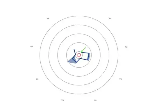
For example, see the code below where I've added a red circle and a green arrow to the plot. The idea is that the labels on the diagram V1 to V8 correspond to the numbers 1 to 8. A circle is just a line from x = 0 to x = 9 at a constant y value. An arrow is a line from the starting point to where you want it to point, with arrow parameters added.
coord_radar <- function (theta = "x", start = 0, direction = 1)
{
  theta <- match.arg(theta, c("x", "y"))
  r <- if (theta == "x")
    "y"
  else "x"

  #dirty
  rename_data <- function(coord, data) {
    if (coord$theta == "y") {
      plyr::rename(data, c("y" = "theta", "x" = "r"), warn_missing = FALSE)
    } else {
      plyr::rename(data, c("y" = "r", "x" = "theta"), warn_missing = FALSE)
    }
  }
  theta_rescale <- function(coord, x, scale_details) {
    rotate <- function(x) (x + coord$start) %% (2 * pi) * coord$direction
    rotate(scales::rescale(x, c(0, 2 * pi), scale_details$theta.range))
  }

  r_rescale <- function(coord, x, scale_details) {
    scales::rescale(x, c(0, 0.4), scale_details$r.range)
  }

  ggproto("CordRadar", CoordPolar, theta = theta, r = r, start = start,
          direction = sign(direction),
          is_linear = function(coord) TRUE,
          render_bg = function(self, scale_details, theme) {
            scale_details <- rename_data(self, scale_details)

            theta <- if (length(scale_details$theta.major) > 0)
              theta_rescale(self, scale_details$theta.major, scale_details)
            thetamin <- if (length(scale_details$theta.minor) > 0)
              theta_rescale(self, scale_details$theta.minor, scale_details)
            thetafine <- seq(0, 2 * pi, length.out = 100)

            rfine <- c(r_rescale(self, scale_details$r.major, scale_details))

            # This gets the proper theme element for theta and r grid lines:
            #   panel.grid.major.x or .y
            majortheta <- paste("panel.grid.major.", self$theta, sep = "")
            minortheta <- paste("panel.grid.minor.", self$theta, sep = "")
            majorr     <- paste("panel.grid.major.", self$r,     sep = "")

            ggplot2:::ggname("grill", grid::grobTree(
              ggplot2:::element_render(theme, "panel.background"),
              if (length(theta) > 0) ggplot2:::element_render(
                theme, majortheta, name = "angle",
                x = c(rbind(0, 0.45 * sin(theta))) + 0.5,
                y = c(rbind(0, 0.45 * cos(theta))) + 0.5,
                id.lengths = rep(2, length(theta)),
                default.units = "native"
              ),
              if (length(thetamin) > 0) ggplot2:::element_render(
                theme, minortheta, name = "angle",
                x = c(rbind(0, 0.45 * sin(thetamin))) + 0.5,
                y = c(rbind(0, 0.45 * cos(thetamin))) + 0.5,
                id.lengths = rep(2, length(thetamin)),
                default.units = "native"
              ),

              ggplot2:::element_render(
                theme, majorr, name = "radius",
                x = rep(rfine, each = length(thetafine)) * sin(thetafine) + 0.5,
                y = rep(rfine, each = length(thetafine)) * cos(thetafine) + 0.5,
                id.lengths = rep(length(thetafine), length(rfine)),
                default.units = "native"
              )
            ))
          })
}

PlotDataframe =  structure(list(Column = c("V1", "V2", "V3", "V4", "V5", "V6",
                                           "V7", "V8"), Median = c(0, 18.74554, 18.56488, 0, 12.02048, 11.13803,
                                                                   0, 11.48958), Quantile1 = c(0, 16.811494, 15.871041, 0, 10.220009,
                                                                                               2.981794, 0, 10.054176), Quantile3 = c(0, 22.32638, 22.65206,
                                                                                                                                      0, 15.54919, 29.36191, 0, 13.05328), Class = c(3, 3, 3, 3, 3,
                                                                                                                                                                                     3, 3, 3)), class = "data.frame", row.names = c(NA, -8L))

library(ggplot2)
library(stringr)

FingerprintTheme = theme(panel.background=element_blank(),
                         axis.text.y = element_blank(),
                         axis.text.x = element_text(size=6),
                         plot.title=element_text(size=8),
                         axis.ticks.y = element_blank(),
                         panel.grid.major.x = element_blank(),
                         panel.grid.major=element_line(colour="grey70"))

Plot = ggplot(PlotDataframe,
              aes(x=Column,
                  y=Median,
                  group=Class)) +
  geom_ribbon(aes(ymin = Quantile1,
                  ymax = Quantile3),
              fill = "#1c4f96",
              alpha = 0.50) +
  geom_line(linewidth=1,
            show.legend=NA,
            colour = "#1c4f96") +
  labs(x=NULL,
       y=NULL) +
  scale_y_continuous(limits = c(-10, 110)) +
  coord_radar() +
  FingerprintTheme

Plot +
  annotate("line", x = seq(0, 9, len=100), y = -5, colour = "red") +
  annotate("line",
           arrow = arrow(length = unit(0.2, "cm"), ends = "last", type = "open"),
           colour = "green", x = 1, y = c(20, 0))
Created on 2023-07-10 with reprex v2.0.2