3

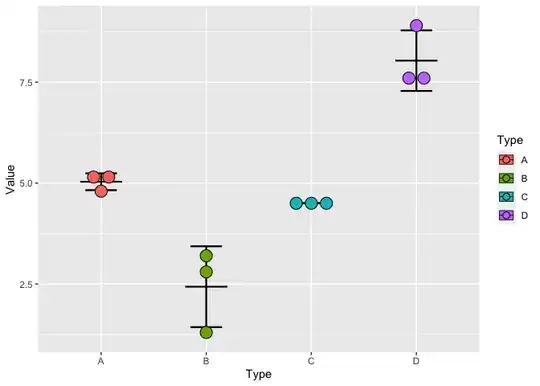
I have data that is categorical on the x axis and continuous on the y axis. I'm trying to produce a plot similar to this one:

image of example plot

I cannot figure out how to get the points to avoid overlapping - neither jitter not dodge seem to be quite what I'm looking for.

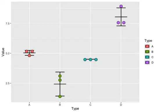
Here's an example with some data:

A <- c(5.1, 5.2, 4.8)
B <- c(1.3, 2.8, 3.2)
C <- c(4.5, 4.5, 4.5)
D <- c(8.9, 7.6, 7.6)

example <- data.frame(A, B, C, D) %>%
              pivot_longer(c(A,B,C, D),
                           names_to = "Type", 
                           values_to = "Value", 
                           cols_vary = "slowest")

ggplot(example, aes(x = Type, y = Value, fill = Type)) +
  stat_summary(fun = "mean", 
               colour = "black", 
               size = 0.3,
               width = 0.4,
               geom = "crossbar") +
  stat_summary(fun.data = mean_sdl, 
               fun.args = list(mult = 1), 
               geom = "errorbar",
               linewidth = 0.8,
               width = 0.3,
               colour = "black") +
  geom_point(size = 3,
             shape = 21,
             #alpha = 0.5,
             colour = "black",
             stroke = 1)

The plot it produces looks like this: example of how my plot looks now

I want to be able to see all three points in groups C and D but I don't want to move the points in group B.

I don't want to introduce jitter - if the points don't overlap then I want them to stay centred and when they do overlap I want them to be evenly spaced.

Position_dodge works but applies to all categories rather than only when needed.

Using geom_dotplot gives the closest result but I don't want the values to be binned - the subtle differences in y values are important and the points need to be at their correct y positions.

Is there any way to acheive this in R?

  • 1
    This might help; https://stackoverflow.com/questions/75275700/arrange-points-on-a-regular-grid-to-avoid-overplotting – Jon Spring Jul 19 '23 at 04:58

1 Answers1

6

One option is to use geom_dotplot() to get your desired outcome, e.g.

library(tidyverse)

A <- c(5.1, 5.2, 4.8)
B <- c(1.3, 2.8, 3.2)
C <- c(4.5, 4.5, 4.5)
D <- c(8.9, 7.6, 7.6)

example <- data.frame(A, B, C, D) %>%
  pivot_longer(c(A,B,C, D),
               names_to = "Type", 
               values_to = "Value", 
               cols_vary = "slowest")

ggplot(example, aes(x = Type, y = Value, fill = Type)) +
  stat_summary(fun = "mean", 
               colour = "black", 
               size = 0.3,
               width = 0.4,
               geom = "crossbar") +
  stat_summary(fun.data = mean_sdl, 
               fun.args = list(mult = 1), 
               geom = "errorbar",
               linewidth = 0.8,
               width = 0.3,
               colour = "black") +
  geom_dotplot(stackdir = "center", 
               binaxis = "y", 
               binwidth = .2,
               binpositions = "all",
               stackratio = 1.25,
               dotsize = 1.5)
#> Warning: Using `size` aesthetic for lines was deprecated in ggplot2 3.4.0.
#> ℹ Please use `linewidth` instead.
#> This warning is displayed once every 8 hours.
#> Call `lifecycle::last_lifecycle_warnings()` to see where this warning was
#> generated.

Created on 2023-07-19 with reprex v2.0.2


Another potential option (a more general solution) is to use geom_beeswarm() from the ggbeeswarm package, e.g.

library(tidyverse)
library(ggbeeswarm)

A <- c(5.1, 5.2, 4.8)
B <- c(1.3, 2.8, 3.2)
C <- c(4.5, 4.5, 4.5)
D <- c(8.9, 7.6, 7.6)

example <- data.frame(A, B, C, D) %>%
  pivot_longer(c(A,B,C, D),
               names_to = "Type", 
               values_to = "Value", 
               cols_vary = "slowest")

ggplot(example, aes(x = Type, y = Value, fill = Type)) +
  stat_summary(fun = "mean", 
               colour = "black", 
               size = 0.3,
               width = 0.4,
               geom = "crossbar") +
  stat_summary(fun.data = mean_sdl, 
               fun.args = list(mult = 1), 
               geom = "errorbar",
               linewidth = 0.8,
               width = 0.3,
               colour = "black") +
  geom_beeswarm(method = "centre",
                shape = 21,
                size = 4,
                cex = 4.5)
#> Warning: Using `size` aesthetic for lines was deprecated in ggplot2 3.4.0.
#> ℹ Please use `linewidth` instead.
#> This warning is displayed once every 8 hours.
#> Call `lifecycle::last_lifecycle_warnings()` to see where this warning was
#> generated.
#> Warning: In `position_beeswarm`, method `center` discretizes the data axis (a.k.a the
#> continuous or non-grouped axis).
#> This may result in changes to the position of the points along that axis,
#> proportional to the value of `cex`.
#> This warning is displayed once per session.

Created on 2023-07-19 with reprex v2.0.2

jared_mamrot
  • 22,354
  • 4
  • 21
  • 46
  • 1
    Amazing work!! I had solution with `position_nudge` although not succinct – Onyambu Jul 19 '23 at 06:28
  • 1
    Great. Played around with `geom_quasirandom`. But `method = "centre"` was the piece I missed. Thx for the reminder – stefan Jul 19 '23 at 06:43