I have a problem. I am trying to plot a graph y = (6x - 20)/5*. However, the graph plots the axes on the far left and bottom. So, I use the abline() function to plot the axes, so the graph passes through the axes. However, I'd like the tick marks and numbers to be on the axes which the graph passes through, not on the left and bottom. Here's the code:
# Define the function
f <- function(x) (6*x - 20)/5

xmin <- -3.5; max <- 7

# Plot the graph
par(bg='transparent')

plot(f, from=xmin, to=xmax, col="#218e8d", lwd=7, xlab="", ylab="",
     xlim=c(xmin,xmax), ylim=c(-5,7), bty= "n", axes="FALSE", n=20000,
     panel.first=c(abline(h=0, lwd=2, col="#636363"),
                     abline(v=0, lwd=2, col="#636363"),
                     axis(1, at=seq(-3, 7, by=1), col="#636363"),
                     axis(2, at=seq(-5, 7, by=1), col="#636363")))

mtext("x", side=1, line=3); mtext("y", side=2, line=3)
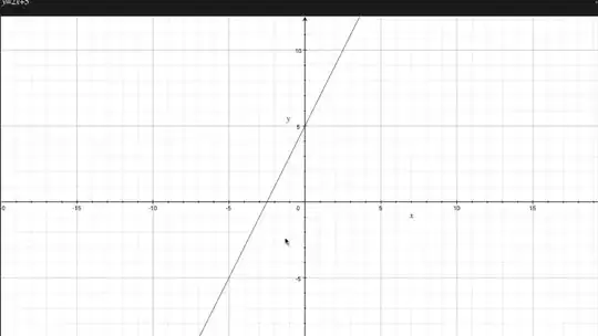
Here's what the code above plots:

The axes that the graph does pass through are the ablines. The axes with the ticks and numbers, however, are on the left and bottom.
Here's an example of a plot that has the ticks and numbers in the right places: