0

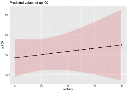
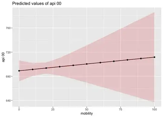
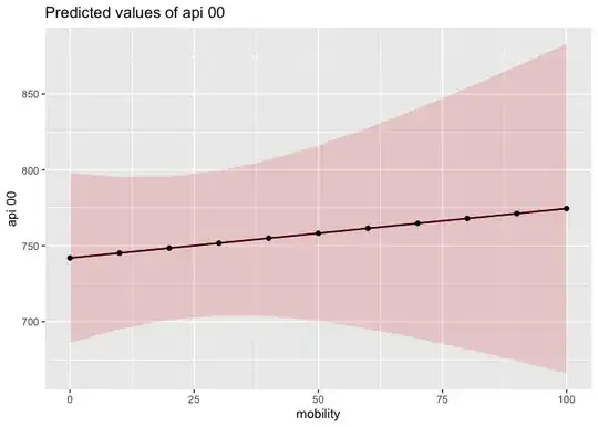
I have 5 plots of the format:

plot1 <- plot_model(Model2015, type = "pred", terms = "Level2") + 
  geom_point() + geom_line() + scale_y_continuous(limits = c(0, 0.40), breaks = seq(0, 0.40, 0.05)) 

plot2 <- plot_model(Model2016, type = "pred", terms = "Level2") +
  geom_point() +
  geom_line() +   scale_y_continuous(limits = c(0, 0.40), breaks = seq(0, 0.40, 0.05))
...

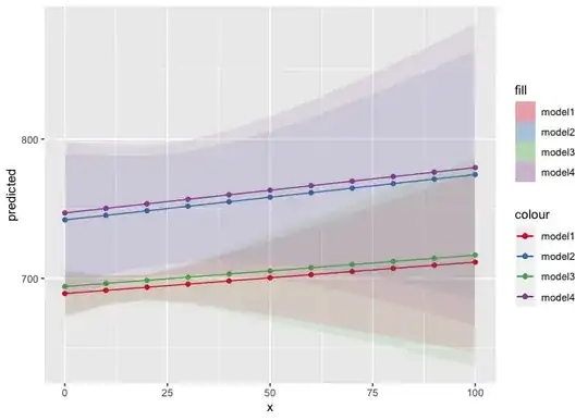
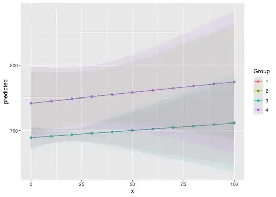
And I want to combine them all into one plot. I'm having difficulty finding a functin or package that will let me plot all 5 models onto the same plot, with the same x and y axis, as opposed to having 5 plots side by side.

These are each survey weighted models using the survey package, which is why I have 5 different dataframes instead of one combined dataframe.

I want to end up with one plot with 5 different colored lines, so you can compare the trend in predictions over time.

Tried various packages like gridextra or patchwork, but they all make side-by-side plots.

Edit: Here's more of the code:

 Model2015 <- svyglm(spdmon ~ Level2 + Sex + Income + Age + Race + Education + Work, N2015_design)
Model2016 <- svyglm(spdmon ~ Level2 + Sex + Income + Age + Race + Education + Work, N2016_design)
Model2017 <- svyglm(spdmon ~ Level2 + Sex + Income + Age + Race + Education + Work, N2017_design)
Model2018 <- svyglm(spdmon ~ Level2 + Sex + Income + Age + Race + Education + Work, N2018_design)
Model2019 <- svyglm(spdmon ~ Level2 + Sex + Income + Age + Race + Education + Work, N2019_design)

plot1 <- plot_model(Model2015, type = "pred", terms = "Level2") + 
  geom_point() + geom_line() + scale_y_continuous(limits = c(0.1, 0.40), breaks = seq(0.1, 0.40, 0.1))
                                                                                                               

plot2 <- plot_model(Model2016, type = "pred", terms = "Level2") +
  geom_point() +
  geom_line() +   scale_y_continuous(limits = c(0, 0.40), breaks = seq(0, 0.40, 0.05))

plot3 <- plot_model(Model2017, type = "pred", terms = "Level2") +
  geom_point() +
  geom_line() + scale_y_continuous(limits = c(0, 0.40), breaks = seq(0, 0.40, 0.05)) 

plot4 <- plot_model(Model2018, type = "pred", terms = "Level2") + 
  geom_point() +
  geom_line() + scale_y_continuous(limits = c(0, 0.40), breaks = seq(0, 0.40, 0.05)) 

plot5 <- plot_model(Model2019, type = "pred", terms = "Level2") +
  geom_point() +
  geom_line() +  scale_y_continuous(limits = c(0, 0.40), breaks = seq(0, 0.40, 0.05))

And what I'm trying to do is place all of the trend lines onto one plot.

  • Combine the dataframes, then plot with group. – zx8754 Jul 26 '23 at 07:05
  • Won't this mess up the weighting? All 5 years have their own weighting, though the variables for weights have the same names. Is it appropriate to combine them? – user22286085 Jul 26 '23 at 21:00
  • 1
    Provide example data please. And expected output. – zx8754 Jul 27 '23 at 06:31
  • 5 dataframes for five years, each with a different number of rows. They all have the same named weighting variable, but the weights are different each year. Using svyglm and svy design. – user22286085 Jul 27 '23 at 20:25

1 Answers1

1

Edit 1

Thanks for editing your question to include more details. I completely misunderstood the type of model you were building/wanting to plot. My suggested approach is the same, regardless of the type of model (i.e. extract the coordinates from the ggplot objects and plot them together on the same graph), but this example should make a lot more sense:

library(tidyverse)
# install.packages("survey")
library(survey)
# install.packages("sjPlot")
library(sjPlot)
data(api)

# make different survey designs
dstrat<-svydesign(id=~1,strata=~stype, weights=~pw, data=apistrat, fpc=~fpc)
dclus2<-svydesign(id=~dnum+snum, weights=~pw, data=apiclus2)
rstrat<-as.svrepdesign(dstrat)
rclus2<-as.svrepdesign(dclus2)

# make the 4 models
model1 <- svyglm(api00~ell+meals+mobility, design=dstrat)
model2 <- svyglm(api00~ell+meals+mobility, design=dclus2)
model3 <- svyglm(api00~ell+meals+mobility, design=rstrat)
model4 <- svyglm(api00~ell+meals+mobility, design=rclus2)

# plot the models individually
plot1 <- plot_model(model1, type = "pred", terms = "mobility") + 
  geom_point() + geom_line()
plot2 <- plot_model(model2, type = "pred", terms = "mobility") + 
  geom_point() + geom_line()
plot3 <- plot_model(model3, type = "pred", terms = "mobility") + 
  geom_point() + geom_line()
plot4 <- plot_model(model4, type = "pred", terms = "mobility") + 
  geom_point() + geom_line()

plot1

plot2

plot3

plot4

# What people usually do (but not what you're after)
plot_models(list(model1, model2, model3, model4))


# What I think you are trying to do
# Extract the data from each plot object and combine
ggplot() +
  geom_line(data = plot1$data,
            aes(x = x, y = predicted, color = "model1")) +
  geom_point(data = plot1$data,
             aes(x = x, y = predicted, color = "model1")) +
  geom_ribbon(data = plot1$data,
              aes(ymin = conf.low,
                  ymax = conf.high,
                  x = x, fill = "model1"),
              alpha = 0.1, linewidth = 0) +
  geom_line(data = plot2$data,
            aes(x = x, y = predicted, color = "model2")) +
  geom_point(data = plot2$data,
             aes(x = x, y = predicted, color = "model2")) +
  geom_ribbon(data = plot2$data,
              aes(ymin = conf.low,
                  ymax = conf.high,
                  x = x, fill = "model2"),
              alpha = 0.1, linewidth = 0) +
  geom_line(data = plot3$data,
            aes(x = x, y = predicted + 5, color = "model3")) +
  geom_point(data = plot3$data,
             aes(x = x, y = predicted + 5, color = "model3")) +
  geom_ribbon(data = plot3$data,
              aes(ymin = conf.low,
                  ymax = conf.high,
                  x = x, fill = "model3"),
              alpha = 0.1, linewidth = 0) +
  geom_line(data = plot4$data,
            aes(x = x, y = predicted + 5, color = "model4")) +
  geom_point(data = plot4$data,
             aes(x = x, y = predicted + 5, color = "model4")) +
  geom_ribbon(data = plot4$data,
              aes(ymin = conf.low,
                  ymax = conf.high,
                  x = x, fill = "model4"),
              alpha = 0.1, linewidth = 0) +
  scale_color_brewer(palette = "Set1") +
  scale_fill_brewer(palette = "Set1")


# The approach @zx8754 suggested
df <- bind_rows(plot1$data, plot2$data, plot3$data, plot4$data, .id = "Group")

df %>%
  ggplot(aes(x = x, y = predicted, color = Group, fill = Group)) +
  geom_line() +
  geom_point() +
  geom_ribbon(aes(ymin = conf.low,
                  ymax = conf.high),
              alpha = 0.1, linewidth = 0)

Created on 2023-07-28 with reprex v2.0.2

Is this what you're trying to do, or have I misunderstood again?

jared_mamrot
  • 22,354
  • 4
  • 21
  • 46
  • For some reason, I can't replicate this. (Caused by error: ! object 'Level2' not found). Would you mind showing how this could be done with plots that are from `plot_model`? – user22286085 Jul 26 '23 at 20:59
  • If you provide a [minimal reproducible example](https://stackoverflow.com/help/minimal-reproducible-example) it would make troubleshooting a lot easier; see: [How to make a great R reproducible example](https://stackoverflow.com/questions/5963269/how-to-make-a-great-r-reproducible-example). If `plot_model()` is from the sjPlot package, you could try [`plot_models()`](https://strengejacke.github.io/sjPlot/reference/plot_models.html), but without example input and expected output it's hard to say – jared_mamrot Jul 26 '23 at 23:12
  • Yes plot_models from sjPlot is what I'm using, though I've also tried to use the margins package as well. I edited my question with the rest of the relevant code. – user22286085 Jul 27 '23 at 19:57
  • Ahh! Sorry! I completely misunderstood. I'll edit my answer with a more relevant example/solution. Thanks for updating your question @user22286085 – jared_mamrot Jul 28 '23 at 00:09