Inspired by this youtube https://www.youtube.com/watch?v=7maMbX_65b0 by the ever fantastic Chuck Huber, how can I recreate the marginsplot of Stata in R?
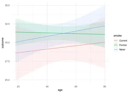
In other words, for my cplot() line at the end of the code block, how can I get the plot to show the predicted values for increments of 'age' by the levels of 'smoke'?
Any help is always much appreciated!
library(margins)
set.seed(42)
n <- 1000
patient <- data.frame(id=1:n,
                      treat = factor(sample(c('Treat','Control'), n, rep=TRUE, prob=c(.5, .5))),
                      age=sample(18:80, n, replace=TRUE),
                      sex = factor(sample(c('Male','Female'), n, rep=TRUE, prob=c(.6, .4))),
                      smoke=factor(sample(c("Never", 'Former', 'Current'), n, rep=TRUE, prob=c(.25, .6, .15))),
                      outcome=runif(n, min=16, max=45))

model <- lm(outcome ~ treat*age + smoke, data = patient)
cplot(model, x="age", by="smoke", overlay=TRUE)