1

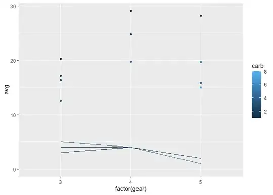
I have a ggplot2 plot such as the following:

mtcars %>%
  group_by(gear, carb) %>%
  summarise(
    avg = mean(mpg),
    n = n(),
    gear = gear,
    carb = carb
  ) %>%
  ggplot(aes(
    x = factor(gear),
    y = avg,
    color = carb,
    group = carb
  )) +
  geom_point(position = "dodge")

Which renders this:

enter image description here

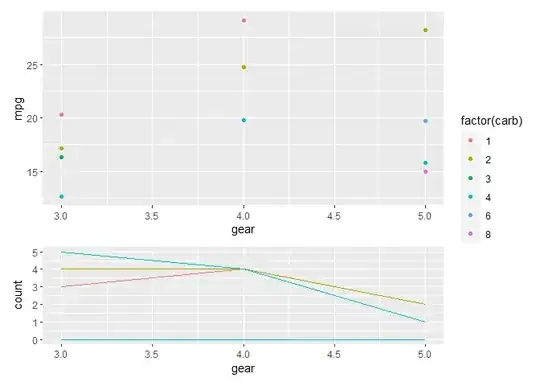
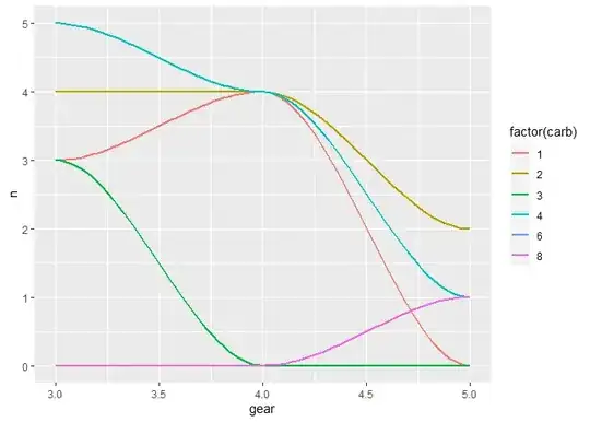
I now need to plot the density distribution of the three categories of the x axis (gear) using the value of n for the number of observations. I want this smooth distribution plot for n of each gear in each carb color.

I attempt to use the following:

mtcars %>% 
  group_by(gear,carb) %>%
  summarise(
    avg = mean(mpg), 
    n = n(),
    gear=gear,
    carb=carb
    ) %>% 
  ggplot(aes(
    x=factor(gear),
    y=avg,
    color = carb,
    group=carb)) +
  geom_point(position = "dodge") +
  geom_density(aes(x=factor(gear),y=n,color=carb))

But I receive the error:

Problem while setting up geom.
ℹ Error occurred in the 2nd layer.
Caused by error in `compute_geom_1()`:
! `geom_density()` requires the following missing aesthetics: x
Backtrace:
  1. base (local) `<fn>`(x)
  2. ggplot2:::print.ggplot(x)
  4. ggplot2:::ggplot_build.ggplot(x)
  5. ggplot2:::by_layer(...)
 12. ggplot2 (local) f(l = layers[[i]], d = data[[i]])
 13. l$compute_geom_1(d)
 14. ggplot2 (local) compute_geom_1(..., self = self)

I have tried placing the variables inside aes() and outside, but nothing has allowed me to generate this plot. How can I generate distribution plots and add them to the larger other ggplot. I recognize I will have to rescale the value of n in order to fit the space below the points in the plot, but how can I set up the plot to accept the n as the variable of the count in the geom_density?

Andy Baxter
  • 5,833
  • 1
  • 8
  • 22
flâneur
  • 633
  • 2
  • 8

1 Answers1

3

The simple solution is to use stat = "identity" in the geom_density call.:

library(tidyverse)

mtcars %>% 
  group_by(gear,carb) %>%
  summarise(
    avg = mean(mpg), 
    n = n()
  ) %>% 
  ggplot(aes(
    x=factor(gear),
    y=avg,
    color = carb,
    group=carb)) +
  geom_point(position = "dodge") +
  geom_density(aes(x=factor(gear),y=n,color=carb),
               stat = "identity")

A slightly more complex solution (in case that's what you're looking for) is to create two graphs with two separate y axes and place them one on top of the other using the patchwork package. For example (with some simplified code):

library(patchwork)

g1 <- mtcars |> 
  ggplot(aes(gear, mpg, colour = factor(carb))) +
  stat_summary(geom = "point", fun = mean)

g2 <- mtcars |> 
  ggplot(aes(gear, colour = factor(carb))) +
  stat_count(geom = "density",
             aes(y = after_stat(count)),
             position = "identity") +
  theme(legend.position = "none")

g1 / g2  + plot_layout(heights = 2:1, guides = "collect")

Edit - using a smooth density

You can use geom_density on its own (with y = after_stat(count) still to get n's), though this is a density function and so it 'estimates' each binned category taking into account the upper and lower categories too (so never quite passes through a simple counted integer):

library(tidyverse)
library(patchwork)

g1 <- mtcars |> 
  ggplot(aes(factor(gear), mpg, colour = factor(carb))) +
  stat_summary(geom = "point", fun = mean)

g2 <- mtcars |> 
  ggplot(aes(gear, colour = factor(carb))) +
  geom_density(aes(y = after_stat(count))) +
  theme(legend.position = "none")

g1 / g2  + plot_layout(heights = 2:1, guides = "collect")

Or perhaps a stat_smooth will work nicely here (with some tinkering to get 0s in data):

library(tidyverse)

counts <- mtcars %>% 
  group_by(gear,carb) %>%
  summarise(
    avg = mean(mpg), 
    n = n()
  ) 
#> `summarise()` has grouped output by 'gear'. You can override using the
#> `.groups` argument.


counts |> 
  ungroup() |> 
  expand(gear, carb) |> 
  left_join(counts) |> 
  replace_na(list(n = 0)) |> 
  ggplot(aes(gear, colour = factor(carb))) +
  stat_smooth(aes(y = n), method = "loess", se = FALSE) 

Andy Baxter
  • 5,833
  • 1
  • 8
  • 22
  • Thank you, your solutions are great. One question: is there any way to smooth the curve so that it looks more like a distribution plot? I know the factor has few levels and low variation, but is it possible to smooth it like a common frequency distribution? – flâneur Jul 29 '23 at 00:06
  • 1
    Have put another set of code as an experimental potential way of getting 'smoothed', although the 'density' smoothing mechanism gives some odd results in a binned discrete scale! But perhaps [this](https://stackoverflow.com/a/35206832/10744082) might be a better way of getting smoothed lines? – Andy Baxter Jul 29 '23 at 00:53
  • 1
    These are both great! Thanks for coming up with these. Truly clever appraoch! – flâneur Jul 29 '23 at 03:13