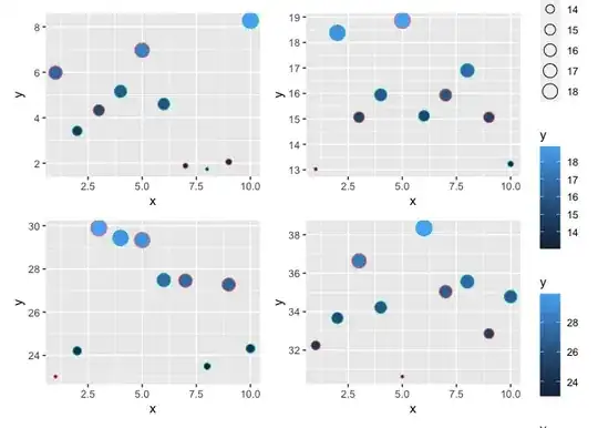
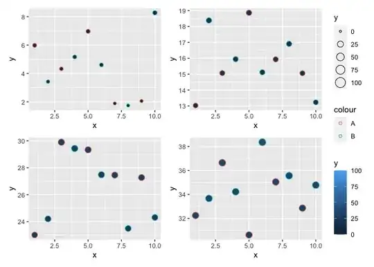
I have 4 sets of data that I am plotting as a scatter plot using ggplot2 in R. Each plot contains an array of points that are both colored and sized according to different variables in the dataset. Each of the 4 sets of data that I would like to plot contain the same variables, but different maximum values.
I would like to plot my data in 4 separate plots arranged into one figure using Patchwork. With patchwork, I would like to use the command plot_layout(guides = 'collect')to collect all 4 color and size figure legends into one legend on the side.
Currently this is not possible, because each plot has a different maximum scale. How can I make this possible?
My first thought is to manually change the upper bound of the size value and color value so that they are the same across each plot? (I am aware that a solution such as this would also change the color and size of the points within each plot to scale relative to the new maximum outside the bounds of the dataset) Is it possible to manually change size and color scales while still having the map to the specific variables of interest?
ggplot(Enrichment_Analysis, aes(x = log2(enrichmentRatio), y = -log10(FDR))) +
    geom_point(aes(size = size, color = overlap))+
    scale_x_continuous(name = expression("log"[2]*"(Enrichment Ratio)"))+
    scale_y_continuous(name = expression("-log"[10]*"(FDR)"))
For each of my 4 data sets the maximum value for size ranges between 300 and 400, and the maximum value for overlap ranges between 30 and 60. I would like to set the size scale for every plot to be 0-400, and the color scale for every plot to be 0-60