4

I want to achieve this same effect as this sample picture where there is 2 layers of the same color tone behind the main image:

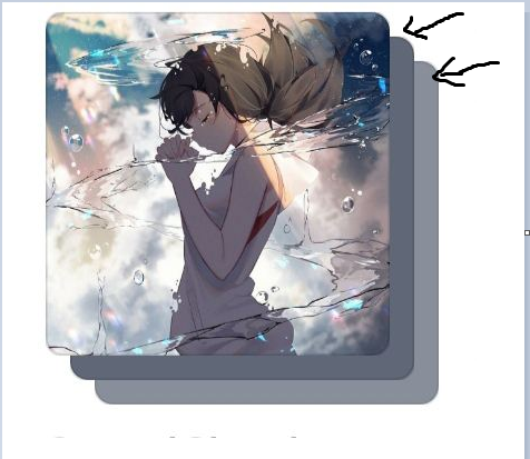
Here is what I have tried so far:

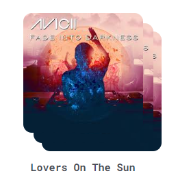
My attempt: I duplicated the main image 3 times and stacked them on top of each other. However, I still have no idea how to style 2nd and 3rd image layer to achieve the same effect as the sample picture. I have tried blurred and frosted glass effects but it just look hideous.

<div v-for="song in top4Songs" :key="song.id" class="song-container">
        <div id="parent">
          <div>               
              <div class="song-image-container">
                  <img :src="song.coverUrl">
              </div>
            
            <div class="song-info">
                <div class="song-image-container2">
                <img :src="song.coverUrl">
                <h2>{{song.title}}</h2>
            </div>           
              
            </div>
            <div class="song-image-container3">
              <img :src="song.coverUrl">
              
            </div>
          </div>
        </div>

CSS

/* second layer */
.song-image-container 
{
  position:absolute;
  top: 12px;
  left: 12px;
  z-index: 1;
}

/* first layer */
.song-image-container2 {
  position: relative;
  top: 0;
  left: 0;
  z-index: 2;
  /*  */ 
}
/*third layer*/
.song-image-container3 
{
  position: absolute; 
  top: 22px;
  left: 22px;
  z-index: 0;  
}

Any suggestions to achieve this specific effect would be really appreciated.

Simplylmk
  • 267
  • 6

2 Answers2

2

create an overlay that covers the top of each image Ex:

<div class="song-image-container">
     <img width="300" :src="song.coverURL">
     <div class="song-image-overlay"></div>
 </div>

Give the overlay a low opacity gray and a back-drop blur Ex:

.song-image-overlay
{
    width: 100%;
    height: 100%;
    position: absolute;
    top: 12px;
    left: 12px;
    z-index: 1;
    background-color: rgba(0, 0, 0, 0.3);
    backdrop-filter: blur(20px);
}

adjust the color, opacity, and blur to your liking between the two images behind your original image.

If this solution doesn't fit your needs, check this link: Get average color of image via Javascript

  • 1
    thank you for your suggestion. However, the low opacity gray does not really fit the image well so I think the function you provided to get the average color via JS is essential for this effect. – Simplylmk Aug 05 '23 at 05:46
  • I think there is a better solution that is just CSS based that won't require multiple images and repeated elements. You could use a single element with `::before` and `::after` pseudo-elements to create this effect. – davidleininger Aug 05 '23 at 07:34
1

You can achieve this with one div and the image. You just need to add a ::before and ::after to the div and style them appropriately. The opacity styling might not be right here for the ::before and ::after, but you should be able to land the plane from here.

.song-image-container {
  border-radius: 20px;
  height: 360px;
  position: relative;
  width: 360px;
}

.song-image-container img {
  border-radius: 20px;
  height: 100%;
  object-fit: cover;
  width: 100%;
}

.song-image-container::before, 
.song-image-container::after {
  background-image: url(https://images.unsplash.com/photo-1495615080073-6b89c9839ce0?ixlib=rb-4.0.3&ixid=M3wxMjA3fDB8MHxzZWFyY2h8Mnx8c3F1YXJlfGVufDB8fDB8fHww&auto=format&fit=crop&w=800&q=60);
  background-size: cover;
  border-radius: 20px;
  content: '';
  height: 100%;
  left: 12px;
  opacity: 0.5;
  position: absolute;
  top: 12px;
  z-index: -1;
  width: 100%;
}
.song-image-container::after {
  border-radius: 20px;
  content: '';
  left: 24px;
  top: 24px;
  z-index: -2;
}

body {
    display: grid;
    height: 100vh;
    margin: 0;
    place-items: center;
}
<div class="song-image-container">
  <img src="https://images.unsplash.com/photo-1495615080073-6b89c9839ce0?ixlib=rb-4.0.3&ixid=M3wxMjA3fDB8MHxzZWFyY2h8Mnx8c3F1YXJlfGVufDB8fDB8fHww&auto=format&fit=crop&w=800&q=60" alt="cover art for...">
</div>

If you needed to supply the image for the background via the markup, you could just add style="background-image: url(...imageurl...);". This would give you the same effect and you wouldn't need to adjust the CSS for each element.

davidleininger
  • 909
  • 4
  • 11
  • 1
    You are correct, this solution achieve the desired effect with less computation resources. Thank you for your suggestion. – Simplylmk Aug 05 '23 at 10:20