I used plot_ly to visualize my data as sunburst as done before with Adobe Illustrator, however failed to colour the segments likewise.
Here is the code (colour codes are random):
library(plotly)
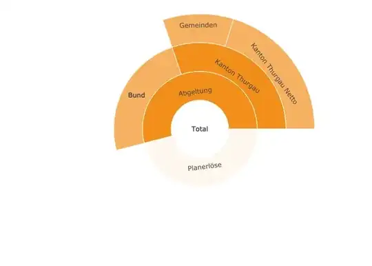
tab <- data.frame(
labels = c("Total", "Planerlöse", "Abgeltung", "Bund", "Kanton Thurgau", "Kanton Thurgau Netto", "Gemeinden" ),
parents = c("", "Total", "Total", "Abgeltung", "Abgeltung", "Kanton Thurgau", "Kanton Thurgau"),
values = c(100, 46,54, 23.76, 30.24, 20.26, 9.97),
colors=c("#f28f1c", "#fef4e8", "#2771b0", "#e9f1f7",
"#b5b5b5", "#787878", "#333333"),
type = 'sunburst',
branchvalues = 'total'
)
fig <- plot_ly(tab, labels = ~labels, parents = ~parents,
values = ~values, colors=colors, type = 'sunburst', branchvalues = 'total'
)
fig
And here the original plot I'd like to replicate:

Thanks for any advise and help!