A similar question is asked here. Basically, I have three columns (A, B, C) and they represent measurements A(B) and C(B). Say, B is time, A temperature and C any other physical quantity that depends on A.
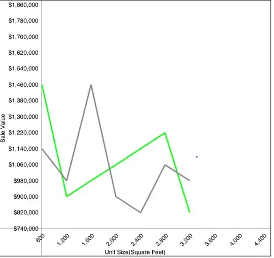
I would like to plot on x1 temperature, on x2 time and on y1 C as it evolves with time. The mentioned solution works for a few datapoints but is not usable for a larger dataset because it essentially modifies the labels and I lose control over the labels. I would like the plot to look like:
 with temperature on the
 x1 axis in a nice form that is something like:
 Obviously they will not be initially equidistant because the relationship between temperature and time is:

Any idea how to approach this? The test data is here https://pastebin.com/CqAHjBJe

