0

I built a barplot in R where each bar represents the cummulative rainfall for a given month in a year. However, the bars themselves don't have labels, and my boss is really emphasizing the fact that they should. Whenveer I try to add labels it alwyas adds way more than I need to. Any advice?

Here's the code I'm using right now:

code and image of plot

stefan
  • 90,330
  • 6
  • 25
  • 51
  • Welcome to SO! It would be easier to help you if you provide [a minimal reproducible example](https://stackoverflow.com/questions/5963269/how-to-make-a-great-r-reproducible-example). Please do not post an image of code/data/errors [for these reasons](https://meta.stackoverflow.com/questions/285551/why-not-upload-images-of-code-errors-when-asking-a-question/285557#285557). Just include the code, console output, or data (e.g. `dput(head(x))` or `data.frame(...)`) directly. – stefan Aug 09 '23 at 20:49

2 Answers2

0

It looks like you might need to summarize the data first, your plot is combining al the values for the month, so when you label it it labels each terra::plot(rnaturalearth::ne_countries(returnclass = "sf")["geometry"])ortino o fthe bar. If you use prism2018 <-prism2018 %>$ group_by(Month)%>%summarise(ppt=sum(ppt)) then you shoudl get one value to label per month.

BEVAN
  • 426
  • 2
  • 12
0

The issue is that you did not aggregate your data by month in geom_text as you did for your bars, i.e. you have to use a stat_summary with geom="text" for your labels. Otherwise you end up with multiple labels per month.

However, IMHO an easier approach would be to aggregate your dataframe outside of ggplot().

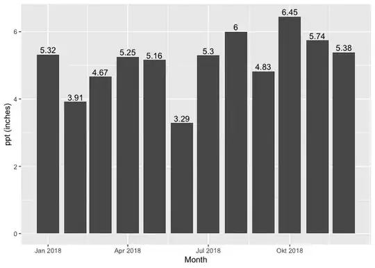
Using some fake random example data:

library(ggplot2)
library(dplyr, warn=FALSE)

set.seed(123)

prism2018 <- data.frame(
  Month = rep(
    seq.Date(as.Date("2018-01-01"), as.Date("2018-12-01"), by = "month"),
    10
  ),
  `ppt (inches)` = runif(120),
  check.names = FALSE
)

prism2018 |>
  group_by(Month) |>
  summarise(`ppt (inches)` = sum(`ppt (inches)`, na.rm = TRUE)) |>
  ggplot(aes(Month, `ppt (inches)`)) +
  geom_col() +
  geom_text(
    aes(label = prettyNum(`ppt (inches)`, digits = 3)),
    vjust = 0, position = position_nudge(y = .05)
  )

stefan
  • 90,330
  • 6
  • 25
  • 51
  • How could I use my own data instead of random data if I aggregated outside of ggplot? – Noah Measells Aug 09 '23 at 22:02
  • From the provided information I tried to mimic your data as close as possible. So in principle the code should work on the data you passed to `ggplot()`. If run into any issues then I would suggest to include a snippet of your real data. To that end have a look at the [link]((https://stackoverflow.com/questions/5963269/how-to-make-a-great-r-reproducible-example)) I already provided in my comment. – stefan Aug 09 '23 at 22:09