1

I am trying to use help_secondary of ggh4x with geom_col like

library(tidyverse)
library(ggh4x)
library(scales) 

# Run the secondary axis helper
sec <- help_secondary(df, primary = c(Tmax, Tmin, RH), 
                      secondary = Rainfall)

ggplot(df, aes(x = Date)) +
  geom_col(aes(y = sec$proj(Rainfall)), colour = "blue") +
  geom_line(aes(y = Tmax), colour = "red") +
  geom_line(aes(y = Tmin), colour = "green") +
  geom_line(aes(y = RH), colour = "black") +
  scale_y_continuous(sec.axis = sec) +
  ylab("Max and Min temperature, RH")

enter image description here

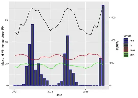
As you can see from the plot, the secondary y-axis starts at -500. The 0 rainfall value is shown as -500 which ideally should be left out in the barplot.

Another thing, how can I have the legend?

Data

df = structure(list(Date = structure(c(18628, 18659, 18687, 18718, 
18748, 18779, 18809, 18840, 18871, 18901, 18932, 18962, 18993, 
19024, 19052, 19083, 19113, 19144, 19174, 19205, 19236, 19266, 
19297, 19327, 19358, 19389, 19417, 19448, 19478, 19509, 19539
), class = "Date"), Tmax = c(34.3774193548387, 34.8428571428571, 
35.7387096774194, 35.44, 34.1161290322581, 30.9333333333333, 
29.2193548387097, 29.9225806451613, 29.78, 32.4096774193548, 
32.97, 32.4129032258065, 32.2225806451613, 33.9428571428571, 
35.6, 35.2133333333333, 33.658064516129, 31.0566666666667, 29.4516129032258, 
29.6548387096774, 30.2066666666667, 32.4870967741935, 34.2566666666667, 
34.558064516129, 33.8161290322581, 36.3821428571429, 35.9483870967742, 
35.2266666666667, 35.9709677419355, 33.04, 28.6322580645161), 
    Tmin = c(21.5483870967742, 20.4714285714286, 24.1483870967742, 
    24.41, 25.2354838709677, 23.3966666666667, 23.2129032258064, 
    23.7935483870968, 24.6633333333333, 24.0225806451613, 23.3466666666667, 
    20.8516129032258, 19.3806451612903, 19.5, 23.558064516129, 
    24.9533333333333, 25.8741935483871, 23.92, 23.3709677419355, 
    22.8677419354839, 22.5433333333333, 21.7161290322581, 21.2133333333333, 
    21.0258064516129, 19.3612903225807, 20.6142857142857, 21.641935483871, 
    24.5343333333333, 26.0903225806452, 25.4443333333333, 23.7645161290323
    ), RH = c(62.1129032258064, 57.5892857142858, 70.4193548387097, 
    68.25, 74.8387096774194, 85.3333333333333, 88.5161290322581, 
    85.8870967741936, 86.4333333333334, 79.1129032258064, 74.6, 
    69.1935483870968, 62.6290322580645, 65.5892857142858, 66.3548387096774, 
    70.7166666666667, 75.7741935483871, 85.6833333333334, 88.3387096774194, 
    86.8064516129033, 84.1166666666667, 74.3870967741936, 64.4, 
    63.7903225806452, 60.1290322580645, 58.7321428571429, 58.4677419354839, 
    69.3, 65.9193548387097, 79.45, 91.6451612903226), Rainfall = c(9.1, 
    2, 0, 27, 422.6, 903.9, 1345.9, 343.9, 481, 239.9, 166.4, 
    105.9, 0, 0, 0.3, 51.2, 99.6, 700.6, 1098.3, 347.6, 276.8, 
    71.3, 0, 2.2, 0, 0, 0, 0, 0, 597, 1763.4)), row.names = c(NA, 
31L), class = "data.frame")
UseR10085
  • 7,120
  • 3
  • 24
  • 54

2 Answers2

3

The issue is that by default help_secondary will rescale the based on the range of the variables mapped on the primary and the secondary axis, i.e. the primary minimum is mapped on the secondary minimum.

However, as you are using a geom_col the range or the limits of the y scale are extended to include 0. This is not and can't be accounted for by help_secondary.

For your case, where the minimum of the secondary variable is zero, you could fix that by switching to method="max" in help_secondary.

To get a legend, you have to map on aesthetics, i.e. move color= inside aes() and set your colors via scale_color_manual.

library(ggplot2)
library(ggh4x)
library(scales)

sec <- help_secondary(df,
  primary = c(Tmax, Tmin, RH),
  secondary = Rainfall,
  method = "max"
)

ggplot(df, aes(x = Date)) +
  geom_col(aes(y = sec$proj(Rainfall), color = "rain")) +
  geom_line(aes(y = Tmax, color = "tmax")) +
  geom_line(aes(y = Tmin, color = "tmin")) +
  geom_line(aes(y = RH, color = "rh")) +
  scale_color_manual(
    values = c(
      tmin = "green", tmax = "red",
      rh = "black", rain = "blue"
    )
  ) +
  scale_y_continuous(sec.axis = sec) +
  ylab("Max and Min temperature, RH")

EDIT To fix the legend, map on the fill aes to get filled bars, apply the color scale both on the color and fill aes by adding aesthetics = c("fill", "color"), set the same name for both scales (so that both legends get merged) and tweak the legend via the override.aes argument of guide_legend, i.e. remove the legend fill for the lines:

ggplot(df, aes(x = Date)) +
  geom_col(aes(y = sec$proj(Rainfall), fill = "rain")) +
  geom_line(aes(y = Tmax, color = "tmax")) +
  geom_line(aes(y = Tmin, color = "tmin")) +
  geom_line(aes(y = RH, color = "rh")) +
  scale_color_manual(
    values = c(
      tmin = "green", tmax = "red",
      rh = "black", rain = "blue"
    ),
    aesthetics = c("fill", "color")
  ) +
  scale_y_continuous(sec.axis = sec) +
  labs(y = "Max and Min temperature, RH", color = NULL, fill = NULL) +
  guides(color = guide_legend(
    override.aes = list(fill = c("blue", rep("transparent", 3)))
  ))

enter image description here

stefan
  • 90,330
  • 6
  • 25
  • 51
  • 1
    do you know what is happening with that legend? It looks cool, but it's quite odd! – Mark Aug 11 '23 at 07:01
  • How can we improve the legend like only line for `geom_line` and box for `geom_col`? Also the fill color for `geom_col`. – UseR10085 Aug 11 '23 at 07:01
  • 1
    @Mark That's how a combo of a `key_glyph="rect"` and a `key_glyph="line"` looks, i.e. the geom_col will give us a rectangle with a colored outline, and the geom_line will add the horizontal lines inside. – stefan Aug 11 '23 at 07:04
  • See my edit. Always a bit fiddling to mix legends with different geoms and aesthetics. – stefan Aug 11 '23 at 07:12
  • Wow! Great answer. Another thing, in my question you can see the plot axis is not correctly written i.e. RH is not complete. Why this happens can you tell me? – UseR10085 Aug 11 '23 at 07:15
  • Hm. Actually No. This looks as if the y axis title is clipped off. But I have no clue why this happens and can't reproduce this behavior. And it's the first time I encounter such an issue. Normally axis title only gets clipped off when extending obver the plot boundaries. – stefan Aug 11 '23 at 07:21
2

Here's one way:

ggplot(df, aes(x = Date)) +
  geom_col(aes(y = Rainfall * 0.1), color = "blue") +
  geom_line(aes(y = Tmax), color = "red") +
  geom_line(aes(y = Tmin), color = "green") +
  geom_line(aes(y = RH), color = "black") +
  scale_y_continuous(
    name = "Max and Min temperature, RH",
    sec.axis = sec_axis(~ . / 0.1, name = "Rainfall"))

Update: I had a play around with help_secondary. It has a bunch of methods of projecting the secondary axis data:

"range" Causes the ranges of primary and secondary data to overlap completely.

What appears to be the default

"max" Causes the maxima of primary and secondary data to coincide.

Gets the right answer

"fit" Uses the coefficients of lm(primary ~ secondary) to make the axes fit.

Throws an error in this case

"ccf" Uses the lag at which maximum cross-correlation occurs to then align the data by truncation. The aligned data is then passed to the "fit" method.

Also throws an error

"sortfit" Sorts the both primary and secondary independently before passing these on to the "fit" method.

Throws an error too.

So changing sec to be sec <- help_secondary(df, primary = c(Tmax, Tmin, RH), secondary = Rainfall, method = "max"), then the code should work as expected. See the documentation for more information.

Mark
  • 7,785
  • 2
  • 14
  • 34