3
library(ggplot2)
library(ggpubr)
data('iris')
ggplot(data = iris, aes(x = Petal.Length, y = Sepal.Length, color = Species))+
  geom_point()+
  geom_smooth(method = 'lm')+
  facet_wrap('Species', scales = 'free')+
  stat_cor(aes(color = NULL),label.x.npc = 'left', label.y.npc = 'top', size = 4, family = 'serif', show.legend = F, p.accuracy = 0.001)

Notice how this output displays the readout for the thrid plot below the other 2 plots. It seems to read the top datapoint as 'top', instead of using the entire plot window. Is there any way to fix this issue? I can't even seem to manually specify locations for each facet

Pedro J. Aphalo
  • 5,796
  • 1
  • 22
  • 23
Bryce Cook
  • 45
  • 4
  • Looks like a bug to me and there is already an open issue on Github: https://github.com/kassambara/ggpubr/issues/248. – stefan Aug 15 '23 at 19:54

2 Answers2

1

An option to manually change the y-coordinates of the stats, is using ggplot_build which makes it possible to manually modify the layer. This contains the y-coordinates of the labels. Here is some reproducible code:

library(ggplot2)
library(ggpubr)
data('iris')
p <- ggplot(data = iris, aes(x = Petal.Length, y = Sepal.Length, color = Species))+
  geom_point()+
  geom_smooth(method = 'lm')+
  facet_wrap('Species', scales = 'free')+
  stat_cor(aes(color = NULL),
           size = 4, family = 'serif', show.legend = F, p.accuracy = 0.001)
p
#> `geom_smooth()` using formula = 'y ~ x'


q <- ggplot_build(p)
#> `geom_smooth()` using formula = 'y ~ x'
# Change coordinates
q$data[[3]]$y = c(5.8, 7, 8.2)

# Turn back
q <- ggplot_gtable(q)

# Plot again
plot(q)

Created on 2023-08-16 with reprex v2.0.2

As you can see the labels are now on the same height.

Quinten
  • 35,235
  • 5
  • 20
  • 53
1

You can use package 'ggpmisc'. The functions in 'ggpubr' were based some years' back on those then existing in 'ggpmisc'. Since then many bugs were fixed and features added in 'ggpmisc' and the packages diverged. As the author of 'ggpmisc' I prefer it...

library(ggplot2)
library(ggpmisc)
#> Loading required package: ggpp
#> 
#> Attaching package: 'ggpp'
#> The following object is masked from 'package:ggplot2':
#> 
#>     annotate
#> Registered S3 method overwritten by 'ggpmisc':
#>   method                  from   
#>   as.character.polynomial polynom
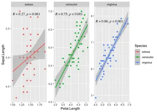
ggplot(data = iris, 
       aes(x = Petal.Length, y = Sepal.Length, color = Species))+
  geom_point()+
  geom_smooth(method = 'lm')+
  facet_wrap('Species', scales = 'free') +
  stat_correlation(use_label(c("R", "p")), 
                   colour = "black",
                   p.digits = 3, 
                   size = 3.5) +
  scale_y_continuous(expand = expansion(mult = c(0.05, 0.12)))
#> `geom_smooth()` using formula = 'y ~ x'

Created on 2023-08-17 with reprex v2.0.2

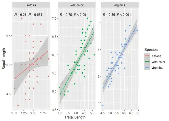
When there is a grouping, assuming that there is a single panel, we need to displace the labels for each group vertically so that they do not overlap. In stat_correlation() vstep controls how big this displacement is, so setting it to zero solves this problem, if we want to keep the colour mapping for the labels (e.g., replace colour = "black" with vstep = 0). I expanded the y scale so that the labels do not overlap with the observations. I forgot to add family = 'serif' and I put a slightly smaller size. Of course, this can changed to match your example.

stat_correlation() can do a few more tricks, such computing the confidence interval for R, rho or tau, or use r instead of R, and p instead of P if preferred. There are examples in the documentation of 'ggpmisc' and at https://www.r4photobiology.info/galleries/plot-equations.html#linear-correlation

Pedro J. Aphalo
  • 5,796
  • 1
  • 22
  • 23