2

I am doing a plot for a conference and would like to add more significance bars. This is my code:

bxp_stress <-
  subjstress %>%
  ggboxplot( x = "timetask",
             y = "Stress",
             fill = "group",
             xlab = "timepoint",
             ylab = "subjective rating [VAS]",
             title = "Subjective stress"
  )+
  scale_fill_manual(values = my_palette) +
  scale_x_discrete(labels = c("pre-ctrl", "post-ctrl", "pre-stress", "post-stress")) +
  geom_signif(comparisons = list(c("MAST_pre", "MAST_post"), c("plac_post", "MAST_post")),
                                 annotations = "***",
              step_increase = 0.05,
              map_signif_level = TRUE,
              vjust = 0.4, 
              tip_length = 0)

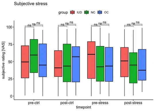
And how my plot looks:

boxplot with parts of the significance bars

Now I would like to add significance bars for "post-stress between the three groups (that are defined within the "fill" argument of ggboxplot). How can I do this, as signicance is only found between 2 of the groups (NC vs. IUD) and I don't want an overall significance, as I am getting using this code: bxp_stress + stat_compare_means(aes(group = group), label = "p.signif")

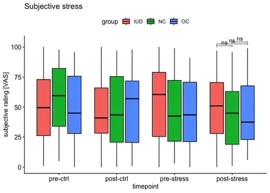
Edit: This is what I am imagining:

Boxplot with drawn stat bracket

Edit2: useable dataframe

subjstress <- tibble(
  group = rep(c("NC", "IUD", "OC"), each = 232),
  timetask = rep(c("plac_pre", "plac_post", "MAST_pre", "MAST_post"), times = 174),
  Stress = sample(0:100, 696, replace = TRUE)
)
Zoe
  • 23
  • 4
  • So what do you want the final output to be? Can you draw on top of your plot exactly what you want to add to make it more clear? – MrFlick Aug 17 '23 at 14:24
  • I edited my post to add the drawn idea of what I want. – Zoe Aug 17 '23 at 14:39
  • That's helpful, thanks. Also it's helpful to include a simple [reproducible example](https://stackoverflow.com/questions/5963269/how-to-make-a-great-r-reproducible-example) with sample input that can be used to test and verify possible solutions. It doesn't have to be your real data, just something to test with. – MrFlick Aug 17 '23 at 14:44
  • Added a dataframe to try out, hope that helps! – Zoe Aug 17 '23 at 15:05

1 Answers1

1

You could first plot the significance by creating a dataframe using add_significance with a t-test. After that you plot them and filter only the group you want by modifying the plotted layer using ggplot_build like this:

library(ggpubr)
library(dplyr)
library(rstatix)

stat.test <- subjstress %>%
  group_by(timetask) %>%
  t_test(Stress ~ group) %>%
  adjust_pvalue() %>%
  add_significance("p.adj") %>%
  add_xy_position(x = "timetask") 
stat.test
#> # A tibble: 12 × 16
#>    timetask  .y.    group1 group2    n1    n2 statistic    df     p p.adj
#>    <chr>     <chr>  <chr>  <chr>  <int> <int>     <dbl> <dbl> <dbl> <dbl>
#>  1 MAST_post Stress IUD    NC        58    58    0.998   113. 0.32      1
#>  2 MAST_post Stress IUD    OC        58    58    0.840   113. 0.402     1
#>  3 MAST_post Stress NC     OC        58    58   -0.159   114. 0.874     1
#>  4 MAST_pre  Stress IUD    NC        58    58    0.851   114. 0.396     1
#>  5 MAST_pre  Stress IUD    OC        58    58    1.51    113. 0.134     1
#>  6 MAST_pre  Stress NC     OC        58    58    0.649   114. 0.518     1
#>  7 plac_post Stress IUD    NC        58    58   -0.142   113. 0.888     1
#>  8 plac_post Stress IUD    OC        58    58   -0.581   114. 0.562     1
#>  9 plac_post Stress NC     OC        58    58   -0.415   114. 0.679     1
#> 10 plac_pre  Stress IUD    NC        58    58   -1.09    114. 0.279     1
#> 11 plac_pre  Stress IUD    OC        58    58    0.0732  114. 0.942     1
#> 12 plac_pre  Stress NC     OC        58    58    1.17    114. 0.246     1
#> # ℹ 6 more variables: p.adj.signif <chr>, y.position <dbl>,
#> #   groups <named list>, x <dbl>, xmin <dbl>, xmax <dbl>

p <- subjstress %>%
  ggboxplot( x = "timetask",
             y = "Stress",
             fill = "group",
             xlab = "timepoint",
             ylab = "subjective rating [VAS]",
             title = "Subjective stress"
  ) +
  stat_pvalue_manual(
    stat.test,  label = "p.adj.signif", tip.length = 0.01
  ) + 
  scale_x_discrete(labels = c("pre-ctrl", "post-ctrl", "pre-stress", "post-stress")) 
p


q <- ggplot_build(p)

q$data[[2]] <- q$data[[2]] %>%
  filter(group %in% c(10:12))

q <- ggplot_gtable(q)

plot(q)

Created on 2023-08-18 with reprex v2.0.2

Quinten
  • 35,235
  • 5
  • 20
  • 53