In my data I counted the number of arguments in written texts in two different groups and I want to compare them with a barplot. The groups do not have the same size, so comparison based upon absolute counts doesn't make sense, I need the frequencies of the number of arguments in each group.
Here is some exemplary data:
df <- data.frame(c("A","A","A","B","B","B","B","B","B"),c(1,1,2,0,1,1,1,2,2))
colnames(df) = c("group","count")
When I use
ggplot(df,aes(fill=group,x=count)) + geom_bar(position="dodge")
I got this barplot with the absolute counts, which is not what I want:

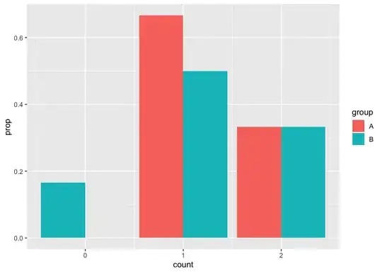
Instead, I want a plot that looks like this:
 I created this plot with
df2 <- data.frame(c("A","A","A","B","B","B"),c(0,1,2,0,1,2),c(0,0.67,0.33,0.167,0.5,0.33))
colnames(df2) = c("group","count","relFreq")
ggplot(df2,aes(fill=group,x=count,y=relFreq)) + geom_bar(position="dodge",stat="identity")
In this minimal example I can calculate the relative frequencies pretty easily. I could also do this with my data, but this would be to laborious in my opinion. Is there any way I can do this with ggplot? I tried this solution Display frequency instead of count with geom_bar() in ggplot but this gives me the frequencies of all arguments and the height of the bars doesn't change. I also tried this Plot relative frequencies with dodged bar plots in ggplot2, which is much closer to what I want, but this is a continuous x-axis, which I don't want.