0

I have gone through and followed this guide on how to make stacked bar plots with percentages: Plot stacked bar chart of likert variables in R

Issue 1: it has organised the bars alphabetically, not in the order I had them.

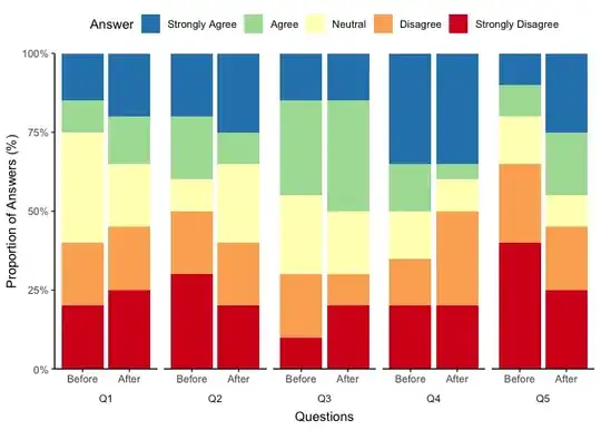
Issue 2: I have Before and After responses for each of 5 questions and I cannot figure out how to have "Before" "After" underneath each stacked plot, and then below that have "Question 1".

Issue 3: I also would like to have the groups of 2 stacked plots for each question, separated from the other questions a little bit.

My plot currently

Here is a snippet of my data:data

This is the code I have used:

graphdata3 <- graphdata3 %>% gather(key='Question_num', value='Answer', -Participant)

    graphdata3$Answer <- factor(graphdata3$Answer,
                           levels=5:1,
                           labels=c('Strongly Agree','Agree','Neutral','Disagree','Strongly Disagree'))

    ggplot(graphdata3, aes(x=Question_num)) +
      geom_bar(aes(fill=Answer), position="fill") +
      scale_fill_brewer(palette='Spectral', direction=-1) +
      scale_y_continuous(expand=expansion(0), labels=scales::percent_format()) +
      labs(    x='Questions', y='Proportion of Answers (%)') +
      theme_classic() +
      theme(legend.position='top')
lisa
  • 5
  • 2
  • To fix issue 3 (and 2) I would suggest to use facetting, i.e. split `Question_num` into the question part and the timepoint part aka `"Before"` and `"After"`. Then facet by Question and map the timepoints on x. Concerning your first issue, if you want a specific order then convert to a factor with the levels set according to your desired order. For more help please provide [a minimal reproducible example](https://stackoverflow.com/questions/5963269/how-to-make-a-great-r-reproducible-example) including a snippet of your data or some fake data (see e.g. the answer you referenced). – stefan Aug 29 '23 at 05:50
  • Apologies, I have attempted to add a snippet of my data before I did anything to it and it has added it as an image. The columns are Participant (1-194), Q1 Before, Q1 After, Q2 Before..... up to 5 questions for before and after. The responses in each column are between 1-5. I also noticed the first line of the code I used wasn't showing, so it is there now too. – lisa Aug 29 '23 at 06:18

2 Answers2

0

Because I did not have any data to work on, I am not too sure if the following code is working but please look at it:

ggplot(graphdata3, aes(x=factor(Question_num, levels = c('before', 'after')))  ## Re-order the questions +
  geom_bar(aes(fill=factor(Answer, levels = c('Strongly Agree','Agree','Neutral','Disagree','Strongly Disagree'))), ## Re-order the Answer levels
           position="fill") +
  scale_fill_brewer(palette='Spectral', direction=-1) +
  scale_y_continuous(expand=expansion(0), labels=scales::percent_format()) +
  labs(    x='Questions', y='Proportion of Answers (%)') +
  theme_classic() +
  theme(legend.position='top')

If you had a reproducible example I could maybe give you a better answer. For now, I just re-order the factors inside the plot.

Matt B
  • 306
  • 6
0

To fix issue 2 and 3 I would suggest to use facetting, i.e. split Question_num into the question id and the "timepoint" (aka "Before" and "After"). Then facet your chart by the question id and map the timepoint on x. Additionally, this requires some styling like putting the facet labels at the bottom, placing the on the outside of the axis and getting rid of the box drawn around each label.

Concerning your first issue, if you want a specific order then convert to a factor with the levels set according to your desired order. Guessing that you want to bars in the order "Before" and "After" make time a factor.

Using some fake random example data:

library(dplyr, warn.conflicts = FALSE)
library(tidyr)
library(ggplot2)

#### Create example data
set.seed(123)
graphdata3 <- data.frame(Participant = 1:20)

for (qid in 1:5) {
  for (time in c("Before", "After")) {
    graphdata3[[paste0("Q", qid, ".", time)]] <- sample(1:5, 20, replace = TRUE)
  }
}
####

graphdata3 <- graphdata3 |>
  tidyr::pivot_longer(-Participant, names_to = "Question_num", values_to = "Answer") |>
  tidyr::separate(Question_num, into = c("qid", "time"), sep = "\\.") |>
  mutate(time = factor(time, c("Before", "After")))

graphdata3$Answer <- factor(graphdata3$Answer,
  levels = 5:1,
  labels = c("Strongly Agree", "Agree", "Neutral", "Disagree", "Strongly Disagree")
)

ggplot(graphdata3, aes(x = time)) +
  geom_bar(aes(fill = Answer), position = "fill") +
  scale_fill_brewer(palette = "Spectral", direction = -1) +
  scale_y_continuous(expand = expansion(0), labels = scales::percent_format()) +
  facet_wrap(~qid, nrow = 1, strip.position = "bottom") +
  labs(x = "Questions", y = "Proportion of Answers (%)") +
  theme_classic() +
  theme(
    legend.position = "top",
    strip.placement = "outside",
    strip.background.x = element_blank()
  )

stefan
  • 90,330
  • 6
  • 25
  • 51
  • This is great - thank you - it's exactly how I want it to look. I have been playing around with it and I can't figure out what in that code I would need to replace to make the results use my actual data frame? Because it's coming up very differently to what I had before. I have a total of 11 columns (first one is just the participant number) and 194 rows. – lisa Aug 29 '23 at 07:11
  • Hi Lisa, I just made an edit to indicate the part which creates the fake example dataset. This part creates a dataset similar to the one in your picture, i.e. 11 columns where the first is the participant id. Replace this part with your real dataset. – stefan Aug 29 '23 at 07:17
  • 1
    Thank you Stefan - it's obvious now. I had left the loop in because I wasn't sure what I was doing. It works perfectly. Thank you so much! – lisa Aug 29 '23 at 07:31
  • Hi Stefan - do you know if there is a simple line of code I can add to change the names from Q1/Q2/Q3 etc to words for the graph? Or will I have to go back and change something at the start? – lisa Aug 30 '23 at 00:22
  • Sure. Create a vector of question labels, i.e. `labels <- c(Q1 = "Question 1", Q2 = "Question 2", ...)`. These labels can then be applied to your plot via the `labeller` argument of `facet_wrap`, i.e. `facet_wrap(..., labeller = labeller(qid = labels))`. – stefan Aug 30 '23 at 00:46
  • 1
    Thank you - I appreciate your help so much. – lisa Aug 30 '23 at 01:56