-1

I'm trying to give a certain DIV (which contains other elements) rounded edges,I need the other elements inside the DIV to be affected and get the same attribute.

I don't mean rounded corners which can be achieved with border-radius: Xpx; like this:
Text

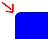
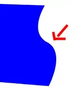
and I don't mean such a two-dimensional curve either,like this:
Text
I mean a 3-dimensional curve like this:
Text
A relatively simple simulation:
Text

postFix
  • 361
  • 2
  • 10
  • 2
    So a beveled gradient? Why are you simulating hardware features inside of software? – Mr. Polywhirl Aug 29 '23 at 18:12
  • @Mr.Polywhirl to be more beautiful the DIV needs to simulate the behavior of a certain hardware. (not a phone, it's just for the example, something with rounded edges) – postFix Aug 29 '23 at 18:16
  • Please see [ask]. You're expected to make an effort and show some code. Your title should be a clear, specific question. – isherwood Aug 29 '23 at 18:32

2 Answers2

2

You can use mask-image with linear-gradient:

body{ /* or any other wrapper */
  background: white;
}
.edge{
  justify-content: center;
  display: flex;
  align-items:center;
  font-size: 3rem;
  height: 800px;
  width: 400px;

  border-radius:30px;
  
  background: blue;
  --gradient: linear-gradient(90deg, rgba(0,0,0,0.25) 0%, rgba(0,0,0,1) 4%, rgba(0,0,0,1) 96%, rgba(0,0,0,0.25) 100%); /* you can modify this for your desire */
  -webkit-mask-image: var(--gradient); 
  mask-image: var(--gradient);
  
}
<div class="edge">
   <div>
      hello
   </div>
</div>

Related: Using CSS, can you apply a gradient mask to fade to the background over text?

ATP
  • 2,939
  • 4
  • 13
  • 34
-1

One common way to achieve this is by box-shadow. here is a example:

body {
  display: flex;
  justify-content: center;
  align-items: center;
  height: 100vh;
  margin: 0;
  background-color: #f0f0f0;
}

.curved-rectangle {
  width: 300px;
  height: 200px;
  background-color: #3498db;
  /* Your desired background color */
  position: relative;
  overflow: hidden;
  box-shadow: 5px 5px 5px inset white;
}
<!DOCTYPE html>
<html lang="en">

<head>
  <meta charset="UTF-8">
  <meta name="viewport" content="width=device-width, initial-scale=1.0">
  <link rel="stylesheet" href="styles.css">
  <title>Curved Rectangular Effect</title>
</head>

<body>
  <div class="curved-rectangle">
    <div class="content">
      you are the best
    </div>
  </div>
</body>

</html>
Stephen P
  • 14,422
  • 2
  • 43
  • 67
  • done but why downvote me ok i guess. – Shriyans Pranay Aug 29 '23 at 18:56
  • People (not me) downvote because, as the down vote arrow says, "This answer is not useful" - so one person thinks this is not a good answer... maybe(?) because a simple box-shadow can't really accomplish the desired result. A non-linear gradient would probably work best, but there's no such thing as, say, a bezier-gradient — only linear, radial, and conic. There are, however, some [techniques that will come closer](https://css-tricks.com/easing-linear-gradients/). – Stephen P Aug 29 '23 at 19:19