I am currently building a responsive website and need a menu to be fixed, thus not scrolling when the rest of the site scrolls. the issue is that it is a fluid layout and i want the "fixed positioned" menu item to be fixed relative to the containing parent element and not to browser window. is there anyway this can be done?
Asked
Active
Viewed 1.4e+01k times
11 Answers
22
This question came first on Google although an old one so I'm posting the working answer I found, which can be of use to someone else.
This requires 3 divs including the fixed div.
HTML
<div class="wrapper">
    <div class="parent">
        <div class="child"></div>
    </div>
</div>
CSS
.wrapper { position:relative; width:1280px; }
    .parent { position:absolute; }
        .child { position:fixed; width:960px; }
Leo
- 329
- 2
- 3
-
3This totally does work... but if any sort of transform is applied to the wrapper, it breaks the fixed nature of the child. :( – Alkanshel Mar 13 '15 at 20:25
-
Found a solution to the transform problem here -- http://stackoverflow.com/questions/2637058/positions-fixed-doesnt-work-when-using-webkit-transform -- but these two styles combined still foil it, even with the above technique. "-webkit-perspective: 1000; -webkit-transform-style: preserve-3d; " – Alkanshel Mar 16 '15 at 01:20
-
Works for me! This relative->absolute->fixed chain makes my day. Thank you! – lemoid Jul 29 '15 at 11:10
-
At least I had to add -webkit-transform: translate3d(0,0,0); to .child but as it was mention before there are several go-arounds – lemoid Jul 29 '15 at 11:17
-
1This should be picked as the correct answer. Because **it keeps fixed one div**, **scrollable the other one** and **keeps the correct aspect ratio and order in the layout**, completely **responsive**. Quite useful on **pixel perfect projects**. Kudos to Leo. – Luis Aug 09 '16 at 00:41
-
1I'm not sure if this worked in 2014, but it doesn't work in 2022. Any position you set on the fixed element is still relative to the window. – Glenn Maynard Nov 01 '22 at 15:02
13
Gavin,
The issue you are having is a misunderstanding of positioning. If you want it to be "fixed" relative to the parent, then you really want your #fixed to be position:absolute which will update its position relative to the parent.
This question fully describes positioning types and how to use them effectively.
In summary, your CSS should be
#wrap{
    position:relative;
}
#fixed{
    position:absolute;
    top:30px;
    left:40px;
}
Community
- 1
- 1
Fuzzical Logic
- 12,947
- 2
- 30
- 58
-
16I understand that but the problem is that i don't want the element to scroll. this is fine with a static page. but i am building a responsive page. so as the window gets smaller so the element needs to shift with the parent element. I tried using persentages for right positioning but it does not always stay in the correct area. so my thinking was to position it absolute within the parent element, but how do i get it not to scroll? – Gavin Wood Oct 24 '11 at 14:09
-
2Then, positioning must be fixed, but if it is fixed, it cannot be positioned according to the parent. If you want the parent to scroll, but not the child, then you cannot position relative to the parent. (i.e. `fixed` ignores the parent unless the parent is `fixed` too) If I understand correctly what you are asking, then a combination of Javascript and CSS is going to be your only recourse. – Fuzzical Logic Oct 24 '11 at 22:16
-
2Trying to find a solution to a problem isn't a "misunderstanding". – Glenn Maynard Nov 01 '22 at 14:59
7
An easy solution that doesn't involve resorting to JavaScript and will not break CSS transforms is to simply have a non-scrolling element, the same size as your scrolling element, absolute-positioned over it.
The basic HTML structure would be
CSS
<style>
    .parent-to-position-by {
        position: relative;
        top: 40px; /* just to show it's relative positioned */
    }
    .scrolling-contents {
        display: inline-block;
        width: 100%;
        height: 200px;
        line-height: 20px;
        white-space: nowrap;
        background-color: #CCC;
        overflow: scroll;
    }
    .fixed-elements {
        display: inline-block;
        position: absolute;
        top: 0;
        left: 0;
    }
    .fixed {
        position: absolute; /* effectively fixed */
        top: 20px;
        left: 20px;
        background-color: #F00;
        width: 200px;
        height: 20px;
    }
</style>
HTML
<div class="parent-to-position-by">
<div class="fixed-elements">
<div class="fixed">
I am "fixed positioned"
</div>
</div>
<div class="scrolling-contents">
Lots of contents which may be scrolled.
</div>
</div>
parent-to-position-bywould be the relativedivto position something fixed with respect to.scrolling-contentswould span the size of thisdivand contain its main contentsfixed-elementsis just an absolute-positioneddivspanning the same space over top of thescrolling-contentsdiv.- by absolute-positioning the
divwith thefixedclass, it achieves the same effect as if it were fixed-positioned with respect to the parentdiv. (or the scrolling contents, as they span that full space)
Case
- 4,244
- 5
- 35
- 53
KernelDeimos
- 503
- 4
- 12
-
The problem here, is that using your mouse's scroll-wheel does not work when positioned over your red, fixed element. ~ Not a problem for every implementation, but in the case where you want a 'fade-out' effect that overlays your scrollable content, it is. – leifparker Sep 02 '15 at 15:19
3
This is possible if you move the fixed <div> using margins and not positions:
#wrap{ position:absolute;left:100px;top:100px; }
#fixed{
   position:fixed;
   width:10px;
   height:10px;
   background-color:#333;
   margin-left:200px;
   margin-top:200px;
}
And this HTML:
<div id="wrap">
   <div id="fixed"></div>
</div>
Play around with this jsfiddle.
JCOC611
- 19,111
- 14
- 69
- 90
-
you have set the wrapper to absolute. I need my wrapper to be relative and centered. so i have set it as follow: #wrapper{ position:relative; width:90%; } #fixed{ position:fixed; right:0; top:0;} //supposed to be 0 position of the #wrapper parent element – Gavin Wood Oct 21 '11 at 07:52
2
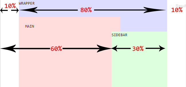
A simple thing you can do is position your fixed DIV relative to the rest of your page with % values.
Check out this jsfiddle here where the fixed DIV is a sidebar.
div#wrapper {
    margin: auto;
    width: 80%;
}

div#main {
    width: 60%;
}

div#sidebar {
    position: fixed;
    width: 30%;
    left: 60%;
}
And a brief picture below describing the layout above:
afable
- 175
- 1
- 9
1
here is a more generic solution, that don't depends on the Menu/Header height. its fully responsive, Pure CSS solution, Works great on IE8+, Firefox, Chrome, Safari, opera. supports Content scrolling without affecting the Menu/Header.
Test it with that Working Fiddle
The Html:
<div class="Container">
    <div class="First">
        <p>The First div height is not fixed</p>
        <p>This Layout has been tested on: IE10, IE9, IE8, FireFox, Chrome, Safari, using Pure CSS 2.1 only</p>
    </div>
    <div class="Second">
        <div class="Wrapper">
            <div class="Centered">
                <p>The Second div should always span the available Container space.</p>
                <p>This content is vertically Centered.</p>
            </div>
        </div>
    </div>
</div>
The CSS:
*
{
    margin: 0;
    padding: 0;
}

html, body, .Container
{
    height: 100%;
}

    .Container:before
    {
        content: '';
        height: 100%;
        float: left;
    }

.First
{
    /*for demonstration only*/
    background-color: #bf5b5b;
}

.Second
{
    position: relative;
    z-index: 1;
    /*for demonstration only*/
    background-color: #6ea364;
}

    .Second:after
    {
        content: '';
        clear: both;
        display: block;
    }

/*This part his relevant only for Vertically centering*/
.Wrapper
{
    position: absolute;
    width: 100%;
    height: 100%;
    overflow: auto;
}
    .Wrapper:before
    {
        content: '';
        display: inline-block;
        vertical-align: middle;
        height: 100%;
    }

.Centered
{
    display: inline-block;
    vertical-align: middle;
}
avrahamcool
- 13,888
- 5
- 47
- 58
1
you can fix the wrapper using absolute positioning. and the give inside div a fixed position.
.wrapper{
 position:absolute;
 left:10%;// or some valve in px
 top:10%; // or some valve in px
 }
and div inside that
.wrapper .fixed-element{
position:fixed;
width:100%;
height:100%;
margin-left:auto; // to center this div inside at center give auto margin
margin-right:auto;
}
try this It might work for you
Mandar Kawtakwar
- 107
- 8
1
Sample solution. Check, if this is what you need.
<div class="container">
   <div class="relative">
      <div class="absolute"></div>
      <div class="content">
        <p>
          Content here
        </p>
      </div>
    </div>
 </div>
And for CSS
.relative {
  position: relative;
}

.absolute {
  position: absolute;
  top: 15px;
  left: 25px;
}
See it on codepen https://codepen.io/FelySpring/pen/jXENXY
Fely Spring
- 11
- 5
0
If you would like to have one of the div appear to be fixed while the other sibling div to be scrollable agains parent div(like side navigation bar and content area), here is one way to achieve it.
<div class="parent__div">
   <div class="fixed__div">

   </div>
   <div class="non__fixed-scrollable-div">

   </div>
</div>

.parent__div {
  display: grid;
  grid-template-columns: 1fr 10fr;
  overflow-y: hidden;
  height: 100vh;
}

.fixed__div {
  background: white;
  height: 100vh;
  overflow-y: auto;
}
.non__fixed-scrollable-div{
  height: 100vh;
  overflow-y: auto;
}
Tadele Ayelegn
- 4,126
- 1
- 35
- 30