10

The options for 2D plots of (x,y,z) in R are a bit numerous. However, grappling with the options is a bit of a challenge, especially in the case that all three are continuous.

To clarify the problem (and possibly assist in explaining why I might be getting tripped up with contour or image), here is a possible classification scheme:

  • Case 1: The value of z is not provided but is a conditional density based on values in (x,y). (Note: this is essentially relegating the calculation of z to a separate function - a density estimation. Something still has to use the output of that calculation, so allowing for arbitrary calculations would be nice.)
  • Case 2: (x,y) pairs are unique and regularly spaced. This implies that only one value of z is provided per (x,y) value.
  • Case 3: (x,y) pairs are unique, but are continuous. Coloring or shading is still determined by only 1 unique z value.
  • Case 4: (x,y) pairs are not unique, but are regularly spaced. Coloring or shading is determined by an aggregation function on the z values.
  • Case 5: (x,y) pairs are not unique, are continuous. Coloring / shading must be determined by an aggregation function on the z values.

If I am missing some cases, please let me know. The case that interests me is #5. Some notes on relationships:

  • Case #1 seems to be well supported already.
  • Case #2 is easily supported by heatmap, image, and functions in ggplot.
  • Case #3 is supported by base plot, though use of a color gradient is left to the user.
  • Case #4 can become case #2 by use of a split & apply functionality. I have done that before.
  • Case #5 can be converted to #4 (and then #2) by using cut, but this is inelegant and boxy. Hex binning may be better, though that does not seem to be easily conditioned on whether there is a steep gradient in the value of z. I'd settle for hex binning, but alternative aggregation functions are quite welcome, especially if they can utilize the z values.

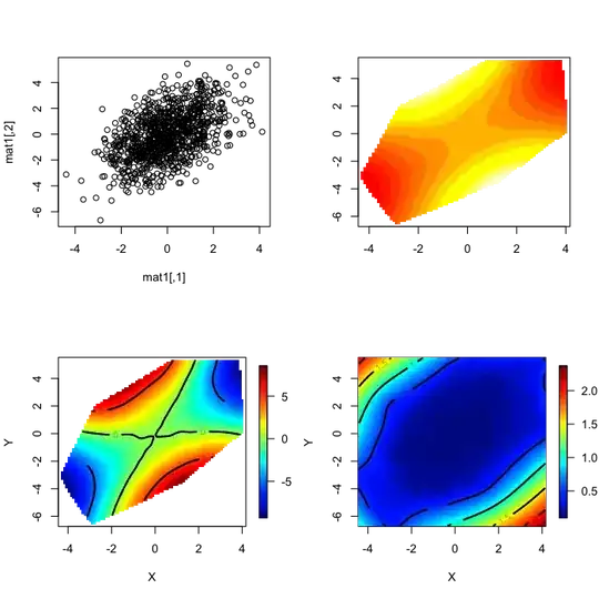
How can I do #5? Here is code to produce a saddle, though the value of spread changes the spread of the z value, which should create differences in plotting gradients.

N       = 1000
spread  = 0.6   # Vals: 0.6, 3.0
set.seed(0)
rot     = matrix(rnorm(4), ncol = 2)
mat0    = matrix(rnorm(2 * N), ncol = 2)
mat1    = mat0 %*% rot
zMean   = mat0[,2]^2 - mat0[,1]^2
z       = rnorm(N, mean = zMean, sd = spread * median(abs(zMean)))

I'd like to do something like hexbin, but I've banged on this with ggplot and haven't made much progress. If I can apply an arbitrary aggregation function to the z values in a region, that would be even better. (The form of such a function might be like plot(mat1, colorGradient = f(z), aggregation = "bin", bins = 50).)

How can I do this in ggplot or another package? I am happy to make this question a community wiki question (or other users can, by editing it enough times). If so, one answer per post, please, so that we can focus on, say, ggplot, levelplot, lattice, contourplot (or image), and other options, if they exist.


Updates 1: The volcano example is a good example of case #3: the data is regularly spaced (it could be lat/long), with one z value per observation. A topographic map has (latitude, longitude, altitude), and thus one value per location. Suppose one is obtaining weather (e.g. rainfall, windspeed, sunlight) over many days for many randomly placed sensors: that is more akin to #5 than to #3 - we may have lat & long, but the z values can range quite a bit, even for the same or nearby (x,y) values.

Update 2: The answers so far, by DWin, Kohske, and John Colby are all excellent. My actual data set is a small sample of a larger set, but at 200K points it produces interesting results. On the (x,y) plane, it is has very high density in some regions (thus, overplotting would occur in those areas) and much lower density or complete absence in other regions. With John's suggestion via fields, I needed to subsample the data for Tps to work out (I'll investigate if I can do it without subsampling), but the results are quite interesting. Trying rms/Hmisc (DWin's suggestion), the full 200K points seem to work out well. Kohske's suggestion is quite good, and, as the data is transformed into a grid before plotting, there's no issue with the number of input data points. It also gives me greater flexibility to determine how to aggregate the z values in the region. I am not yet sure if I will use mean, median, or some other aggregation.

I also intend to try out Kohske's nice example of mutate + ddply with the other methods - it is a good example of how to get different statistics calculated over a given region.


Update 3: The different methods are distinct and several are remarkable, though there isn't a clear winner. I selected John Colby's answer as the first. I think I will use that or DWin's method in further work.

Iterator
  • 20,250
  • 12
  • 75
  • 111
  • 1
    the case where (x,y) values are unique but irregularly spaced is interesting too. Two options, I think : (i) interpolate on a regular grid. (ii) My preference, use a Voronoi/Delaunay tesselation. The `latticeExtra` package provides `panel.levelplot.voronoi` for this. – baptiste Oct 22 '11 at 00:11
  • @baptiste Good point - I assume that irregularly spaced is in case 5 (or *is* case 5), but I didn't make that explicit. The Voronoi & Delaunay suggestion is great. I will follow up with `latticeExtra`. Thanks! – Iterator Oct 22 '11 at 00:14
  • http://stackoverflow.com/q/5608381/471093 would be relevant for this situation. – baptiste Oct 22 '11 at 00:18
  • Fun stuff. Great question...it's neat to see the different offerings. – John Colby Oct 22 '11 at 00:40
  • 1
    Have you seen this recent blog post by Hadley which would get at #5 via binning and effectively 2D small multiples? http://blog.revolutionanalytics.com/2011/10/ggplot2-for-big-data.html – Brian Diggs Oct 24 '11 at 20:35
  • @BrianDiggs Great link! No code, so it's a teaseR. :) I like the inset histograms, though. – Iterator Oct 24 '11 at 21:59

4 Answers4

5

I've had great luck with the fields package for this type of problem. Here is an example using Tps for thin plate splines:

EDIT: combined plots and added standard error

require(fields)

dev.new(width=6, height=6)
set.panel(2,2)

# Plot x,y
plot(mat1)

# Model z = f(x,y) with splines
fit = Tps(mat1, z)
pred = predict.surface(fit)

# Plot fit
image(pred)
surface(pred)

# Plot standard error of fit 
xg = make.surface.grid(list(pred$x, pred$y))
pred.se = predict.se(fit, xg)

surface(as.surface(xg, pred.se))

enter image description here

John Colby
  • 22,169
  • 4
  • 57
  • 69
  • 1
    This is fantastic. I need to dig into it more to see how it's aggregating the z values, but is presenting some very interesting results for my data. – Iterator Oct 21 '11 at 19:14
  • 1
    I'm glad it helped! I think `fields` is a great package. I've never needed to use it for anything more than this basic type of surface fitting, but it always "just works" for me. It has nice built-in diagnostic plots too (`plot(fit)`). – John Colby Oct 21 '11 at 19:22
3

I generally use the rms/Hmisc package combination. This is a linear regression analysis (function ols) using crossed cubic spline terms whose plotted output closely resembles the fields example offered:

dfrm <- data.frame(z=z, xcor = mat1[,1], ycor=mat1[,2])
require(rms)  # will automatically load Hmisc which needs to have been installed
lininterp <- ols(z ~ rcs(xcor,3)*rcs(ycor,3), data=dfrm)
ddI <- datadist(dfrm)
options(datadist="ddI")

 bplot(Predict(lininterp, xcor, ycor))  # Plot not shown
 perim <- with(dfrm, perimeter(xcor, ycor))
 bplot(Predict(lininterp, xcor, ycor), perim=perim)  
# Plot attached after converting to .png

You can also see a method that does not rely on regression estimates of the 3-D surface in second part of my answer to this question: Using color as the 3rd dimension

enter image description here The plotting paradigm is lattice and you can also get contour plots as well as this pretty levelplot. If you want the predicted values at an iterior point, then you can get that with the Predict function applied to the fit-object.

Community
  • 1
  • 1
IRTFM
  • 258,963
  • 21
  • 364
  • 487
3

There is a panel.2dsmoother function in the latticeExtra package:

library(lattice)
library(latticeExtra)

df <- data.frame(mat1, z)
names(df)[c(1,2)] <- c('x', 'y')

levelplot(z ~ x * y, data = df, panel = panel.2dsmoother, contour=TRUE)

panel.2dsmoother

According to its help page "the smoothing model is constructed (approximately) as method(form, data = list(x=x, y=y, z=z), {args}) [...] This should work with any model function that takes a formula argument, and has a predict method argument".

Oscar Perpiñán
  • 4,491
  • 17
  • 28
  • This is also great. It is sluggish for a large data set, but this is a good intro and I'll see what I can do for preparing the data so that it is rendered more quickly. – Iterator Oct 25 '11 at 18:03
2

Probably the question can be divided into two parts. The first is aggregating the data, and the second is visualizing it.

fields package, as @John shows, can do these things at one time. In ggplot2, if aggregation is simply count of the data, stat_bin2d is available.

Anyway, if you want to your own aggregate function, maybe something like this will help:

df <- data.frame(x = mat1[,1], y = mat1[,2], z = z)

Nx <- 10 # nubmer of bins for x
Ny <- 4  # number of bins for y

# create a data.
df2 <- mutate(ddply(df, .(x = cut(x, Nx), y = cut(y, Ny)), summarise, 
                    Mean = mean(z),
                    Var = var(z)),
              xmin = as.numeric( sub("\\((.+),.*", "\\1", x)),
              xmax = as.numeric( sub("[^,]*,([^]]*)\\]", "\\1", x)),
              ymin = as.numeric( sub("\\((.+),.*", "\\1", y)),
              ymax = as.numeric( sub("[^,]*,([^]]*)\\]", "\\1", y)),
              xint = as.numeric(x),
              yint = as.numeric(y))

# then, visualize
ggplot(df2, aes(xint, yint, xmin = xmin, ymin = ymin, xmax = xmax, ymax = ymax, fill = Mean)) +
  geom_tile(stat = "identity")

ggplot(df2, aes(xint, yint, xmin = xmin, ymin = ymin, xmax = xmax, ymax = ymax, fill = Var)) +
  geom_tile(stat = "identity")

enter image description here

enter image description here

kohske
  • 65,572
  • 8
  • 165
  • 155
  • This is quite interesting, thanks! I'm puzzled about `xint` and `yint`: these seem to convert the intervals to enumerated factors, so the axes are different from the original scale. However `xint = (xmin + xmax)/2)` (similarly for `yint`), seems to do the trick. Perhaps this was what was intended? – Iterator Oct 21 '11 at 20:42
  • Thanks again. This is also a nice introduction to `mutate` and its use with `ddply`. – Iterator Oct 22 '11 at 00:22
  • and the benefit of this method is that you can use any aggregation function (here, mean and var) and control the widths and heights of each bin. – kohske Oct 22 '11 at 00:22
  • I am especially excited about that. :) What's more, this technique can be used to easily create layers of such analyses, e.g. to compare neighbors, thereby addressing gradients in relation to z and other interesting issues. – Iterator Oct 22 '11 at 00:27