6

I'm trying to analyze some noisy time-series data in R. The data are based on the CO2 emission of animals and they show a sort of cyclic periodicity that I'd like to characterize. I'd like to test the hypotheses:

H0: There is no cyclic CO2 emission (i.e. no more than random).

H1: There is a pattern of CO2 emission in cycles or pulses.

So to do this I've imported the data into R, converted it to a time series class, and plotted its periodogram.

t25a <- read.table("data.txt", header=TRUE, sep="\t")
t1 <- ts(t25a$Co2)
plot(t1)
spec.pgram(t1, spans=4, log="no")

Here's what that looks like, with the raw data plotted on top and the periodogram beneath:

R periodogram of time series CO2 data

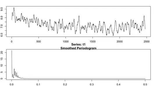
In the bottom figure, I can see four or five somewhat-distinct peaks indicating a frequency component in the data. My question is -- are they all equally "important"? Is there any way to test whether the observed peaks are significantly different from each other or from the predictions of the null hypothesis? All I know how to do is find the frequency associated with those peaks, but I'd like a more objective method for determining how many "significant" peaks there really are in the data.

Paul Hiemstra
  • 59,984
  • 12
  • 142
  • 149
James Waters
  • 323
  • 1
  • 3
  • 9
  • You understand what the units of a power spectrum are, yes? [units**2/Hz] You can think of the integrated spectrum as the variance of the original timeseries, so if a peak is larger than another, it has more energy (signal) at that frequency than the other does. So the "significance" is not really a meaningful question. And you should really be using a tapering scheme, and plotting logarithmic frequency (in this case). – Andy Barbour Oct 21 '11 at 19:25
  • @AndyBarbour First, the units. My understanding is that the y-axis on the periodogram above is a measure of power and that the x-axis is the inverse frequency. Where does the *2 come from in your units*2/Hz? As a measure of relative significance of different components of the signal, might I consider the ratio of an integrated peak to the total area? – James Waters Oct 21 '11 at 20:21
  • Take a look at Parseval's Theorem, or work out the Fourier transform on an analytic function to easily demonstrate the units. The units on the plot are probably, for y, in dB relative to 1 unit**2/Hz, and for x, 0 to the Nyquist frequency. It depends what question you want to answer, but the peaks are likely real cycles in the data (just by inspection of your timeseries). – Andy Barbour Oct 21 '11 at 23:25
  • I think reading up on the time-series literature might be a good idea (or possibly asking a variant of this question on Stack Exchange). There is a big (and alas complicated) literature on spectral analysis, with various different kinds of hypothesis testing frameworks. I personally like Diggle's time series analysis book: http://www.amazon.com/Time-Biostatistical-Introduction-Peter-Diggle/dp/0198522266/ref=sr_1_1?ie=UTF8&qid=1319295506&sr=8-1 – Ben Bolker Oct 22 '11 at 14:59
  • PS I strongly recommend inspecting the periodogram on the log scale -- and taking a look at the 95% confidence interval that is plotted by default by `plot.spec`. And note that @AndyBarbour is talking about **squaring** the units, not multiplying them by two. The ratios of integrated peaks are indeed sensible -- if you normalize correctly, they represent fractions of overall variance accounted for by various frequency ranges. For example, see http://www.math.mcmaster.ca/~bolker/bbpapers/BolkerGrenfell1995.pdf (username: "bbpapers", password "research") – Ben Bolker Oct 22 '11 at 15:04
  • Under the null hypothesis of white noise, the *unsmoothed* periodogram coefficients (again appropriately scaled) have a chi^2 distribution with 2 degrees of freedom ... – Ben Bolker Oct 22 '11 at 15:05

1 Answers1

1

One option would be to simulate data sets under your null hypothesis (don't have the periodicity that you are looking for, but still have the other time series characteristics). If you have a numerical test statistic (number of peaks, or some other measure) then you can compute this for each of many simulated data sets and this will give you the sampling distribution, just compare the test statistic for your actual data to the sampling distribution. If you don't have a straight forward numeric test statistic then you might consider doing a visual test, see:

 Buja, A., Cook, D. Hofmann, H., Lawrence, M. Lee, E.-K., Swayne,
 D.F and Wickham, H. (2009) Statistical Inference for exploratory
 data analysis and model diagnostics Phil. Trans. R. Soc. A 2009
 367, 4361-4383 doi: 10.1098/rsta.2009.0120

The vis.test function in the TeachingDemos package for R helps with implementing this test (but there are other ways as well).

Greg Snow
  • 48,497
  • 6
  • 83
  • 110
  • Hey Greg, thanks for pointing me to that reference! I've thought about using the number of peaks as a test statistic, but I run into a small problem. I want to avoid counting peaks "by eye", so I smooth the data (using cubic splines) and then round a nifty bit of R code to count the peaks in the smoothed data. But those results depend on the amount of smoothing I apply, which is inherently somewhat subjective. I haven't read that article yet, but perhaps it will address these concerns. – James Waters Oct 21 '11 at 20:30
  • The article talks about a visual test that still requires you looking at the plot by eye, counting actual peaks may be optional. But it does make an intuitive test when looking at the results. – Greg Snow Oct 24 '11 at 16:01