3

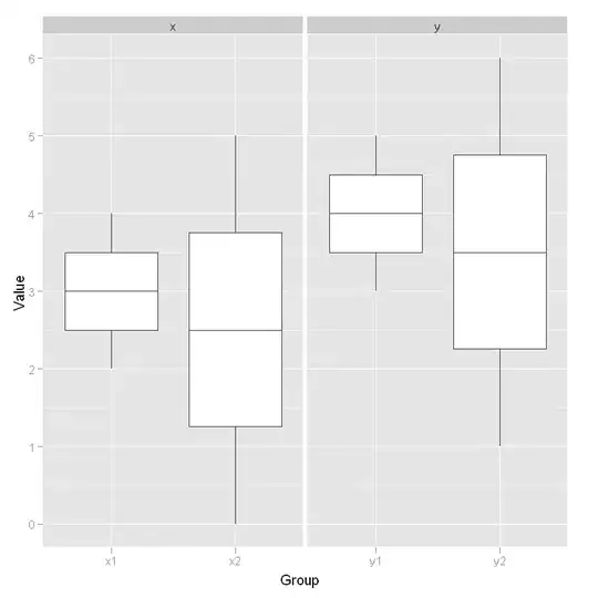
I have two groups of data (x1 and x2 versus y1 and y2), which I would like to display as two groups of boxplots.

I tried the following, but it displays the wrong data because the vectors x1 and x2 (and y1 and y2) are not of the same lengths:

x1 <- c(2,3,4)
x2 <- c(0,1,2,3,4,5)

y1 <- c(3,4,5)
y2 <- c(1,2,3,4,5,6)

d0 <- matrix(c(x1, x2),  ncol=2)
d1 <- matrix(c(y1, y2),  ncol=2)

lmts <- range(d0,d1)

par(mfrow = c(1, 2))
boxplot(d0, ylim=lmts, xlab="x")
boxplot(d1, ylim=lmts, xlab="y")

This is what it shows (of course, I wanted the whiskers of the first boxplot to go from 2 to 4 instead, according to the range of x1, etc.):

drawn

Frank
  • 64,140
  • 93
  • 237
  • 324

2 Answers2

3

Yup, or you could have used.

lmts <- range(x1,x2,y1,y2)
par(mfrow = c(1, 2))
boxplot(x1, x2, ylim=lmts,names=c("x1","x2"),xlab="x")
boxplot(y1, y2, ylim=lmts,names=c("y1","y2"),xlab="y")

enter image description here

On a complete side not based on the comments...

> quantile(c(2,3,4), type=1)
  0%  25%  50%  75% 100% 
   2    2    3    4    4 
> quantile(c(2,3,4), type=2)
  0%  25%  50%  75% 100% 
   2    2    3    4    4 
> quantile(c(2,3,4), type=3)
  0%  25%  50%  75% 100% 
   2    2    3    3    4 
> quantile(c(2,3,4), type=4)
  0%  25%  50%  75% 100% 
2.00 2.00 2.50 3.25 4.00 
> quantile(c(2,3,4), type=5)
  0%  25%  50%  75% 100% 
2.00 2.25 3.00 3.75 4.00 
> quantile(c(2,3,4), type=6)
  0%  25%  50%  75% 100% 
   2    2    3    4    4 
> quantile(c(2,3,4), type=7)
  0%  25%  50%  75% 100% 
 2.0  2.5  3.0  3.5  4.0 
> quantile(c(2,3,4), type=8)
      0%      25%      50%      75%     100% 
2.000000 2.166667 3.000000 3.833333 4.000000 
> quantile(c(2,3,4), type=9)
    0%    25%    50%    75%   100% 
2.0000 2.1875 3.0000 3.8125 4.0000 
nzcoops
  • 9,132
  • 8
  • 41
  • 52
  • +1, I was about to post this solution myself. Note that the two approaches yield different results! I think this might be because of how they treat N/A items, but I'm not sure. – Ben Hocking Oct 25 '11 at 00:02
  • Mmm, interesting point Ben. Added an image to show the difference. I think you're on the right track with the NA comment. Which isn't an issue in this method given we're using the vectors without NAs etc. – nzcoops Oct 25 '11 at 00:04
  • Yes, in refreshing my memory on the Tukey plot, the borders of the box should be at the 25th and 75th percentiles. For 3 data points, that would split the 2/3 and 3/4 points, respectively (for x). For 5 data points, two of which are N/A, I'm not sure how one "correctly" calculates that. Edit to add: actually, I'm not even sure what the "correct" percentiles are for 3 data points without NA now that I think about it some more. – Ben Hocking Oct 25 '11 at 00:08
  • Heh, this reminds me of the time I went ?quantile to find there were 9 different ways to calculate the quantiles. I still tend to stick my head in the sand majority of the time when faced with this... – nzcoops Oct 25 '11 at 00:13
  • Oops, I deleted my answer, which was suggesting to use `data.frame(x1,x2)`, because it's incorrect, due to the different lengths, just like using matrix. Your result is correct, nzoops. – Frank Oct 25 '11 at 00:14
  • @Ben: Just type `quantile(c(2,3,4))` :) – Frank Oct 25 '11 at 00:16
  • @Frank: Nice. I had just used the clumsy technique of using `boxplot` on that and `c(2,3,4,NA,NA)` to find that they both yield the same answer. Interestingly, `boxplot(c(2,3,4,NA,NA))` works just fine, but `quantile(c(2,3,4,NA,NA))` does not! `quantile(c(2,3,4,NULL,NULL))` does work, however (I tried that after reading `help(boxplot)`). – Ben Hocking Oct 25 '11 at 00:19
1

Another options is to use the ggplot2 package. You need a bit more work to put your data into one data.frame. But then it is very easy.

library(ggplot2)
dataset <- data.frame(
    Group = c(rep("x1", length(x1)), rep("x2", length(x2)), rep("y1", length(y1)), rep("y2", length(y2))),
    Subplot = c(rep("x", length(x1) + length(x2)), rep("y", length(y1) + length(y2))),
    Value = c(x1, x2, y1, y2))
ggplot(dataset, aes(x = Group, y = Value)) + geom_boxplot() + facet_wrap(~Subplot, scales = "free_x")

enter image description here

Thierry
  • 18,049
  • 5
  • 48
  • 66