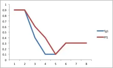
Here is an example to get you started (data at https://gist.github.com/1349300). For further tweaking, check out the excellent ggplot2 documentation that is all over the web.
library(ggplot2)

# Load data
Tg = read.table('Tg.txt', header=T, fill=T, sep=' ')
Pf = read.table('Pf.txt', header=T, fill=T, sep=' ')

# Format data
Tg$x        = as.numeric(rownames(Tg))
Tg          = melt(Tg, id.vars='x')
Tg$source   = 'Tg'
Tg$variable = factor(as.numeric(gsub('Tg(.+)', '\\1', Tg$variable)))

Pf$x        = as.numeric(rownames(Pf))
Pf          = melt(Pf, id.vars='x')
Pf$source   = 'Pf'
Pf$variable = factor(as.numeric(gsub('Pf(.+)', '\\1', Pf$variable)))

# Stack data
data = rbind(Tg, Pf)

# Plot
dev.new(width=5, height=4)
p = ggplot(data=data, aes(x=x)) + geom_line(aes(y=value, group=source, color=source)) + facet_wrap(~variable)
p

Highlighting the area between the lines
First, interpolate the data onto a finer grid. This way the ribbon will follow the actual envelope of the lines, rather than just where the original data points were located.
data = ddply(data, c('variable', 'source'), function(x) data.frame(approx(x$x, x$value, xout=seq(min(x$x), max(x$x), length.out=100))))
names(data)[4] = 'value'
Next, calculate the data needed for geom_ribbon - namely ymax and ymin.
ribbon.data = ddply(data, c('variable', 'x'), summarize, ymin=min(value), ymax=max(value))
Now it is time to plot. Notice how we've added a new ribbon layer, for which we've substituted our new ribbon.data frame.
dev.new(width=5, height=4)
p + geom_ribbon(aes(ymin=ymin, ymax=ymax),  alpha=0.3, data=ribbon.data)

Dynamic coloring between the lines
The trickiest variation is if you want the coloring to vary based on the data. For that, you currently must create a new grouping variable to identify the different segments. Here, for example, we might use a function that indicates when the "Tg" group is on top:
GetSegs <- function(x) {
  segs = x[x$source=='Tg', ]$value > x[x$source=='Pf', ]$value
  segs.rle = rle(segs)

  on.top = ifelse(segs, 'Tg', 'Pf')
  on.top[is.na(on.top)] = 'Tg'

  group = rep.int(1:length(segs.rle$lengths), times=segs.rle$lengths)
  group[is.na(segs)] = NA

  data.frame(x=unique(x$x), group, on.top)
}
Now we apply it and merge the results back with our original ribbon data.
groups = ddply(data, 'variable', GetSegs)
ribbon.data = join(ribbon.data, groups)
For the plot, the key is that we now specify a grouping aesthetic to the ribbon geom.
dev.new(width=5, height=4)
p + geom_ribbon(aes(ymin=ymin, ymax=ymax, group=group, fill=on.top),  alpha=0.3, data=ribbon.data)
Code is available together at: https://gist.github.com/1349300