4

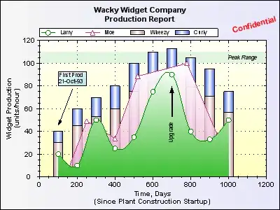
I have a graph combining 3D columns and lines (MSColumn3DLineDY) and the anchors are not aligning to the center of columns. In this example, the anchors are aligned to center without any specific property to do it.

Here's my graph:

my graph

The open char tag of above chart:

<chart caption=''
       palette='2'
       animation='1'
       showValues='0'
       formatNumberScale='0'
       numberPrefix=''
       slantLabels='1'
       showLabels='1'
       rotateValues='0'
       placeValuesInside='0'
       labelDisplay='ROTATE'
       seriesNameInToolTip='1'
       anchorBorderColor='339966'
       decimalSeparator=','
       thousandSeparator='.'
       syAxisMaxValue='$maximo'
       pyAxisMaxValue='$maximo'>

A chart with the correct align I am after:

another chart

And it's chart tag:

<chart caption=''
       PYAxisName='Quantidade'
       SYAxisName='Valores (Em R$/Mil)'
       palette='2'
       animation='1'
       showValues='0'
       formatNumberScale='0'
       numberPrefix=''
       slantLabels='1'
       showLabels='1'
       rotateValues='0'
       placeValuesInside='0'
       labelDisplay='ROTATE'
       seriesNameInToolTip='1'
       anchorBorderColor='FFFF33'
       decimalSeparator=','
       thousandSeparator='.'
       baseFontSize='8'>`

They are almost the same!

Jared Farrish
  • 48,585
  • 17
  • 95
  • 104
  • Are you referring to the orientation of the white dot on the second-to-last blue column? How it appears to be in the middle of the top? – Jared Farrish Nov 18 '11 at 11:49
  • I'm refering to white dot of the two lines to be aligned to the center of the green bar. Actually it's out of the bar, I want in the middle. –  Nov 18 '11 at 12:08
  • I was referring to the second example. I'm not sure I'm really following what you're looking for exactly. – Jared Farrish Nov 18 '11 at 12:11
  • Yeah, I'm having dificult to explain. If you pay attention to the first example (my example) the white dot is out of the bar like this -> `o||` I want it to show like this -> `|o|` –  Nov 18 '11 at 12:20
  • So you mean it's to the left of the bar? In the second example, it's to the right of the blue bar, but it's in the middle of the blue and yellow bars because there are two series bars. Is this what you're talking about? – Jared Farrish Nov 18 '11 at 12:22
  • Yes. I want to align the white dot on center of my green bar (first ex) as is aligned on the blue bar (secund ex) –  Nov 18 '11 at 12:26
  • The dot is aligned as such in the second example, as far as I can tell, due to there being two series. So it's aligning the dot to be over the "center" of the series. (Note, reading through the docs, I don't see a method to determine the orientation of anchors, or a way to offset left/right.) – Jared Farrish Nov 18 '11 at 12:29
  • Fusion Charts seems to center an anchor over the center of two bars that represent different series, but doesn't provide a method that I can see to manipulate it yourself. I don't think you can do what you want by using a method or setting. – Jared Farrish Nov 18 '11 at 12:37
  • Strange that I have other similar graphs that is centering like I want and the chart is rendered with exactly the same properties.. =s –  Nov 18 '11 at 12:44
  • The example of what you want is flawed then, because it's not the same type of graph (single series vs two series). – Jared Farrish Nov 18 '11 at 12:47
  • @JaredFarrish Please take a look on my edit. –  Nov 18 '11 at 13:01
  • Is there CSS or some other stylesheet used with Fusion Charts? Can you recreate exactly the second chart and it appears correctly? I have edited your question to format the markup so it's easier to compare (and remove the original second chart so it's not cluttered). I have to catch a train, so I won't be able to respond until tomorrow, but start with recreating the (new) second example. My guess at this point is there's some kind of stylesheet involved, but I don't know for sure. – Jared Farrish Nov 18 '11 at 13:25
  • Is it possible that the error lies in the data you use to draw the graph? Take a look at key/value pairs and if the keys of the two data sources (bar an line) match. – MiDo Nov 20 '11 at 18:31
  • Thank you @JaredFarrish for your support and sorry about my poor english. –  Nov 21 '11 at 10:33

1 Answers1

0

Seems you have a blank <dataset> in your data. Please check.

The anchors aligns to the center. If you have 2 column datasets of which one is blank or invisible, the anchors would be aligned to the center of these possible columns and hence this.

sudipto
  • 2,472
  • 1
  • 17
  • 21
  • You got it.. I have copied the source and I'm inexperienced with fusion charts. –  Nov 21 '11 at 10:32