1

i have a Tabcontrol with Datatemplate for its TabItems and a ItemContainerStyle for the style of the TabItem.

The TabControl:

<TabControl Name="MainTabCtrl"  Margin="0" Padding="0" BorderThickness="0" Background="Transparent"
                        IsSynchronizedWithCurrentItem="True"
                        ItemsSource="{Binding Path=TabViewModels}" 
                        ItemTemplate="{StaticResource ClosableTabItemTemplate}"
                        HorizontalContentAlignment="Stretch" VerticalContentAlignment="Stretch"
                        ItemContainerStyle="{StaticResource ContainerStyle}">

The DataTemplate for the TabItems called ClosableTabItemTemplate:

<DataTemplate x:Key="ClosableTabItemTemplate" >
            <Border BorderThickness="3" BorderBrush="Transparent" CornerRadius="4" >
                <!--Border to make the tab item gap from the content-->
                <Border x:Name="InsideBorder" BorderThickness="3" BorderBrush="#D6EAFF" CornerRadius="4">
                    <!--Border for the rounded corners-->
                    <!--TabItem Content Grid-->
                    <Grid x:Name="tabItemGrid" ShowGridLines="True" Margin="0" Background="#D6EAFF">
                        <Grid.RowDefinitions>
                            <RowDefinition Height="Auto"/>
                        </Grid.RowDefinitions>
                        <Grid.ColumnDefinitions>
                            <ColumnDefinition Width="25"/>
                            <!--Icon Column-->
                            <ColumnDefinition Width="1*"/>
                            <!--Title Column-->
                            <ColumnDefinition Width="20"/>
                            <!--Close Button Column-->
                        </Grid.ColumnDefinitions>

                        <!--Icon of tab Item-->
                        <Image Grid.Column="0" Grid.Row="1" Height="18" HorizontalAlignment="Left" Source="Images/tab1.jpg"/>

                        <!--Title of tab Item-->
                        <Label Name="TabText" Grid.Column="1" Grid.Row="1" Content="TabItem"  Height="23"  HorizontalAlignment="Left" 
                                           Margin="4,1,0,0"  VerticalAlignment="Top" FontFamily="Courier" FontSize="12" />

                        <!--Close button of tab Item-->
                        <Button Style="{DynamicResource TabButton}"
                                            Name="button_close" Content="x"
                                            Command="{Binding Path=CloseCommand}"
                                            Grid.Column="2" Grid.Row="1" 
                                            Height="20" Width="20" 
                                            Margin="0,0,0,2" VerticalAlignment="Center" HorizontalAlignment="Right"
                                            FontFamily="Courier" FontStretch="Normal" FontWeight="Bold" FontSize="14" 
                                            Visibility="Visible" ToolTip="Close" 
                                            BorderBrush="Transparent" BorderThickness="0" Background="Transparent" Padding="0,0,0,0"
                                            >
                        </Button>
                    </Grid>
                </Border>
            </Border>


            <DataTemplate.Triggers>

                <DataTrigger Binding="{Binding RelativeSource={RelativeSource Mode=FindAncestor, AncestorType={x:Type TabItem}},Path=IsSelected}" Value="True">
                    <Setter TargetName="tabItemGrid" Property="Background" Value="#D6EAFF" />
                </DataTrigger>

                <DataTrigger Binding="{Binding RelativeSource={RelativeSource Mode=FindAncestor, AncestorType={x:Type TabItem}},Path=IsSelected}" Value="False">
                    <!--<Trigger Property="IsSelected"  Value="False">-->
                    <Setter TargetName="InsideBorder" Property="BorderBrush">
                        <Setter.Value>
                            <LinearGradientBrush EndPoint="0,1" StartPoint="0,0">
                                <GradientStop Color="#FFCCCCD0" />
                                <GradientStop Color="#FF526593" Offset="1" />
                            </LinearGradientBrush>
                        </Setter.Value>
                    </Setter>
                    <Setter TargetName="tabItemGrid" Property="Background">
                        <Setter.Value>
                            <LinearGradientBrush EndPoint="0,1" StartPoint="0,0">
                                <GradientStop Color="#FFCCCCD0" />
                                <GradientStop Color="#FF526593" Offset="1" />
                            </LinearGradientBrush>
                        </Setter.Value>
                    </Setter>
                </DataTrigger>
                <!--</Trigger>-->
            </DataTemplate.Triggers>
        </DataTemplate>

The ItemContainerStyle of the tabItem:

<Style TargetType="{x:Type TabItem}" x:Key="ContainerStyle">
            <Setter Property="Background" Value="Red" />
            <Setter Property="BorderBrush" Value="Red" />
            <Setter Property="Padding" Value="0" />
            <Setter Property="Margin" Value="0" />
            <Style.Triggers>
                <Trigger Property="IsEnabled" Value="false">
                    <Setter Property="Background" Value="Red"/>
                    <Setter Property="BorderBrush" Value="Red" />
                </Trigger>
                <Trigger Property="IsEnabled" Value="true">
                    <Setter Property="Background" Value="Red"/>
                    <Setter Property="BorderBrush" Value="Red" />
                </Trigger>

                <Trigger Property="IsMouseOver" Value="false">
                    <Setter Property="Background" Value="Red"/>
                    <Setter Property="BorderBrush" Value="Red" />
                </Trigger>
                <Trigger Property="IsMouseOver" Value="true">
                    <Setter Property="Background" Value="Red"/>
                    <Setter Property="BorderBrush" Value="Red" />
                </Trigger>

                <Trigger Property="IsFocused" Value="false">
                    <Setter Property="Background" Value="Red"/>
                    <Setter Property="BorderBrush" Value="Red" />
                </Trigger>
                <Trigger Property="IsFocused" Value="true">
                    <Setter Property="Background" Value="Red"/>
                    <Setter Property="BorderBrush" Value="Red" />
                </Trigger>
                <Trigger Property="IsKeyboardFocused" Value="false">
                    <Setter Property="Background" Value="Red"/>
                    <Setter Property="BorderBrush" Value="Red" />
                </Trigger>
                <Trigger Property="IsKeyboardFocused" Value="true">
                    <Setter Property="Background" Value="Red"/>
                    <Setter Property="BorderBrush" Value="Red" />
                </Trigger>

            </Style.Triggers>
        </Style>

what happens is that the selected tab is always with white default control background no matter what i do:

enter image description here

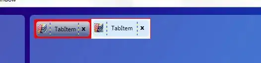
also when i point the mouse over the unselected tab it turns blue background instead of red:

enter image description here

i use transparent color instead of red but it is easier to show the problem with the red color.

why does the default colors override the itemStyleContainer and the style triggers?

Rodniko
  • 4,926
  • 20
  • 69
  • 93

3 Answers3

2

Usually some behavior is hard-coded into the Template, so if you drastically restyle a control you need to create a new template, too. (You could use the default one as base though)

Community
  • 1
  • 1
H.B.
  • 166,899
  • 29
  • 327
  • 400
  • +1 but as a side note, things like the focused border come from the default Focus Visual, which is usually an application-wide resource. I'm fairly sure you can override it somehow, but I'm not positive how. – Rachel Jan 25 '12 at 17:38
  • Not sure if the focus visual comes into play here, isn't that just this faint dottet border? – H.B. Jan 25 '12 at 17:53
  • @HB Hrrm you're right it doesn't matter if you're overwriting the template. I was thinking of [this question](http://stackoverflow.com/q/8434258/302677) where someone had set the background color of a button, but the focus visual still showed up when you tabbed to the button. In the case of a button, the focus visual changes the entire background color. – Rachel Jan 25 '12 at 18:05
  • Guys thank you very much, just for the record, this code worked when it was not inside a datatemplate but in a style of TabItem. i mived it inside a datatemplate because i wanted the "ItemTemplate" property of the tabcontrol to have a clear datatemplate. i'll look into your links and also try to set it back like it was.... – Rodniko Jan 26 '12 at 05:59
  • posted the right solution in a different answer. thanks guys. – Rodniko Jan 26 '12 at 06:25
0

In your style for TabItem, add a ressource section:

<Style.Resources>
   <SolidColorBrush x:Key="{x:Static SystemColors.HighlightBrushKey}" Color="Red" />
   <SolidColorBrush x:Key="{x:Static SystemColors.ControlBrushKey}" Color="Green" />
</Style.Resources>

The original style uses those system colors, so if you override them locally, you get the desired result.

Louis Kottmann
  • 16,268
  • 4
  • 64
  • 88
0

Ok, found the solution. the Datatemplate messed things up, i just entered the same code of the Datatemplate, inside the override code of the Tabitem style and its working fine.

The style of Tabitem (instead of DataTemplate):

<!--Oveerriding TabItem-->
        <Style TargetType="{x:Type TabItem}">
            <Setter Property="VerticalContentAlignment" Value="Center" />
            <Setter Property="HorizontalContentAlignment" Value="Center" />

            <!--Creating TabItem Template-->
            <Setter Property="Template">
                <Setter.Value>
                    <!--Content of template-->
                    <ControlTemplate TargetType="{x:Type TabItem}">
                        <Border BorderThickness="3" BorderBrush="Transparent" CornerRadius="4">
                            <!--Border to make the tab item gap from the content-->
                            <Border x:Name="InsideBorder" BorderThickness="3" BorderBrush="#D6EAFF" CornerRadius="4">
                                <!--Border for the rounded corners-->
                                <!--TabItem Content Grid-->
                                <Grid x:Name="tabItemGrid" ShowGridLines="True" Margin="0" Background="#D6EAFF">
                                    <Grid.RowDefinitions>
                                        <RowDefinition Height="Auto"/>
                                    </Grid.RowDefinitions>
                                    <Grid.ColumnDefinitions>
                                        <ColumnDefinition Width="25"/>
                                        <!--Icon Column-->
                                        <ColumnDefinition Width="1*"/>
                                        <!--Title Column-->
                                        <ColumnDefinition Width="20"/>
                                        <!--Close Button Column-->
                                    </Grid.ColumnDefinitions>

                                    <!--Icon of tab Item-->
                                    <Image Grid.Column="0" Grid.Row="1" Height="18" HorizontalAlignment="Left" Source="Images/tab1.jpg"/>

                                    <!--Title of tab Item-->
                                    <Label Name="TabText" Grid.Column="1" Grid.Row="1" Content="TabItem"  Height="23"  HorizontalAlignment="Left" 
                                           Margin="4,1,0,0"  VerticalAlignment="Top" FontFamily="Courier" FontSize="12" />

                                    <!--Close button of tab Item-->
                                    <Button Style="{DynamicResource TabButton}"
                                            Name="button_close" Content="x"
                                            Command="{Binding Path=CloseCommand}"
                                            Grid.Column="2" Grid.Row="1" 
                                            Height="20" Width="20" 
                                            Margin="0,0,0,2" VerticalAlignment="Center" HorizontalAlignment="Right"
                                            FontFamily="Courier" FontStretch="Normal" FontWeight="Bold" FontSize="14" 
                                            Visibility="Visible" ToolTip="Close" 
                                            BorderBrush="Transparent" BorderThickness="0" Background="Transparent" Padding="0,0,0,0">
                                    </Button>
                                </Grid>
                            </Border>
                        </Border>

                        <!--TabItem Triggers-->
                        <ControlTemplate.Triggers>

                            <Trigger Property="IsSelected" Value="True">
                                <Setter TargetName="tabItemGrid" Property="Background" Value="#D6EAFF" />
                            </Trigger>

                            <Trigger Property="IsSelected"  Value="False">
                                <Setter TargetName="InsideBorder" Property="BorderBrush">
                                    <Setter.Value>
                                        <LinearGradientBrush EndPoint="0,1" StartPoint="0,0">
                                            <GradientStop Color="#FFCCCCD0" />
                                            <GradientStop Color="#FF526593" Offset="1" />
                                        </LinearGradientBrush>
                                    </Setter.Value>
                                </Setter>
                                <Setter TargetName="tabItemGrid" Property="Background">
                                    <Setter.Value>
                                        <LinearGradientBrush EndPoint="0,1" StartPoint="0,0">
                                            <GradientStop Color="#FFCCCCD0" />
                                            <GradientStop Color="#FF526593" Offset="1" />
                                        </LinearGradientBrush>
                                    </Setter.Value>
                                </Setter>
                                <!--<Setter TargetName="button_close" Property="Visibility" Value="Hidden" />-->
                            </Trigger>

                            <!--<Trigger Property="IsMouseOver" Value="True">
                                <Setter TargetName="tabItemCtrl" Property="Background" Value="#D6EAFF" />
                                <Setter TargetName="InsideBorder" Property="BorderBrush" Value="#D6EAFF" />
                            </Trigger>-->
                        </ControlTemplate.Triggers>

                    </ControlTemplate>
                </Setter.Value>
            </Setter>
        </Style>

Tabcontrol code (no Itemtemplate property):

<TabControl Name="MainTabCtrl"  Margin="0" Padding="0" BorderThickness="0" Background="Transparent"
                        IsSynchronizedWithCurrentItem="True"
                        ItemsSource="{Binding Path=TabViewModels}" 
                        HorizontalContentAlignment="Stretch" VerticalContentAlignment="Stretch">
            </TabControl>

The result is:

enter image description here

Rodniko
  • 4,926
  • 20
  • 69
  • 93