12

How can I create a cluster plot in R without using clustplot?

I am trying to get to grips with some clustering (using R) and visualisation (using HTML5 Canvas).

Basically, I want to create a cluster plot but instead of plotting the data, I want to get a set of 2D points or coordinates that I can pull into canvas and do something might pretty with (but I am unsure of how to do this). I would imagine that I:

  1. Create a similarity matrix for the entire dataset (using dist)
  2. Cluster the similarity matrix using kmeans or something similar (using kmeans)
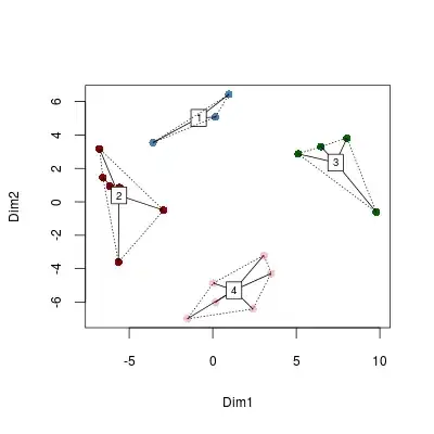
  3. Plot the result using MDS or PCA - but I am unsure of how steps 2 and 3 relate (cmdscale).

I've checked out questions here, here and here (with the last one being of most use).

Community
  • 1
  • 1
slotishtype
  • 2,715
  • 7
  • 32
  • 47

2 Answers2

32

Did you mean something like this? Sorry but i know nothing about HTML5 Canvas, only R... But I hope it helps...

First I cluster the data using kmeans (note that I did not cluster the distance matrix), than I compute the distance matix and plot it using cmdscale. Then I add colors to the MDS-plot that correspond to the groups identified by kmeans. Plus some nice additional graphical features.

You can access the coordinates from the object created by cmdscale.

### some sample data
require(vegan)
data(dune)

# kmeans
kclus <- kmeans(dune,centers= 4, iter.max=1000, nstart=10000)

# distance matrix
dune_dist <- dist(dune)

# Multidimensional scaling
cmd <- cmdscale(dune_dist)

# plot MDS, with colors by groups from kmeans
groups <- levels(factor(kclus$cluster))
ordiplot(cmd, type = "n")
cols <- c("steelblue", "darkred", "darkgreen", "pink")
for(i in seq_along(groups)){
  points(cmd[factor(kclus$cluster) == groups[i], ], col = cols[i], pch = 16)
}

# add spider and hull
ordispider(cmd, factor(kclus$cluster), label = TRUE)
ordihull(cmd, factor(kclus$cluster), lty = "dotted")

enter image description here

EDi
  • 13,160
  • 2
  • 48
  • 57
  • 1
    Thanks @EDi, that is really great. So, just to clarify, you cluster and then build a similarity matirx. You then use MDS to position the points in 2D and THEN you colour the points by their relationships to the cluster. Brilliant. If you have a chance, could you explain what this does: groups <- levels(factor(kclus$cluster)) – slotishtype Jan 26 '12 at 16:37
  • 1
    see my edit. groups is just an objekt that contains the names of the groups, only used for the for-loop. – EDi Jan 26 '12 at 16:41
  • Ok I see your edit. One last question, can you cluster the distance matrix or is that a crazy move? Sorry, learning at the moment and just working my way through things. – slotishtype Jan 26 '12 at 16:53
0

Here you can find one graph to analyze cluster results, "coordinate plot", within "clusplot" package.

It is not based on PCA. It uses function scale to have all the variables means in a range of 0 to 1, so you can compare which cluster holds the max/min average for each variable.

install.packages("devtools") ## To be able to download packages from github
library(devtools)
install_github("pablo14/clusplus")
library(clusplus)

## Create k-means model with 3 clusters
fit_mtcars=kmeans(mtcars,3)

## Call the function
plot_clus_coord(fit_mtcars, mtcars)

This post explains how to use it.

Pablo Casas
  • 868
  • 13
  • 15