63

What is your best practical user-friendly user-interface design or principle?

Please submit those practices that you find actually makes things really useful - no matter what - if it works for your users, share it!


Summary/Collation

Principles

  1. KISS.
  2. Be clear and specific in what an option will achieve: for example, use verbs that indicate the action that will follow on a choice (see: Impl. 1).
  3. Use obvious default actions appropriate to what the user needs/wants to achieve.
  4. Fit the appearance and behavior of the UI to the environment/process/audience: stand-alone application, web-page, portable, scientific analysis, flash-game, professionals/children, ...
  5. Reduce the learning curve of a new user.
  6. Rather than disabling or hiding options, consider giving a helpful message where the user can have alternatives, but only where those alternatives exist. If no alternatives are available, its better to disable the option - which visually then states that the option is not available - do not hide the unavailable options, rather explain in a mouse-over popup why it is disabled.
  7. Stay consistent and conform to practices, and placement of controls, as is implemented in widely-used successful applications.
  8. Lead the expectations of the user and let your program behave according to those expectations.
  9. Stick to the vocabulary and knowledge of the user and do not use programmer/implementation terminology.
  10. Follow basic design principles: contrast (obviousness), repetition (consistency), alignment (appearance), and proximity (grouping).

Implementation

  1. (See answer by paiNie) "Try to use verbs in your dialog boxes."
  2. Allow/implement undo and redo.

References

  1. Windows Vista User Experience Guidelines [http://msdn.microsoft.com/en-us/library/aa511258.aspx]
  2. Dutch websites - "Drempelvrij" guidelines [http://www.drempelvrij.nl/richtlijnen]
  3. Web Content Accessibility Guidelines (WCAG 1.0) [http://www.w3.org/TR/WCAG10/]
  4. Consistence [http://www.amazon.com/Design-Everyday-Things-Donald-Norman/dp/0385267746]
  5. Don't make me Think [http://www.amazon.com/Dont-Make-Me-Think-Usability/dp/0321344758/ref=pdbbssr_1?ie=UTF8&s=books&qid=1221726383&sr=8-1]
  6. Be powerful and simple [http://msdn.microsoft.com/en-us/library/aa511332.aspx]
  7. Gestalt design laws [http://www.squidoo.com/gestaltlaws]
Stephen Kennedy
  • 20,585
  • 22
  • 95
  • 108
slashmais
  • 7,069
  • 9
  • 54
  • 80
  • It's a rather all-encompassing question... zone in a little bit more.. I posted MVP first.. thinking you're interested in UI design alternatives. – Gishu Sep 18 '08 at 08:01
  • My aim is in the end to glean what are used in the field - not the text-book academic views, but practices that actually makes things really useful. – slashmais Sep 18 '08 at 09:31
  • Related: *[What are some good usability guidelines an average developer should follow?](http://stackoverflow.com/questions/51050/what-are-some-good-usability-guidelines-an-average-developer-should-follow)* – Peter Mortensen Feb 03 '12 at 12:09
  • Related question: http://stackoverflow.com/questions/51050/what-are-some-good-usability-guidelines-an-average-developer-should-follow – Marcio Aguiar Sep 18 '08 at 07:59

19 Answers19

58

I test my GUI against my grandma.

Victor
  • 23,172
  • 30
  • 86
  • 125
53

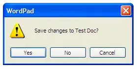
Try to use verbs in your dialog boxes.

It means use

alt text

instead of

alt text

MattH
  • 121
  • 8
kzotin
  • 5,365
  • 3
  • 29
  • 36
  • I like this too, but I noticed you'll get allot of discussion from older developers. – Davy Landman Sep 18 '08 at 08:25
  • 26
    Yeah u are right about ingoring text! But - users dont read title and text, they read button captions! – kzotin Sep 19 '08 at 10:05
  • So you say the word "save" is not a verb? :) – Spoike Oct 06 '08 at 14:45
  • 10
    Instead of 3 words on second dialog ("Save changes to") there are 22 on first one - nobody will read this. However, captions on first one are so much better! – ya23 Oct 24 '08 at 12:55
  • he meant to compare tbe button text "save / don't save" (which i think is better) to "yes / no". – Lucas Feb 02 '09 at 17:15
  • 1
    i also find yes/no/cancel much more logical then save/cancel/no save ... i.e. yes/opposite/cancel instead of yes/cancel/opposite of yes ... – Rook Dec 10 '09 at 17:56
  • 8
    Most people just read the button text - something like Yes/No/cancel could be referring to anything, but Save/Don't Save is very clear what you are doing. It is fine to have additional text above the buttons, because if someone sees Save/Don't Save and was expecting something else (say about printing), then they will stop and read the text. You just can't expect the normal use-case to be the user reading all the text in your dialog. – Tim Dec 09 '10 at 15:24
  • @Idigas Logical placement in this context fails. The reason why yes/cancel/opposite of yes is better is to compensate for mistakes. If a user accidentally misses the affirmative button and clicks the one next to it, in a Y/C/O arrangement, they've just cancelled their close action; in a Y/O/C arrangement, they've confirmed their close action without saving, and lost all their changes. – Travis Nov 08 '13 at 20:43
  • Links are dead... Please attach them as images not links so they dont disappear – ifma Aug 22 '17 at 15:06
27

Follow basic design principles

  • Contrast - Make things that are different look different
  • Repetition - Repeat the same style in a screen and for other screens
  • Alignment - Line screen elements up! Yes, that includes text, images, controls and labels.
  • Proximity - Group related elements together. A set of input fields to enter an address should be grouped together and be distinct from the group of input fields to enter credit card info. This is basic Gestalt Design Laws.
Craig Pickering
  • 1,184
  • 1
  • 12
  • 16
  • 2
    Robin Williams "The Non-Designer's Design Book: Design and Typographic Principles for the Visual Novice" covers these principles in a great way! http://goo.gl/qoG0Q – Chris Hayes Jun 29 '11 at 23:45
  • 4
    Like the acronym. When you're finished, do you say it looks like CRAP :p ? – James P. Mar 23 '13 at 05:35
  • 1
    @Chris There's now a newer (4th, 2014) edition of the [Williams book](https://www.amazon.com/Non-Designers-Design-Book-4th/dp/0133966151/). – bitFlipper Jun 23 '16 at 00:12
25

Never ask "Are you sure?". Just allow unlimited, reliable undo/redo.

Jörg W Mittag
  • 363,080
  • 75
  • 446
  • 653
  • 9
    You're right, but I don't think this is realistic. Implementing a rollback often require a lot of effort. – Dimitri C. Mar 12 '10 at 08:13
  • @Dimitri C.: Not nearly as much if you build it into the design from day -1. In a text editor, for example, you could just create a hidden directory and use Mercurial/Git/whatever to keep track of potentially destructive operations. The Command Software Design Pattern is also helpful. Google Mail is a nice example: have noticed that if you delete a thread there is no dialog box? Instead, there is a small notification bar which says something like: "You just moved a thread to the trashcan. [More Information] [Undo]" – Jörg W Mittag Mar 12 '10 at 14:00
11

Try to think about what your user wants to achieve instead of what the requirements are.

The user will enter your system and use it to achieve a goal. When you open up calc you need to make a simple fast calculation 90% of the time so that's why by default it is set to simple mode.

So don't think about what the application must do but think about the user which will be doing it, probably bored, and try to design based on what his intentions are, try to make his life easier.

Jorge Córdoba
  • 51,063
  • 11
  • 80
  • 130
8

If you're doing anything for the web, or any front-facing software application for that matter, you really owe it to yourself to read...

Don't make me think - Steve Krug

Ali Parr
  • 4,737
  • 3
  • 31
  • 35
7

Breadcrumbs in webapps:
Tell -> The -> User -> Where -> She -> Is in the system

This is pretty hard to do in "dynamic" systems with multiple paths to the same data, but it often helps navigate the system.

kosoant
  • 11,619
  • 7
  • 31
  • 37
  • 2
    Jared Spool did some user testing on this and learned that only coputer savvy people use breadcrumbs. Normal visitors don't get this concept. – Silviu Postavaru Jun 02 '09 at 09:48
  • 1
    It might be so. But a quick read on Spool's article http://www.uie.com/brainsparks/2005/09/26/value-of-breadcrumbs/ gives me the impression that he thinks that breadcrumbs are just a navigational tool for the user. In my opinion they're also a good "page heading". Also, Spool's article is far from scientific... – kosoant Jun 03 '09 at 06:00
  • I think these would actually be pretty good in some desktop apps too! – paulm Feb 06 '13 at 19:59
6

I try to adapt to the environment.

When developing for an Windows application, I use the Windows Vista User Experience Guidelines but when I'm developing an web application I use the appropriate guidelines, because I develop Dutch websites I use the "Drempelvrij" guidelines which are based on the Web Content Accessibility Guidelines (WCAG 1.0) by the World Wide Web Consortium (W3C).

The reason I do this is to reduce the learning curve of a new user.

Davy Landman
  • 15,109
  • 6
  • 49
  • 73
6

I would recommend to get a good solid understanding of GUI design by reading the book The Design of Everyday Things. Although the main printable is a comment from Joel Spolsky: When the behavior of the application differs to what the user expects to happen then you have a problem with your graphical user interface.

The best example is, when somebody swaps around the OK and Cancel button on some web sites. The user expects the OK button to be on the left, and the Cancel button to be on the right. So in short, when the application behavior differs to what the user expects what to happen then you have a user interface design problem.

Although, the best advice, in no matter what design or design pattern you follow, is to keep the design and conventions consistent throughout the application.

Peter Mortensen
  • 30,738
  • 21
  • 105
  • 131
Chad
  • 2,938
  • 3
  • 27
  • 38
3

Avoid asking the user to make choices whenever you can (i.e. don't create a fork with a configuration dialog!)

For every option and every message box, ask yourself: can I instead come up with some reasonable default behavior that

  • makes sense?
  • does not get in the user's way?
  • is easy enough to learn that it costs little to the user that I impose this on him?

I can use my Palm handheld as an example: the settings are really minimalistic, and I'm quite happy with that. The basic applications are well designed enough that I can simply use them without feeling the need for tweaking. Ok, there are some things I can't do, and in fact I sort of had to adapt myself to the tool (instead of the opposite), but in the end this really makes my life easier.

This website is another example: you can't configure anything, and yet I find it really nice to use.

Reasonable defaults can be hard to figure out, and simple usability tests can provide a lot of clues to help you with that.

Carl Seleborg
  • 13,125
  • 11
  • 58
  • 70
3

Show the interface to a sample of users. Ask them to perform a typical task. Watch for their mistakes. Listen to their comments. Make changes and repeat.

Kramii
  • 8,379
  • 4
  • 32
  • 38
  • Make sure it's a representative sample of your customers. We use an intern for this and we have to give them special instructions to include the over 30 crowd. – Clay Nichols Nov 22 '08 at 22:27
2

When constructing error messages make the error message be the answers to these 3 questions (in that order):

  1. What happened?

  2. Why did it happen?

  3. What can be done about it?

This is from "Human Interface Guidelines: The Apple Desktop Interface" (1987, ISBN 0-201-17753-6), but it can be used for any error message anywhere. There is an updated version for Mac OS X. The Microsoft page User Interface Messages says the same thing: "... in the case of an error message, you should include the issue, the cause, and the user action to correct the problem."

Also include any information that is known by the program, not just some fixed string. E.g. for the "Why did it happen" part of the error message use "Raw spectrum file L:\refDataForMascotParser\TripleEncoding\Q1LCMS190203_01Doub leArg.wiff does not exist" instead of just "File does not exist".

Contrast this with the infamous error message: "An error happend.".

Peter Mortensen
  • 30,738
  • 21
  • 105
  • 131
2

The Design of Everyday Things - Donald Norman

A canon of design lore and the basis of many HCI courses at universities around the world. You won't design a great GUI in five minutes with a few comments from a web forum, but some principles will get your thinking pointed the right way.

--

MC

1
  1. Use discreet/simple animated features to create seamless transitions from one section the the other. This helps the user to create a mental map of navigation/structure.

  2. Use short (one word if possible) titles on the buttons that describe clearly the essence of the action.

  3. Use semantic zooming where possible (a good example is how zooming works on Google/Bing maps, where more information is visible when you focus on an area).

  4. Create at least two ways to navigate: Vertical and horizontal. Vertical when you navigate between different sections and horizontal when you navigate within the contents of the section or subsection.

  5. Always keep the main options nodes of your structure visible (where the size of the screen and the type of device allows it).

  6. When you go deep into the structure always keep a visible hint (i.e. such as in the form of a path) indicating where you are.

  7. Hide elements when you want the user to focus on data (such as reading an article or viewing a project). - however beware of point #5 and #4.

Peter Mortensen
  • 30,738
  • 21
  • 105
  • 131
vasilis
  • 1
  • 1
1

(Stolen from Joel :o) )

Don't disable/remove options - rather give a helpful message when the user click/select it.

slashmais
  • 7,069
  • 9
  • 54
  • 80
  • 1
    I also read that article, but think it works for most of the time, but not always. In some scenario you have to hide/disable menu options. Think about this: you have the Paste menupoint always visible and enabled and when you click on it, it will show a message: You have nothing to paste. :-) – Biri Sep 18 '08 at 08:03
  • 1
    One of the rare occasions where I completely disagree with Joel: Disabling menu options gives a direct feedback - 'not available now'. Save the user the action (and the disappointment) of having to click on a menu to find out. Hiding menu options is bad, though – Treb Oct 04 '08 at 07:59
1

As my data structure professor pointed today: Give instructions on how your program works to the average user. We programmers often think we're pretty logical with our programs, but the average user probably won't know what to do.

Peter Mortensen
  • 30,738
  • 21
  • 105
  • 131
marioBonales
  • 91
  • 2
  • 6
0

With GUIs, standards are kind of platform specific. E.g. While developing GUI in Eclipse this link provides decent guideline.

Hammad
  • 23
  • 7
0

I've read most of the above and one thing that I'm not seeing mentioned:

If users are meant to use the interface ONCE, showing only what they need to use if possible is great.

If the user interface is going to be used repeatedly by the same user, but maybe not very often, disabling controls is better than hiding them: the user interface changing and hidden features not being obvious (or remembered) by an occasional user is frustrating to the user.

If the user interface is going to be used VERY REGULARLY by the same user (and there is not a lot of turnover in the job i.e. not a lot of new users coming online all the time) disabling controls is absolutely helpful and the user will become accustomed to the reasons why things happen but preventing them from using controls accidentally in improper contexts appreciated and prevents errors.

Just my opinion, but it all goes back to understanding your user profile, not just what a single user session might entail.

0

Be Powerful and Simple

Oh, and hire a designer / learn design skills. :)

Nidonocu
  • 12,476
  • 7
  • 42
  • 43