25

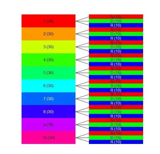
I use lme4 in R to fit the mixed model

lmer(value~status+(1|experiment)))

where value is continuous, status(N/D/R) and experiment are factors, and I get

Linear mixed model fit by REML 
Formula: value ~ status + (1 | experiment) 
  AIC   BIC logLik deviance REMLdev
 29.1 46.98 -9.548    5.911    19.1
Random effects:
 Groups     Name        Variance Std.Dev.
 experiment (Intercept) 0.065526 0.25598 
 Residual               0.053029 0.23028 
Number of obs: 264, groups: experiment, 10

Fixed effects:
            Estimate Std. Error t value
(Intercept)  2.78004    0.08448   32.91
statusD      0.20493    0.03389    6.05
statusR      0.88690    0.03583   24.76

Correlation of Fixed Effects:
        (Intr) statsD
statusD -0.204       
statusR -0.193  0.476

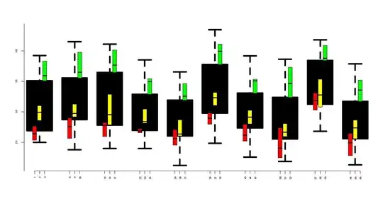
I would like to graphically represent the fixed effects evaluation. However the seems to be no plot function for these objects. Is there any way I can graphically depict the fixed effects?

ECII
  • 10,297
  • 18
  • 80
  • 121

4 Answers4

22

Using coefplot2 (on r-forge):

Stealing the simulation code from @Thierry:

set.seed(101)
dataset <- expand.grid(experiment = factor(seq_len(10)), 
    status = factor(c("N", "D", "R"), levels = c("N", "D", "R")), 
    reps = seq_len(10))
X <- model.matrix(~status,dataset)
dataset <- transform(dataset, 
    value=rnorm(nrow(dataset), sd = 0.23) +   ## residual
    rnorm(length(levels(experiment)), sd = 0.256)[experiment] +  ## block effects
    X %*% c(2.78,0.205,0.887))  ## fixed effects

Fit model:

library(lme4)
model <- lmer(value~status+(1|experiment), data = dataset)

Plot:

install.packages("coefplot2",repos="http://r-forge.r-project.org")
library(coefplot2)
coefplot2(model)

edit:

I have frequently been having problems with the R-Forge build. This fallback should work if the R-Forge build is not working:

install.packages("coefplot2",
  repos="http://www.math.mcmaster.ca/bolker/R",
  type="source")

Note that the coda dependency must already be installed.

Ben Bolker
  • 211,554
  • 25
  • 370
  • 453
  • Thanks for your contribution Ben. I see you simulate a dataset, build a model and use the coefplot2. However I cant seem to find coefplot2 in CRAN. Is there another repository for this packages? – ECII Feb 25 '12 at 23:49
  • yes -- see my comment above, and the (edited) `install.packages()` command in the code above that references r-forge (I'm being a bonehead today). It's on r-forge ... – Ben Bolker Feb 25 '12 at 23:59
  • I can see that the current status of the coefplot 2 package is: "Failed to build" and it's not possible to install it on R 2.15.2. Has further development been abandoned? And for which R vers. is it usable on? – ego_ Nov 12 '12 at 12:58
  • What's the current (2018) status on `coefplot2`? Is this still your go-to or is there now a reliable package in CRAN that performs equally well or better? – theforestecologist May 21 '18 at 16:01
  • 1
    I use `dotwhisker` + `broom` (CRAN) or `broom.mixed` (Github) – Ben Bolker May 21 '18 at 16:50
  • @BenBolker Is it possible to join two GLMMs in the same plot using this function? – mto23 Jun 10 '19 at 08:19
17

I like the coefficient confidence interval plots, but it may be useful to consider some additional plots to understand the fixed effects..

Stealing the simulation code from @Thierry:

library(ggplot2)
library(lme4)
library(multcomp)
dataset <- expand.grid(experiment = factor(seq_len(10)), status = factor(c("N", "D", "R"), levels = c("N", "D", "R")), reps = seq_len(10))
dataset$value <- rnorm(nrow(dataset), sd = 0.23) + with(dataset, rnorm(length(levels(experiment)), sd = 0.256)[experiment] + ifelse(status == "D", 0.205, ifelse(status == "R", 0.887, 0))) + 2.78
model <- lmer(value~status+(1|experiment), data = dataset)

Get a look at the structure of the data...looks balanced..

library(plotrix); sizetree(dataset[,c(1,2)])

enter image description here

It might be interesting to track the correlation between fixed effects, especially if you fit different correlation structures. There's some cool code provided at the following link...

http://hlplab.wordpress.com/2012/03/20/correlation-plot-matrices-using-the-ellipse-library/

my.plotcorr(
matrix(c(1,     .891,   .891,
        .891,   1,      .891,
        .891,   .891,   1), nrow=3)
)

very basic implementation of function

Finally it seems relevant to look at the variability across the 10 experiments as well as the variability across "status" within experiments. I'm still working on the code for this as I break it on unbalanced data, but the idea is...

My2Boxes(m=4,f1=dataset$experiment,f2=dataset$status,x=dataset$value,color=c("red","yellow","green"))

enter image description here

Finally the already mentioned Piniero and Bates (2000) book strongly favored lattice from what little I've skimmed.. So you might give that a shot. Maybe something like plotting the raw data...

lattice::xyplot(value~status | experiment, groups=experiment, data=dataset, type=c('p','r'), auto.key=F)

enter image description here

And then plotting the fitted values...

lattice::xyplot(fitted(model)~status | experiment, groups=experiment, data=dataset, type=c('p','r'), auto.key=F)

enter image description here

Wes McClintick
  • 497
  • 5
  • 14
15

Here are a few suggestions.

library(ggplot2)
library(lme4)
library(multcomp)
# Creating datasets to get same results as question
dataset <- expand.grid(experiment = factor(seq_len(10)),
                       status = factor(c("N", "D", "R"),
                       levels = c("N", "D", "R")),
                       reps = seq_len(10))
dataset$value <- rnorm(nrow(dataset), sd = 0.23) + 
                   with(dataset, rnorm(length(levels(experiment)),
                        sd = 0.256)[experiment] +
                   ifelse(status == "D", 0.205,
                          ifelse(status == "R", 0.887, 0))) +
                   2.78

# Fitting model
model <- lmer(value~status+(1|experiment), data = dataset)

# First possibility
tmp <- as.data.frame(confint(glht(model, mcp(status = "Tukey")))$confint)
tmp$Comparison <- rownames(tmp)
ggplot(tmp, aes(x = Comparison, y = Estimate, ymin = lwr, ymax = upr)) +
  geom_errorbar() + geom_point()

# Second possibility
tmp <- as.data.frame(confint(glht(model))$confint)
tmp$Comparison <- rownames(tmp)
ggplot(tmp, aes(x = Comparison, y = Estimate, ymin = lwr, ymax = upr)) +
  geom_errorbar() + geom_point()

# Third possibility
model <- lmer(value ~ 0 + status + (1|experiment), data = dataset)
tmp <- as.data.frame(confint(glht(model))$confint)
tmp$Comparison <- rownames(tmp)
ggplot(tmp, aes(x = Comparison, y = Estimate, ymin = lwr, ymax = upr)) +
  geom_errorbar() + geom_point()
Arthur Spoon
  • 442
  • 5
  • 18
Thierry
  • 18,049
  • 5
  • 48
  • 66
  • 1
    Could you explain the use of `glht` in your code? I read that it is a function for testing [General Linear Hypotheses](https://www.rdocumentation.org/packages/multcomp/versions/1.4-6/topics/glht), which feels a little bit unnecessary here... I also just tested this with a more complex dataset/model combination with more than one fixed effect, it doesn't give me the `Comparison` names anymore... Is there a way to make your code more general? – Arthur Spoon Aug 06 '17 at 12:42
3

This answer illustrates the newer dotwhisker::dwplot + broom.mixed solution.

Adding one more variable in the simulation:

dataset <- transform(dataset, 
    value=rnorm(nrow(dataset), sd = 0.23) +   ## residual
    rnorm(length(levels(experiment)), sd = 0.256)[experiment] +  ## block effects
        X %*% c(2.78,0.205,0.887),
    var2=rnorm(nrow(dataset)))  ## fixed effects

Fitting two different models:

library(lme4)
model <- lmer(value~status+var2 + (1|experiment), data = dataset)
model2 <- update(model, . ~ . -var2)

Plotting:

library(broom.mixed)
library(dotwhisker)
dwplot(list(first=model,second=model2), effects="fixed")+
    geom_vline(xintercept=0, lty=2)

(using effects="fixed" gets us just the fixed-effect parameters, dropping the intercept by default).

broom.mixed has many other options. When I want to do something complex I may use ggplot + ggstance::geom_pointrangeh (+ position="position_dodgev") to make my own custom plot rather than relying on dotwhisker::dwplot().

Ben Bolker
  • 211,554
  • 25
  • 370
  • 453