18

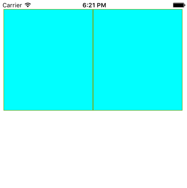
I have a regular layout that looks that this: enter image description here

This layout is done using CSS floats.

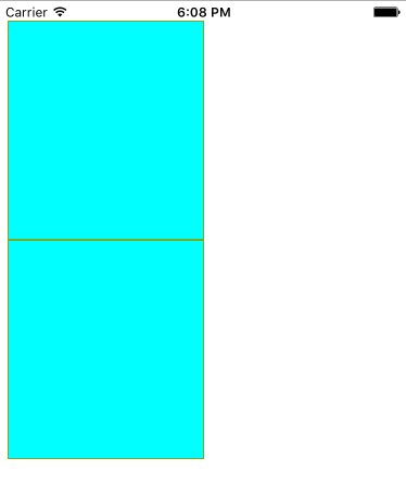
When I switch to mobile, I want my layout to do this:

enter image description here

That is, I want my sidebar to be below the content. I can do this using absolute positioning, but I was wondering, is there a way to do this using floats so that if my content changes the sidebar will adjust for the height difference?

redconservatory
  • 21,438
  • 40
  • 120
  • 189

5 Answers5

13

Here's how I would do it. The DIVs are floated on your desktop version, but displayed on top of eachother (default block display) on mobile.

CSS:

#sidebar {
    float: left;
    width: 30%;
}

#content {
    float: right;
    width: 70%;
}

.mobile #sidebar,
.mobile #content {
    float: none;
    display: block;
    margin-bottom: 15px;
}

Standard HTML:

<body>
<div id="content">
...
</div>
<div id="sidebar">
...
</div>
</body>

Mobile HTML:

<body class="mobile">
<div id="content">
...
</div>
<div id="sidebar">
...
</div>
</body>
Patrick Moore
  • 13,251
  • 5
  • 38
  • 63
5

Media query, flex container and its order property should do the trick:

@media(max-width:767px) {
    .container {
        display: flex;
        flex-wrap: wrap;
    }
    .content {
        order: 1;
    }
    .sidebar {
        order: 2;
    }
}

Make sure to replace max-width value with your own mobile breakpoint.

Browser support for flex is also pretty decent now.

tomyam
  • 369
  • 4
  • 9
3

Assuming:

  1. The two elements have a shared parent element
  2. The content div appears BEFORE the sidebar in the source

You don't have to change the source order, you can achieve this with floats by default.

That is, in your desktop layout:

#content {
   float: right;
   width: 60%;
}

#sidebar {
   float: left;
   width: 40%;
}

Then, for mobile (using media queries or whatever other mechanism):

#content, #sidebar {
   float: none;
   clear: both;
 }
chipcullen
  • 6,840
  • 1
  • 21
  • 17
0

Actually, I wanted to set layout like first layout so I had used:

        .iconHome{
            float: left;
            border: 1px solid #73AD21;
            width: 50%;
            height: 100px;
            background-color: aqua;

            /*margin: 50px;*/
        }

    <div class="iconHome1">


    </div>

    <div class="iconHome1">


    </div>

The result is the second layout!!!There fore, I think default "float:left" is not be set on mobile. You can use above way. Hope help you

Edit:

I tried some codes:

        .iconHome1{
            float: left;
            border: 1px solid #73AD21;
            width: 50%;/*185px*/
            height: 200px;
            background-color: aqua;
            margin: 0;/*0 0 0 -7px*/
            /*clear: left;*/
        }

enter image description here

That means "width" & "margin" will effect to layout,although you have to set "float:left". Fix "width:49%", result:

enter image description here

AmyNguyen
  • 437
  • 6
  • 10
0

Inside your mobile media queries set float:none.

Litek
  • 4,888
  • 1
  • 24
  • 28