WPF doesn't do primitive font-based scaling because it's... well, primitive. You can see it in your own screenshots.
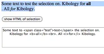
Here's your "WinForms, before changing font" screenshot. Take a look at how much space there is between "sat on a log." and the right edge of the form.

And here's your "WinForms, after changing font" screenshot. Notice how much less margin you have after "scaling".

If you hadn't left all that extra space, then your label would be cut off with the new font. And with some fonts, it would be cut off even though you did leave all that extra space. That's what I mean when I say WinForms' scaling is "primitive". WinForms picks a single scale to apply to everything, and that scale is not chosen with any awareness of your content; it's based on average statistics for the font, which can and will fall apart once you start talking about specifics.
WPF doesn't hobble you with something that primitive. It gives you an amazingly powerful layout system, where it would be trivial to make a window that scales beautifully. But instead, you're choosing to cripple that layout system by using hard-coded sizes. Stop it.
Hard-coded sizes have two huge problems:
- They don't adapt to different fonts. You've noticed this already.
- They don't adapt to different content. (What happens when you want to make a German version of your app, and the German text doesn't fit into your hard-coded button size?)
Hard-coded sizes just don't adapt. To anything. You had to use them in WinForms because that's all WinForms supported. But WPF gives you a proper layout system, so you don't have to (and shouldn't) use anything that crude.
All you need is this:
- A
Window with SizeToContent="WidthAndHeight". That way, the window will be exactly the right size to accommodate the text and button, no matter what font or language you use.
- Since you only have two UI elements, and one is above the other, you would put a
StackPanel inside your Window.
- Inside the
StackPanel, you need:
- A
Label or TextBlock to show your text, with the text in Content (Label) or Text (TextBlock); and
- A
Button with HorizontalAlignment="Right", and the text in Content.
- Set some
Margins on the StackPanel, TextBlock, and Button to space things out to your liking.
That's it. Don't set any other properties on anything -- especially not Width or Height.
Now, if you change your font, the window and the button will still be exactly the right size, and won't cut off your text. If you localize your app into a different language, the window and the button will be exactly the right size, and won't cut off your text. Stop fighting WPF, and it will give you great results.
If you later want to make your layout more advanced, you could consider things like:
- If you want the button to be a little wider (to have more breathing room before and after the text), try playing with the
Padding, or set a MinWidth and MinHeight. (Don't use Width or Height if your button contains text. You might consider using them if your button only contains an image, but maybe not even then.)
- If you're worried that the font might make the window so large that it no longer fits on the user's screen, and want to enable word-wrapping, then play around with
MaxWidth and TextWrapping.
WPF's layout system is amazingly powerful. Learn it. Don't fight it by using hard-coded layouts and then complaining that your hard-coded layouts suck.

