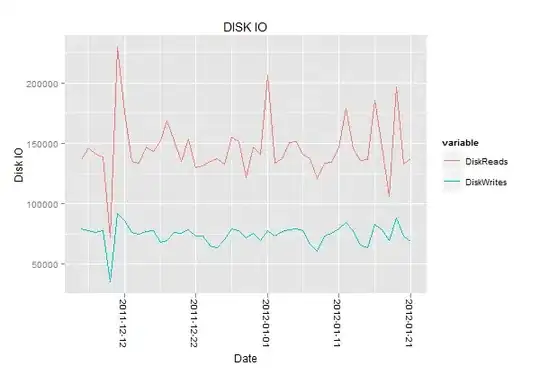
I have a data frame that has dates, disk reads and disk writes data. I am able to create the stack chart but the dates on xaxis are not readable. Is there an option in qplot to scale the graph or dont display all of the dates or something? I've been looking at this now for a long time, I couldn't find an answer.
I melt it first
app1_diskIO.M<-melt(app1_diskIO.M, id=c("Date2"))

qplot(x = factor(Date2), y = value, data = app1_diskIO.M, geom = "bar", fill = variable, main="DISK IO", xlab="Date", ylab="Disk IO")
Data frame looks like this:
       Date2 DiskReads DiskWrites
1  2011-12-06  136382.2    78961.0
2  2011-12-07  146277.0    77802.0
3  2011-12-08  141123.6    76219.0
4  2011-12-09  139219.8    77649.4
5  2011-12-10   72101.1    35258.6
6  2011-12-11  229445.9    92316.6
7  2011-12-12  175886.7    86087.0
8  2011-12-13  134958.3    76605.6
9  2011-12-14  133972.1    75141.4
10 2011-12-15  147175.2    77189.7
11 2011-12-16  143542.3    78155.9
12 2011-12-17  152579.1    68395.2
13 2011-12-18  168667.7    69720.1
14 2011-12-19  152328.6    75994.2
15 2011-12-20  135061.8    75271.6
16 2011-12-21  153455.0    78197.5
17 2011-12-22  130020.8    73369.7
18 2011-12-23  131423.6    73484.9
19 2011-12-24  135285.6    65081.4
20 2011-12-25  137185.4    63334.8
21 2011-12-26  132612.9    70484.4
22 2011-12-27  155396.9    79239.1
23 2011-12-28  151587.5    77986.5
24 2011-12-29  122076.5    71575.5
25 2011-12-30  146888.8    75376.3
26 2011-12-31  141285.5    69737.8
27 2012-01-01  206306.6    78059.4
28 2012-01-02  134002.4    73062.5
29 2012-01-03  137753.8    76947.4
30 2012-01-04  150655.8    78836.3
31 2012-01-05  151750.3    79300.9
32 2012-01-06  141464.8    77529.4
33 2012-01-07  137667.3    66344.8
34 2012-01-08  120998.5    60582.4
35 2012-01-09  133422.4    73688.3
36 2012-01-10  134247.7    75664.5
37 2012-01-11  146243.5    79042.2
38 2012-01-12  178738.2    84199.7
39 2012-01-13  145564.8    77908.2
40 2012-01-14  135966.8    65900.9
41 2012-01-15  136448.4    63339.9
42 2012-01-16  186109.9    83348.6
43 2012-01-17  146906.5    78645.6
44 2012-01-18  106343.0    69313.6
45 2012-01-19  197205.6    88411.6
46 2012-01-20  132950.1    73078.0
47 2012-01-21  137488.1    68711.5