0

Am I missing something, if I just have a standard TextView and set its text size over a set number the gravity to center the text stops working, see below example.

Gravity working:

 <TextView
    android:layout_width="fill_parent"
    android:layout_height="fill_parent"
    android:gravity="center"
    android:text="B"
    android:textSize="472sp" />
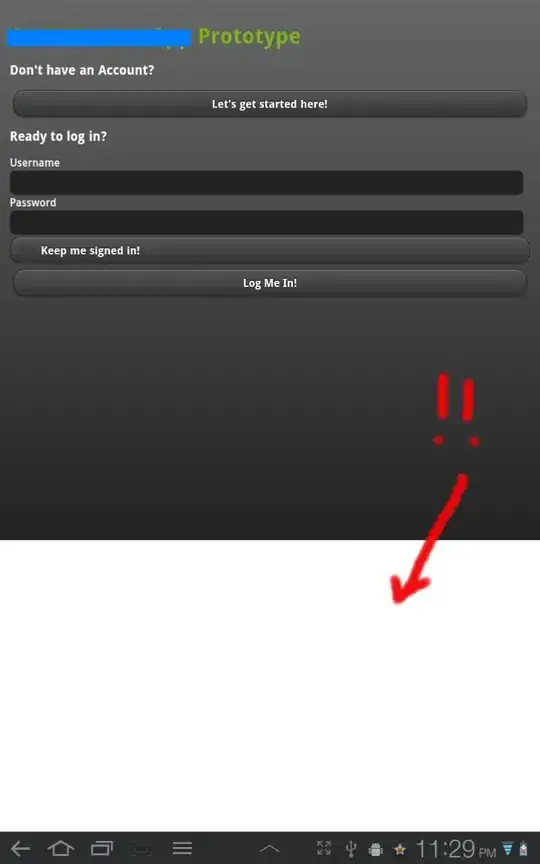
Gravity working


Gravity not working

 <TextView
    android:layout_width="fill_parent"
    android:layout_height="fill_parent"
    android:gravity="center"
    android:text="B"
    android:textSize="572sp" />
Gravity not working

This happens on a device as well as the emulator / preview.

Blundell
  • 75,855
  • 30
  • 208
  • 233

1 Answers1

2

I would have guessed it's because the total size of the TextView including implicit padding (such as may exist) is simply larger than your screen, so the field is pinned at the top and the visible portion is forced down the screen. What happens if you put it onto a bigger display? Edit: In the 572sp example, it comes pretty close to centered in portrait mode on a tablet.

Sparky
  • 8,437
  • 1
  • 29
  • 41
  • AH ok. Yeah putting it on a 5inch it's centered again. So the space around the letter 'B' I guess thats part of the font? Because my textviews padding is 0. – Blundell Mar 18 '12 at 23:02
  • Did you apply custom styling to remove any padding that might have been in the parent style? – Sparky Mar 18 '12 at 23:04
  • 2
    My guess is the font itself has no intrinsic padding, but maybe the text field does. – Sparky Mar 18 '12 at 23:05
  • I stuck `android:padding="0dip"` on it with no effect, still that big gap down the left / top. – Blundell Mar 18 '12 at 23:10
  • See for example attributes like android:includeFontPadding and android:lineSpacingExtra. – Sparky Mar 18 '12 at 23:12
  • I'm pretty sure you can also play dirty tricks like specifying negative padding. – Sparky Mar 18 '12 at 23:13
  • 1
    Tried all those attributes with no effect. Only thing I could do is `layout_margin="-20dip"` but that number needs to be dynamic. This guy reckons there is padding in the font that makes the most sense at the moment : http://stackoverflow.com/a/4769205/413127 – Blundell Mar 18 '12 at 23:33