132

How can I align two inline-blocks so that one is left and the other is right on the same line? Why is this so hard? Is there something like LaTeX's \hfill that can consume the space between them to achieve this?

I don't want to use floats because with inline-blocks I can line up the baselines. And when the window is too small for both of them, with inline-blocks I can just change the text-align to center and they will be centered one atop another. Relative(parent) + Absolute(element) positioning has the same problems as floats do.

The HTML5:

<header>
    <h1>Title</h1>
    <nav>
        <a>A Link</a>
        <a>Another Link</a>
        <a>A Third Link</a>
    </nav>
</header>

The css:

header {
    //text-align: center; // will set in js when the nav overflows (i think)
}

h1 {
    display: inline-block;
    margin-top: 0.321em;
}

nav {
    display: inline-block;
    vertical-align: baseline;
}

Thery're right next to each other, but I want the nav on the right.
a diagram

Charles
  • 50,943
  • 13
  • 104
  • 142
mk12
  • 25,873
  • 32
  • 98
  • 137
  • 1
    AFAIK the only way to solve this is to use floats or absolute positioning. You can achieve the same baseline position using margin-top on the nav. – powerbuoy Apr 22 '12 at 22:22
  • Just use margin-top and floats. It's not possible to do this without that or absolute positioning. – jdhartley Apr 22 '12 at 22:22
  • Use css media queries to change the css depending on the size of the viewport. You can use both `position: absolute` and `inline-block` – elclanrs Apr 22 '12 at 22:31

9 Answers9

170

Edit: 3 years has passed since I answered this question and I guess a more modern solution is needed, although the current one does the thing :)

1.Flexbox

It's by far the shortest and most flexible. Apply display: flex; to the parent container and adjust the placement of its children by justify-content: space-between; like this:

.header {
    display: flex;
    justify-content: space-between;
}

Can be seen online here - http://jsfiddle.net/skip405/NfeVh/1073/

Note however that flexbox support is IE10 and newer. If you need to support IE 9 or older, use the following solution:

2.You can use the text-align: justify technique here.

.header {
    background: #ccc; 
    text-align: justify; 

    /* ie 7*/  
    *width: 100%;  
    *-ms-text-justify: distribute-all-lines;
    *text-justify: distribute-all-lines;
}
 .header:after{
    content: '';
    display: inline-block;
    width: 100%;
    height: 0;
    font-size:0;
    line-height:0;
}

h1 {
    display: inline-block;
    margin-top: 0.321em; 

    /* ie 7*/ 
    *display: inline;
    *zoom: 1;
    *text-align: left; 
}

.nav {
    display: inline-block;
    vertical-align: baseline; 

    /* ie 7*/
    *display: inline;
    *zoom:1;
    *text-align: right;
}

The working example can be seen here: http://jsfiddle.net/skip405/NfeVh/4/. This code works from IE7 and above

If inline-block elements in HTML are not separated with space, this solution won't work - see example http://jsfiddle.net/NfeVh/1408/ . This might be a case when you insert content with Javascript.

If we don't care about IE7 simply omit the star-hack properties. The working example using your markup is here - http://jsfiddle.net/skip405/NfeVh/5/. I just added the header:after part and justified the content.

In order to solve the issue of the extra space that is inserted with the after pseudo-element one can do a trick of setting the font-size to 0 for the parent element and resetting it back to say 14px for the child elements. The working example of this trick can be seen here: http://jsfiddle.net/skip405/NfeVh/326/

skip405
  • 6,119
  • 2
  • 25
  • 28
  • 1
    Is there any way to stop it from making the banner taller though? I realize how this is working, so I would assume there isn't. – mk12 Apr 23 '12 at 20:18
  • This solution it's very elegant, altough extra height sucks, isn't there a workaround... to the workaround? it adds exactly 20 useless pixels :-( **edit**: possible workaround, specify height: NUMpx; on the container, this is very bad for a number of reasons. – Valerio Feb 14 '13 at 11:07
  • 1
    If you're generating your content with javascript, note that this solution only works if there is whitespace between the elements. You will need to insert a text node between the left/right elements or they will both stick to the left. – Stephen Nelson May 21 '13 at 02:13
  • @Valerio Coltrè, I found a workaround to this slight problem. The extra space will actually disappear if we set `font-size: 1px` to the parent container. Only now we will have to set the `font-size` back to normal for the child elements - like so: http://jsfiddle.net/skip405/NfeVh/326/ – skip405 May 27 '13 at 14:39
  • 1
    Would you mind to paste your code in here, as well? Links to external places have a habit of dying at some point, and if that happens, this otherwise useful answer will suddenly become useless. – O. R. Mapper Nov 27 '13 at 22:53
  • 5
    @ValerioColtrè I agree that the empty space is the most (and possibly, only!) annoying thing about this approach. Explicitly managing your `font-size` is rather undesirable. I propose a different solution. Note that the `.header:after` decorator adds one line of height equal to `font-size`. Luckily we know how much that is. It is exactly `1em`! So, [negative margins](http://www.smashingmagazine.com/2009/07/27/the-definitive-guide-to-using-negative-margins/) to the rescue! [This fiddle shows how](http://jsfiddle.net/NfeVh/792/). – Domi Oct 07 '14 at 11:58
  • I'm trying to do something similar in Firefox and it's not working. Two things that occur to me: 1. Isn't the correct CSS selector ::after, not :after? 2. The ::after selector inserts _content_ into the page, not an element. How can you set the width of content when it's not an element? Anyway, seems to be working for some, but I'm confused. – Graham Lea Apr 29 '15 at 07:41
  • "Every browser that supports the double colon (::) CSS3 syntax also supports just the (:) syntax, but IE 8 only supports the single-colon" https://css-tricks.com/almanac/selectors/a/after-and-before/ – Graham Lea Apr 29 '15 at 07:47
  • 1
    @skip405 Note: setting the line height to 0 on the wrapper element (header) and fixing the vertical-alignment of it's pseudo elem (vertical-align: top, say) can fix the extra space problem. We have to, of course, re-set the line-height on the parent elements, but it can be easier in many cases. http://jsfiddle.net/bencergazda/3gL8153n/7/ – bencergazda Oct 24 '16 at 11:14
  • @skip405 if I read the question correctly, OP wants to have both child items aligned on the same baseline. Maybe you want to consider adding this to your answer? Put it in a fiddle here: http://jsfiddle.net/c4pwtn5o/ - it is basically adding `align-items: baseline;` to `.header`. – Jan Papenbrock Nov 23 '16 at 21:54
  • @JanPapenbrock, thanks for suggestion. It does look on OP's image that the elements are on the same baseline. However the question itself was not about vertical alignment. Edits rejected (not by me, btw) – skip405 Nov 24 '16 at 07:44
  • @JanPapenbrock, more to that, the OP states quite clearly they can `line up the baselines`. Does it answer why your edits are rejected? No offence? – skip405 Nov 24 '16 at 07:48
  • I'm not personally attached to this improvement ;-) I just found myself in the need to adjust to baseline - and from the question's image I thought it was OPs need as well. So I thought it would be a good addition. Regarding the edit and the reasons for rejection I understood it was a concern of form (should have commented instead of edited) rather than content. – Jan Papenbrock Nov 24 '16 at 10:59
8

For both elements use

display: inline-block;

the for the 'nav' element use

float: right;
Sammy Aguns
  • 97
  • 1
  • 2
5

Taking advantage of @skip405's answer, I've made a Sass mixin for it:

@mixin inline-block-lr($container,$left,$right){
    #{$container}{        
        text-align: justify; 

        &:after{
            content: '';
            display: inline-block;
            width: 100%;
            height: 0;
            font-size:0;
            line-height:0;
        }
    }

    #{$left} {
        display: inline-block;
        vertical-align: middle; 
    }

    #{$right} {
        display: inline-block;
        vertical-align: middle; 
    }
}

It accepts 3 parameters. The container, the left and the right element. For example, to fit the question, you could use it like this:

@include inline-block-lr('header', 'h1', 'nav');
Pablo S G Pacheco
  • 2,550
  • 28
  • 28
3

If you don't want to use floats, you're going to have to wrap your nav:

<header>
<h1>Title</h1>
<div id="navWrap">
<nav>
    <a>A Link</a>
    <a>Another Link</a>
    <a>A Third Link</a>
</nav>
</div>
</header>

...and add some more specific css:

header {
//text-align: center; // will set in js when the nav overflows (i think)
width:960px;/*Change as needed*/
height:75px;/*Change as needed*/
}

h1 {
display: inline-block;
margin-top: 0.321em;
}

#navWrap{
position:absolute;
top:50px; /*Change as needed*/
right:0;
}

nav {
display: inline-block;
vertical-align: baseline;
}

You may need to do a little more, but that's a start.

maiorano84
  • 11,574
  • 3
  • 35
  • 48
2

New ways to align items right:

Grid:

.header {
        display:grid;
        grid-template-columns: 1fr auto;
    }

Demo

Bootstrap 4. Align right:

<div class="row">
      <div class="col">left</div>
      <div class="col">
          <div class="float-right">element needs to be right aligned</div>
      </div>
</div>

Demo

Ievgen
  • 4,261
  • 7
  • 75
  • 124
1

If you're already using JavaScript to center stuff when the screen is too small (as per your comment for your header), why not just undo floats/margins with JavaScript while you're at it and use floats and margins normally.

You could even use CSS media queries to reduce the amount JavaScript you're using.

jdhartley
  • 486
  • 3
  • 11
  • I guess I wasn't really thinking about that yet, it just seemed like it would be easier this way. But apparently not. Any hints as to how I would hook into the nav jumping to the next line from javascript? – mk12 Apr 22 '12 at 22:32
  • Ahh, I can use media queries for this! I thought those only were used on startup, not on resize. Thanks. – mk12 Apr 22 '12 at 22:35
1

I think one possible solution to this is to use display: table:

.header {
  display: table;
  width: 100%;
  box-sizing: border-box;
}

.header > * {
  display: table-cell;
}

.header > *:last-child {
  text-align: right;  
}

h1 {
  font-size: 32px;
}

nav {
  vertical-align: baseline;
}

JSFiddle: http://jsfiddle.net/yxxrnn7j/1/

robd
  • 9,646
  • 5
  • 40
  • 59
0

give it float: right and the h1 float:left and put an element with clear:both after them.

Itay Moav -Malimovka
  • 52,579
  • 61
  • 190
  • 278
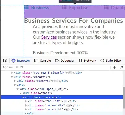
0

Displaying left middle and right of there parents. If you have more then 3 elements then use nth-child() for them.

enter image description here

HTML sample:

<body>
    <ul class="nav-tabs">
        <li><a  id="btn-tab-business" class="btn-tab nav-tab-selected"  onclick="openTab('business','btn-tab-business')"><i class="fas fa-th"></i>Business</a></li>
        <li><a  id="btn-tab-expertise" class="btn-tab" onclick="openTab('expertise', 'btn-tab-expertise')"><i class="fas fa-th"></i>Expertise</a></li>
        <li><a  id="btn-tab-quality" class="btn-tab" onclick="openTab('quality', 'btn-tab-quality')"><i class="fas fa-th"></i>Quality</a></li>
    </ul>
</body>

CSS sample:

.nav-tabs{
  position: relative;
  padding-bottom: 50px;
}

.nav-tabs li {
  display: inline-block;  
  position: absolute;
  list-style: none;
}
.nav-tabs li:first-child{
  top: 0px;
  left: 0px;
}
.nav-tabs li:last-child{
  top: 0px;
  right: 0px;
}
.nav-tabs li:nth-child(2){
  top: 0px;
  left: 50%;
  transform: translate(-50%, 0%);
}
Rafiq
  • 8,987
  • 4
  • 35
  • 35