2

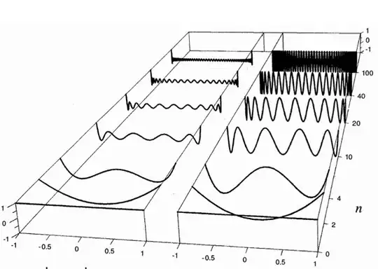
I am trying to plot stacked 2D sin(omega t) for 0 <= t <= 2 pi with different omega values as a 3D plot using Python and Matplotlib. Any hint will be appreciated.

(something like this one)

Something like this one

Papiro
  • 149
  • 11
  • 1
    Do you have an image or drawing to show the desired result? – heltonbiker Apr 24 '12 at 17:44
  • I am a new Python user. I have no idea on how to put 2D plots into 3D. Thank you for your interest. – Papiro Apr 24 '12 at 17:49
  • @Papiro if you're new to python and matplotlib, check out the examples gallery (http://matplotlib.sourceforge.net/gallery.html) to find something close to what you want to do. Try to adapt the examples and come back with a specific question. We're all more than willing to help, but it's almost impossible without some more details: "I tried.... and here's my example code... why don't I get... result?" – Yann Apr 24 '12 at 18:07
  • @Yann thanks for your comments. I am trying to put an image here but I have no sufficient reputation yet. As you will see, it is not trivial. By the way, I have visited "gallery.html". – Papiro Apr 24 '12 at 18:12
  • @Papiro do you have a small example code (with out the resulting image) that doesn't work for you? Sometimes for these questions I make up data using `numpy.random`, so that I can focus on how the data is plotted rather than what is being plotted – Yann Apr 24 '12 at 18:15

1 Answers1

5

This can be done with the simple plot command:

from mpl_toolkits.mplot3d import axes3d
import matplotlib.pyplot as plt
import numpy as np

NANGLES = 200

fig = plt.figure()
ax = fig.add_subplot(111, projection='3d')
nvals = [0, 2, 4, 10, 20, 40, 100]
for iy in range(len(nvals)):
    n = nvals[iy]
    x = np.arange(NANGLES) / float(NANGLES)
    y = np.ones(NANGLES)*iy # set y position to same value, with regular step
    z = np.sin(n*x*np.pi)
    ax.plot(x, y, z)
ax.set_ylabel('n')
ax.set_yticklabels(nvals) # update y ticks (set at regular step) to your vals

plt.savefig('stackedplot.png')
plt.show()

What I've shown is a simple start, and adjusting the cosmetic aspects of the plot is probably a good challenge to learn/explore more of python/matplotlib:

enter image description here

Yann
  • 33,811
  • 9
  • 79
  • 70
  • @Papiro I don't mean to discourage you from asking questions. I only want to encourage you to find the answer on your own. It's hard at first, but it's very rewarding. Come back if you have issues making the plot exactly the way you want, and I'll gladly help you again. I'm not sure if there's a way to reproduce exactly the plot you've shown. I would have to dig into the actual `mplot3d` code because it seems the API is not extensively documented. Feel free to try this too, reading the code is hard but a very good way to learn how to use matplotlib. – Yann Apr 24 '12 at 19:06
  • Thank you so much for all your help I really appreciate it. I hope someday I can reciprocate the favor. – Papiro Apr 24 '12 at 21:07