12

What are my best options for creating a financial open-high-low-close (OHLC) chart in a high level language like Ruby or Python? While there seem to be a lot of options for graphing, I haven't seen any gems or eggs with this kind of chart.

http://en.wikipedia.org/wiki/Open-high-low-close_chart (but I don't need the moving average or Bollinger bands)

JFreeChart can do this in Java, but I'd like to make my codebase as small and simple as possible.

Thanks!

Eric the Red
  • 5,364
  • 11
  • 49
  • 63

8 Answers8

18

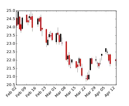
You can use matplotlib and the the optional bottom parameter of matplotlib.pyplot.bar. You can then use line plot to indicate the opening and closing prices:

For example:

#!/usr/bin/env python
import numpy as np
import matplotlib.pyplot as plt
from matplotlib import lines

import random


deltas = [4, 6, 13, 18, 15, 14, 10, 13, 9, 6, 15, 9, 6, 1, 1, 2, 4, 4, 4, 4, 10, 11, 16, 17, 12, 10, 12, 15, 17, 16, 11, 10, 9, 9, 7, 10, 7, 16, 8, 12, 10, 14, 10, 15, 15, 16, 12, 8, 15, 16]
bases = [46, 49, 45, 45, 44, 49, 51, 52, 56, 58, 53, 57, 62, 63, 68, 66, 65, 66, 63, 63, 62, 61, 61, 57, 61, 64, 63, 58, 56, 56, 56, 60, 59, 54, 57, 54, 54, 50, 53, 51, 48, 43, 42, 38, 37, 39, 44, 49, 47, 43]


def rand_pt(bases, deltas):
    return [random.randint(base, base + delta) for base, delta in zip(bases, deltas)]

# randomly assign opening and closing prices 
openings = rand_pt(bases, deltas)
closings = rand_pt(bases, deltas)

# First we draw the bars which show the high and low prices
# bottom holds the low price while deltas holds the difference 
# between high and low.
width = 0
ax = plt.axes()
rects1 = ax.bar(np.arange(50), deltas, width, color='r', bottom=bases)

# Now draw the ticks indicating the opening and closing price
for opening, closing, bar in zip(openings, closings, rects1):
    x, w = bar.get_x(), 0.2

    args = {
    }

    ax.plot((x - w, x), (opening, opening), **args)
    ax.plot((x, x + w), (closing, closing), **args)


plt.show()

creates a plot like this:

enter image description here

Obviously, you'd want to package this up in a function that drew the plot using (open, close, min, max) tuples (and you probably wouldn't want to randomly assign your opening and closing prices).

Ivo Flipse
  • 10,222
  • 18
  • 50
  • 63
Aaron Maenpaa
  • 119,832
  • 11
  • 95
  • 108
8

You can use Pylab (matplotlib.finance) with Python. Here are some examples: http://matplotlib.sourceforge.net/examples/pylab_examples/plotfile_demo.html . There is some good material specifically on this problem in Beginning Python Visualization.

Update: I think you can use matplotlib.finance.candlestick for the Japanese candlestick effect.

unmounted
  • 33,530
  • 16
  • 61
  • 61
4

Have you considered using R and the quantmod package? It likely provides exactly what you need.

David Locke
  • 17,926
  • 9
  • 33
  • 53
4

Some examples about financial plots (OHLC) using matplotlib can be found here:

  • finance demo

    #!/usr/bin/env python
    from pylab import *
    from matplotlib.dates import  DateFormatter, WeekdayLocator, HourLocator, \
         DayLocator, MONDAY
    from matplotlib.finance import quotes_historical_yahoo, candlestick,\
         plot_day_summary, candlestick2
    
    # (Year, month, day) tuples suffice as args for quotes_historical_yahoo
    date1 = ( 2004, 2, 1)
    date2 = ( 2004, 4, 12 )
    
    
    mondays = WeekdayLocator(MONDAY)        # major ticks on the mondays
    alldays    = DayLocator()              # minor ticks on the days
    weekFormatter = DateFormatter('%b %d')  # Eg, Jan 12
    dayFormatter = DateFormatter('%d')      # Eg, 12
    
    quotes = quotes_historical_yahoo('INTC', date1, date2)
    if len(quotes) == 0:
        raise SystemExit
    
    fig = figure()
    fig.subplots_adjust(bottom=0.2)
    ax = fig.add_subplot(111)
    ax.xaxis.set_major_locator(mondays)
    ax.xaxis.set_minor_locator(alldays)
    ax.xaxis.set_major_formatter(weekFormatter)
    #ax.xaxis.set_minor_formatter(dayFormatter)
    
    #plot_day_summary(ax, quotes, ticksize=3)
    candlestick(ax, quotes, width=0.6)
    
    ax.xaxis_date()
    ax.autoscale_view()
    setp( gca().get_xticklabels(), rotation=45, horizontalalignment='right')
    
    show()
    

enter image description here

CatShoes
  • 3,613
  • 5
  • 29
  • 43
karlacio
  • 176
  • 7
  • If the code samples are short, please include them in your answer in case the links go dead, and so people don't have to click through. – agf Apr 14 '12 at 00:44
  • Added first example, the second one is too long IMHO. – karlacio Apr 14 '12 at 09:12
1

Are you free to use JRuby instead of Ruby? That'd let you use JFreeChart, plus your code would still be in Ruby

0

Please look at the Open Flash Chart embedding for WHIFF http://aaron.oirt.rutgers.edu/myapp/docs/W1100_1600.openFlashCharts An example of a candle chart is right at the top. This would be especially good for embedding in web pages.

Aaron Watters
  • 2,784
  • 3
  • 23
  • 37
0

Open Flash Chart is nice choice if you like the look of examples. I've moved to JavaScript/Canvas library like Flot for HTML embedded charts, as it is more customizable and I get desired effect without much hacking (http://itprolife.worona.eu/2009/08/scatter-chart-library-moving-to-flot.html).

  • the question is asking for a charting tool in **ruby** or **python**... the solutions you mentioned are in either flash or javascript... – user1055604 Dec 25 '12 at 19:24
0

This is the stock chart I draw just days ago using Matplotlib, I've posted the source too, for your reference: StockChart_Matplotlib

Jacky Liu
  • 45
  • 6