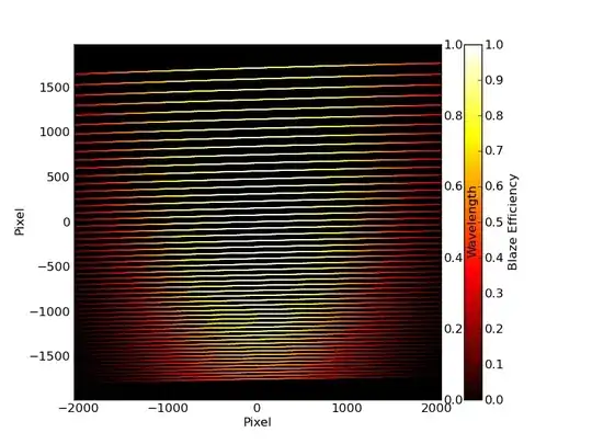
I am trying to produce a scatter plot that has two different y-axes and also a colorbar.
Here is the pseudo-code used:
#!/usr/bin/python

import matplotlib.pyplot as plt
from matplotlib import cm

fig = plt.figure()
ax1 = fig.add_subplot(111)
plt.scatter(xgrid,
        ygrid,
        c=be,                   # set colorbar to blaze efficiency
        cmap=cm.hot,
        vmin=0.0,
        vmax=1.0)

cbar = plt.colorbar()
cbar.set_label('Blaze Efficiency')

ax2 = ax1.twinx()
ax2.set_ylabel('Wavelength')

plt.show()
My question is, how do you use a different scale for the "Wavelength" axes, and also, how do you move the colorbar more to right so that it is not in the Wavelength's way?

 :
: