1

My software should judge spectrum bands, and given the location of the bands, find the peak point and width of the bands.

enter image description here

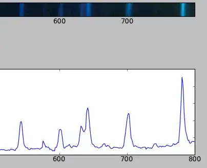
I learned to take the projection of the image and to find width of each peak.


But I need a better way to find the projection.

The method I used reduces a 1600-pixel wide image (eg 1600X40) to a 1600-long sequence. Ideally I would want to reduce the image to a 10000-long sequence using the same image.

I want a longer sequence as 1600 points provide too low resolution. A single point causes a large difference (there is a 4% difference if a band is judged from 18 to 19) to the measure.

How do I get a longer projection from the same image?

Code I used: https://stackoverflow.com/a/9771560/604511

import Image
from scipy import *
from scipy.optimize import leastsq

# Load the picture with PIL, process if needed
pic         = asarray(Image.open("band2.png"))

# Average the pixel values along vertical axis
pic_avg     = pic.mean(axis=2)
projection  = pic_avg.sum(axis=0)

# Set the min value to zero for a nice fit
projection /= projection.mean()
projection -= projection.min()
Community
  • 1
  • 1
Jesvin Jose
  • 22,498
  • 32
  • 109
  • 202
  • It might be worth putting the essence of you original question back in your post, so readers can follow it all a bit better. Also I have updated my answer a little. – fraxel Jun 13 '12 at 16:58

2 Answers2

7

What you want to do is called interpolation. Scipy has an interpolate module, with a whole bunch of different functions for differing situations, take a look here, or specifically for images here.

Here is a recently asked question that has some example code, and a graph that shows what happens.

But it is really important to realise that interpolating will not make your data more accurate, so it will not help you in this situation.

If you want more accurate results, you need more accurate data. There is no other way. You need to start with a higher resolution image. (If you resample, or interpolate, you results will acually be less accurate!)

Update - as the question has changed

@Hooked has made a nice point. Another way to think about it is that instead of immediately averaging (which does throw away the variance in the data), you can produce 40 graphs (like your lower one in your posted image) from each horizontal row in your spectrum image, all these graphs are going to be pretty similar but with some variations in peak position, height and width. You should calculate the position, height, and width of each of these peaks in each of these 40 images, then combine this data (matching peaks across the 40 graphs), and use the appropriate variance as an error estimate (for peak position, height, and width), by using the central limit theorem. That way you can get the most out of your data. However, I believe this is assuming some independence between each of the rows in the spectrogram, which may or may not be the case?

Community
  • 1
  • 1
fraxel
  • 34,470
  • 11
  • 98
  • 102
  • Could you (still) provide a replacement for the `pic_avg.sum(axis=0)` line to obtain a 10000-long sequence? I hope it is more accurate than generating a 1600-long sequence and then interpolating to a 10000. Wont accuracy increase for more vertical pixels? I now understood I am facing a fundamental limit here. – Jesvin Jose Jun 13 '12 at 07:58
  • @aitchnyu The answer is yes and no - there still is hard limit on the amount of information you can extract `1600x40`, but the point is to use the projection in a meaningful way, see my answer for further clarification. – Hooked Jun 13 '12 at 14:19
2

I'd like to offer some more detail to @fraxel's answer (to long for a comment). He's right that you can't get any more information than what you put in, but I think it needs some elaboration...

  1. You are projecting your data from 1600x40 -> 1600 which seems like you are throwing some data away. While technically correct, the whole point of a projection is to bring higher dimensional data to a lower dimension. This only makes sense if...
  2. Your data can be adequately represented in the lower dimension. Correct me if I'm wrong, but it looks like your data is indeed one-dimensional, the vertical axis is a measure of the variability of that particular point on the x-axis (wavelength?).
  3. Given that the projection makes sense, how can we best summarize the data for each particular wavelength point? In my previous answer, you can see I took the average for each point. In the absence of other information about the particular properties of the system, this is a reasonable first-order approximation.
  4. You can keep more of the information if you like. Below I've plotted the variance along the y-axis. This tells me that your measurements have more variability when the signal is higher, and low variability when the signal is lower (which seems useful!): enter image description here
  5. What you need to do then, is decide what you are going to do with those extra 40 pixels of data before the projection. They mean something physically, and your job as a researcher is to interpret and project that data in a meaningful way!

The code to produce the image is below, the spec. data was taken from the screencap of your original post:

import Image
from scipy import *
from scipy.optimize import leastsq

# Load the picture with PIL, process if needed
pic         = asarray(Image.open("spec2.png"))

# Average the pixel values along vertical axis
pic_avg     = pic.mean(axis=2)
projection  = pic_avg.sum(axis=0)

# Compute the variance
variance = pic_avg.var(axis=0)

from pylab import *

scale = 1/40.

X_val = range(projection.shape[0])
errorbar(X_val,projection*scale,yerr=variance*scale)
imshow(pic,origin='lower',alpha=.8)
axis('tight')
show()
Community
  • 1
  • 1
Hooked
  • 84,485
  • 43
  • 192
  • 261