21

I've been trying to create a site with the following structure:
desired structure

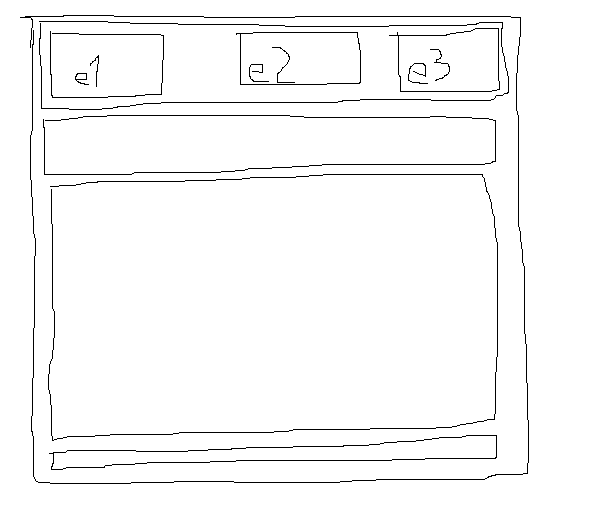
But I can't seem to get the header correct (e1 left, e2 centered, e3 right). I want the three elements e1, e2 and e3 to be left, middle and right positioned. This is what I'm trying:

<div id="wrapper">
<div id="header">
    <div id="header-e1">
        1
    </div>
    <div id="header-e2">
        2
    </div>
    <div id="header-e3">
        3
    </div>
</div>
<div id="nav">
    links
</div>
<div id="content">
    content
</div>
<div id="footer">
    footer
</div>
</div>

With this css:

#wrapper
{
    width: 95%;
    margin: 20px auto;
    border: 1px solid black;
}

#header
{
    margin: 5px;
}
#header-e1
{
    float: left;
    border: 1px solid black;
}
#header-e2
{
    float: left;
    border: 1px solid black;
}
#header-e3
{

    border: 1px solid black;
}

#nav
{
    margin: 5px;
}
#content
{
    margin: 5px;
}
#footer
{
    margin: 5px;
}

Can someone give me tips to what I can do? The structure is going to be used on a mobile website.

UPDATE

The code I have above gives me this: current result 
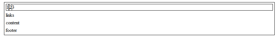
But I want the 2 centered and the 3 on the right side. I don't want to set the width to a percent because the content in the elements may vary, meaning it may be 20/60/20 - 10/80/10 - 33/33/33 or something else.

Glorfindel
  • 21,988
  • 13
  • 81
  • 109
L42
  • 3,052
  • 4
  • 28
  • 49
  • Check out this post: http://stackoverflow.com/questions/2156712/how-to-float-3-divs-side-by-side-using-css – Goose Jul 19 '12 at 22:17
  • I would not have understood your question, but then you posted your layout in paint, and all was good. ;) – eggy May 02 '13 at 00:03

6 Answers6

22

Utilize the Magic of Overflow: Hidden

If you can swap the html position of 2 & 3 like so:

<div id="header-e1">
    1 is wider
</div>
<div id="header-e3">
    3 is also
</div>
<div id="header-e2">
    2 conforms
</div>

Then you can set this css which will cause 2 to "fill" the available space because of the overlow: hidden on it. So if 1 & 3 expand, 2 narrows (shrink window down to see what happens at really small size).

#header-e1 {float: left;}
#header-e2 {overflow: hidden;}
#header-e3 {float: right;}

Technically, you could keep your current html order and your float: left on both 1 & 2 and make 3 the flex div with overflow: hidden. You could do the same with 1 by reversing the order of the html completely and setting 2 & 3 to float: right with 1 having overflow: hidden. To me it would seem best to have the middle flex, but you know your application better than I.

ScottS
  • 71,703
  • 13
  • 126
  • 146
  • This is a wonderful solution. but i have a problem. e2 stretches full and e3 is out of boundary. – Sakthivel May 11 '13 at 07:53
  • @codebrain: You would need to describe your problem (or illustrate it with a fiddle), as I do not know what you mean by "e3 is out of boundary." – ScottS May 11 '13 at 10:08
  • 1
    E1 and E2 are placed inside the container and e3 went out of container. #e1 { float:left; } #e2 { display:inline-block; overflow:hidden; } #e3 { float:right; } **This fixed the issue** Anyways your solution helped a lot and i upvoted it! – Sakthivel May 11 '13 at 10:21
  • you should also add .header{text-align: center;} – Michael Nov 23 '13 at 12:28
5

If you are trying to make the site with a responsive width, you can try the following (33% is roughly one-third):

#header-e1 {
    float: left;
    width:33%;
    border: 1px solid black;
}

#header-e2 {
    float: left;
    width:33%;
    border: 1px solid black;
}

#header-e3 {
    float: left;
    width:33%;
    border: 1px solid black;
}

You could also used fixed widths for the divs. If you want the further from each other you can play with their left/right margins etc. Hope that helps!

Here is an edit for no widths:

#wrapper {
    position:relative; (add to wrapper)
}

#header-e1 {
    position:absolute;
    left:0;
    border:1px solid black;
}

#header-e2 {
    position:absolute;
    left:50%;
    border:1px solid black;
}

#header-e3 {
    position:absolute;
    right:0;
    border: 1px solid black;
}
RevConcept
  • 253
  • 1
  • 6
  • 19
1

You need to give the divs in your header a width, and float header-e3 left.

Note: They all have the same CSS properties, so just give them the same class like .headerDivs and then you don't have repeating code

Edit: here is a working jsfiddle: http://jsfiddle.net/eNDPG/

Andy
  • 14,427
  • 3
  • 52
  • 76
0

I'm using a similar idea to what RevCocnept suggested with the width: 33%, except using display: inline-block instead of float: left. This is to avoid removing the div elements inside #header from the flow of the page and causing the height of #header to become zero.

#header > div {
    display: inline-block;
    width: 31%;
    margin: 5px 1%;
}

Demo

Zhihao
  • 14,758
  • 2
  • 26
  • 36
  • Thank you, but I want to do it without setting the width of each element. Is that possible? – L42 Jul 19 '12 at 22:48
  • @user1539208 off the top of my head, I don't know of an easy way to do it if you want the widths of all child `div` *as well as* the space in between to add up to the width of `#header`. It would depend on how the widths of each are changing (what causes the widths to be different) and whether `#header` or `#wrapper` have fixed widths as well. Not sure if you can do this with CSS alone. Perhaps there is a way that I just don't know about though, in which case I'd be interested in hearing about it as well. – Zhihao Jul 19 '12 at 22:53
0

You can do something like this:

HTML

<div>
    <div id="left">Left</div>
    <div id="right">Right</div>
    <div id="center">Center</div>
</div>

CSS

#left {
  float: left;
  border: 1px solid red;
}

#right {
  float: right;
  border: 1px solid blue;
}

#center {
  margin-left: 50px;
  margin-right: 50px;
  border: 1px solid green;
  text-align: center;
}

The centered <div> must come as the last one in the HTML code.

Here's a JS Bin to test: http://jsbin.com/evagat/2/edit

Leniel Maccaferri
  • 100,159
  • 46
  • 371
  • 480
0
                        <style type="text/css">
                        body {
                        margin:0;
                        }
                        #header {
                        width:100%;
                        **strong text**margin:auto;
                        height:10%;
                        background-color:red;
                        }
                        #left {
                        width:20%;
                        float:left;
                        #margin:auto auto auto auto;
                        height:100%;
                        background-color:blue;
                        }
                        #right {
                        float:right;
                        width:20%;
                        #margin:auto auto auto auto;
                        height:100%;
                        background-color:green;
                        }
                        #middle {
                        position:relative;
                        left:0;
                        right:0;
                        margin:auto;
                        height:80%;
                        background-color:yellow;
                        width:100%;
                        }
                        #middle1 {
                        width: 80%;
                        margin:auto;
                        height:45%;
                        background-color:black;
                        }
                        #middle2 {
                        width: 80%;
                        margin:auto;
                        height:40%;
                        background-color:brown;
                        }
                        #middle3 {
                        width: 80%;
                        margin:auto;
                        height:15%;
                        background-color:orange;
                        }
                        #midmain {
                        width: auto;
                        margin:auto;
                        height:100%;
                        background-color:white;
                        }
                        #footer {
                        width:100%;
                        margin:auto;
                        height:10%;
                        background-color:red;
                        }
                        </style>

now check comment for html design.
P P
  • 49
  • 10