76

I have coded a webpage meant for retina display. I currently do not have a retina display monitor.

Is there any simulator application or tool to test web pages for retina display?

Or, are there monitors(not Apple's MacBook or iPad) which are similar to Apple's retina display?

starball
  • 20,030
  • 7
  • 43
  • 238
Sangam254
  • 3,415
  • 11
  • 33
  • 43
  • Also is there any similarity between high definition monitors and retina display monitors? – Sangam254 Sep 03 '12 at 07:35
  • 1
    Possible duplicate of [How to test a website for Retina on Windows without an actual Retina display?](http://stackoverflow.com/questions/15551287/how-to-test-a-website-for-retina-on-windows-without-an-actual-retina-display) – andrewb Apr 18 '16 at 02:41

7 Answers7

117

about:config hack on Firefox

You actually can using Firefox:
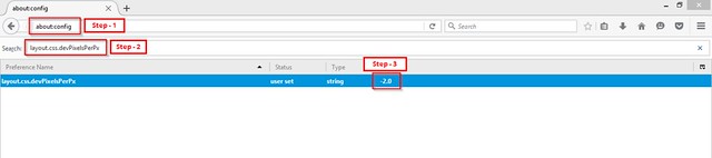
  1. Go to about:config
  2. Find layout.css.devPixelsPerPx
  3. Change it to your desired ratio (1 for normal, 2 for retina, etc.)

Screenshot:


(source: staticflickr.com)

Refresh your page - boom, your media query has now kicked in! Hats off to Firefox for being awesome for web developing!

This was done on Windows 7 with Firefox 21.0.

The advantage of this solution is that it will trigger media queries and other advanced logic. If you're not doing that, and you're just feeding everyone the HiDPI images, you can just zoom in with Chrome etc (or write CSS to zoom for you, if that floats your boat).

Zooming on Firefox & Edge

Currently on Firefox and Edge, if you zoom it triggers dppx-based media queries. So this easier approach may be sufficient, but be aware that the functionality is reported as a "won't fix" bug for Firefox, so this could change.

Glorfindel
  • 21,988
  • 13
  • 81
  • 109
andrewb
  • 5,200
  • 6
  • 36
  • 54
  • 7
    On my version of Firefox, 24, the default is -1 so just set it to -2. Or set it to 2 for the reverse effect, which is also useful. – Mario Awad Oct 21 '13 at 12:23
  • 3
    That's strange, mine (FF 24 on OS X 10.7 and Win 7) doesn't accept a value of -2, or at least it makes no difference. My default was actually -1, I wonder if this means no scaling calcs or something. – andrewb Oct 21 '13 at 21:31
  • 2
    On FF 31 / Win7, setting it to (+) 1.5 works nicely depending on your stylesheet, without making the window too massively large. Although the default is -1, setting it to a negative value doesn't seem to trigger higher DPI display. – nickb Sep 03 '14 at 07:52
  • @nickb Just keep in mind that 1.5 is less than the standard Retina pixels per px ratio of 2, so media queries may not trigger. – andrewb Sep 04 '14 at 01:01
  • 1
    @andrewb Yeah, Retina would require 2x. Depends if you need anything over the default px ratio or a specific target. If your high DPI images are more general (i.e. anything >1.0 and not specifically Retina devices) then 1.5 is enough, if not, up it as necessary. – nickb Sep 04 '14 at 03:29
  • Doesn't work on my end. Default is -1. -2 does not produce the desired result. – Clarus Dignus Apr 17 '16 at 20:41
  • @ClarusDignus Did you try 2, not -2, as well? – andrewb Apr 17 '16 at 23:33
  • Yes however the end result is really no different to zoom. – Clarus Dignus Apr 18 '16 at 00:12
  • Wow good find, that's a more recent change. Though some users have called it a bug, as per: https://bugzilla.mozilla.org/show_bug.cgi?id=809788, so might not be reliable ongoing. Will update my answer. – andrewb Apr 18 '16 at 02:31
20

You can check with the Chrome Browser to test retina display working or not, use this guide

  1. Open Chrome Browser and right click then click inspect element
  2. In the bottom bar you will find some tabs that console, search, emulation and rendering
  3. Click the tabs emulation, then pull up the bar tab as shown below
  4. Adjust according to the menu on the left, adjust the device, screen etc.

Please check this article for detail guide : http://www.gee.web.id/2014/09/how-test-retina-display-on-chrome.html

maheshwaghmare
  • 2,082
  • 19
  • 23
Gee
  • 211
  • 2
  • 5
  • 6
    If you can't see the bar at the botton in step 2, press the Escape key with the developer console still open. This toggles the bar of tabs at the bottom. – Sam Sep 15 '15 at 22:15
4

There is a JavaScript Web Retina Emulator on GitHub.

You can also use Opera Mobile Emulator to test for custom resolutions. There's an explanation of how to do it here.

If you have an older Apple computer (without a retina display) you can simulate retina displays with Quartz Debug, a tool inside XCode. Also in XCode you can test for iOS devices with retina displays using the iOS Simulator.

Nelu
  • 16,644
  • 10
  • 80
  • 88
4

You can add this css. Everything will look 2 times the size but it makes it easy to spot if there is any issues. The Javascript Web Retina Emulator didn't work for me (blurry in Safari)

body {
  zoom: 200%;
  -moz-transform: scale(2);
  -moz-transform-origin: 0 0;
}

The zoom: 200% applies to webkit, -moz for firefox so Safari/Chrome/Firefox this will work, not sure about IE.

If you apply -webkit-transform: scale(2) things will look blurry so you need to use the zoom: 200%;

  • 4
    As Daniel says, that code alone won't do the trick, since it won't trigger media queries that switch images to the higher resolution counterparts. The images will look blurry if you don't use andrewb's solution that changes the pixel ration. – Michael McGinnis Nov 21 '13 at 15:48
0
body {
  zoom: 200%;
  -moz-transform: scale(2);
  -moz-transform-origin: 0 0;
}

That code alone won't do the trick. If you're using media queries, you should switch the pixel ratio to 1, instead of 1.5 or 2, to do the trick. Otherwise it won't switch images to the higher resolution counterparts.

Daniel Dogeanu
  • 397
  • 4
  • 12
0

Just go in responsive mode in Firefox or Chrome, and edit resolutions to choose : Laptops with HiDPI screen. It will do the job ! ;)

DanX
  • 234
  • 2
  • 7
0

DevTools Solution

It's possible to test it with DevTools. To simulate a retina display it's necessary to:

  1. Open browser DevTools;
  2. Choose responsive mode (toggle device toolbar);
  3. Click on the "down arrow" inside the viewport dimensions controller;
  4. A dropdwon will appear. Click on the last option "Edit";
  5. Click on button to "Add custom device...";
  6. When creating a custom device there will be a field with the placeholder "Device pixel ratio". If you put a number in there it will define the device retina value.

enter image description here

Bonus Tip

You can test this implementation with media queries by using devices with different retina values, for example 1 and 2. The attached media query will change the background color from green to orange when the device haves a retina value of 2.

Media Query

body {
    background-color: green;
}

@media only screen and (-webkit-min-device-pixel-ratio: 2),
only screen and (min--moz-device-pixel-ratio: 2),
only screen and (-o-min-device-pixel-ratio: 2/1),
only screen and (min-device-pixel-ratio: 2),
only screen and (min-resolution: 192dpi),
only screen and (min-resolution: 2dppx) {
    body {
        background-color: orange;
    }
}
Grinnex.
  • 869
  • 2
  • 12
  • 23