5

Does anyone know how to create a scatterplot in R to create plots like these in PRISM's graphpad:

enter image description here

I tried using boxplots but they don't display the data the way I want it. These column scatterplots that graphpad can generate show the data better for me.

Any suggestions would be appreciated.

smillig
  • 5,073
  • 6
  • 36
  • 46
crazian
  • 649
  • 4
  • 12
  • 24

3 Answers3

4

As @smillig mentioned, you can achieve this using ggplot2. The code below reproduces the plot that you are after pretty well - warning it is quite tricky. First load the ggplot2 package and generate some data:

library(ggplot2)
dd = data.frame(values=runif(21), type = c("Control", "Treated", "Treated + A"))

Next change the default theme:

theme_set(theme_bw())

Now we build the plot.

  1. Construct a base object - nothing is plotted:

    g = ggplot(dd, aes(type, values))
    
  2. Add on the points: adjust the default jitter and change glyph according to type:

    g = g + geom_jitter(aes(pch=type), position=position_jitter(width=0.1))
    
  3. Add on the "box": calculate where the box ends. In this case, I've chosen the average value. If you don't want the box, just omit this step.

    g = g + stat_summary(fun.y = function(i) mean(i), 
            geom="bar", fill="white", colour="black")
    
  4. Add on some error bars: calculate the upper/lower bounds and adjust the bar width:

    g  = g + stat_summary(
            fun.ymax=function(i) mean(i) + qt(0.975, length(i))*sd(i)/length(i), 
            fun.ymin=function(i) mean(i) - qt(0.975, length(i)) *sd(i)/length(i),
            geom="errorbar", width=0.2)
    
  5. Display the plot

    g
    

enter image description here

  1. In my R code above I used stat_summary to calculate the values needed on the fly. You could also create separate data frames and use geom_errorbar and geom_bar.
  2. To use base R, have a look at my answer to this question.
Community
  • 1
  • 1
csgillespie
  • 59,189
  • 14
  • 150
  • 185
  • Thanks csgillespie, your number 2 link actually gave me pretty much what I needed. But both are great solutions. I tweaked quite some for my own use. – crazian Sep 14 '12 at 01:49
  • The purpose of doing this is to be able to show the medians for both groups, as well as the data points, and the outliers all in one plot frame. Here is the code: – crazian Sep 14 '12 at 05:53
  • @user1322919 No easy solution for that. I would ask another question – csgillespie Sep 14 '12 at 13:13
3

If you don't mind using the ggplot2 package, there's an easy way to make similar graphics with geom_boxplot and geom_jitter. Using the mtcars example data:

library(ggplot2)
p <- ggplot(mtcars, aes(factor(cyl), mpg)) 
p + geom_boxplot() + geom_jitter() + theme_bw()

which produces the following graphic:

enter image description here

The documentation can be seen here: http://had.co.nz/ggplot2/geom_boxplot.html

smillig
  • 5,073
  • 6
  • 36
  • 46
-1

I recently faced the same problem and found my own solution, using ggplot2. As an example, I created a subset of the chickwts dataset.

library(ggplot2)
library(dplyr)
data(chickwts)
Dataset <- chickwts %>%
            filter(feed == "sunflower" | feed == "soybean")

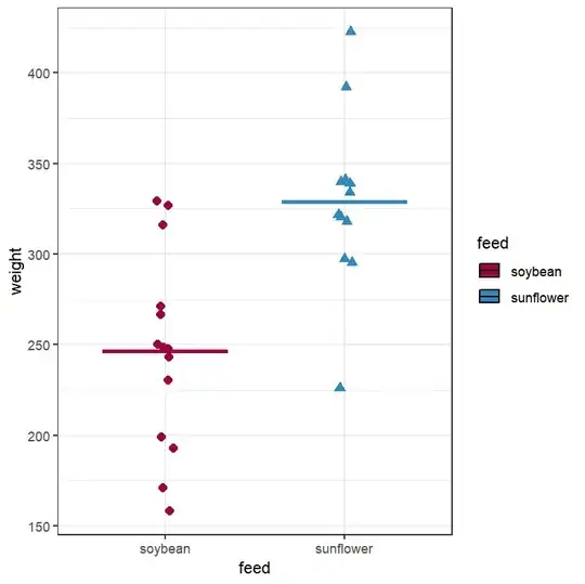
Since in geom_dotplot() is not possible to change the dots to symbols, I used the geom_jitter() as follow:

Dataset %>%
    ggplot(aes(feed, weight, fill = feed)) +
    geom_jitter(aes(shape = feed, col = feed), size = 2.5, width = 0.1)+
    stat_summary(fun = mean, geom = "crossbar", width = 0.7,
             col = c("#9E0142","#3288BD")) +
    scale_fill_manual(values = c("#9E0142","#3288BD")) +
    scale_colour_manual(values = c("#9E0142","#3288BD")) +
    theme_bw()

This is the final plot:

enter image description here

For more details, you can have a look at this post:

http://withheadintheclouds1.blogspot.com/2021/04/building-dot-plot-in-r-similar-to-those.html?m=1

Machavity
  • 30,841
  • 27
  • 92
  • 100
Serenella
  • 1
  • 2