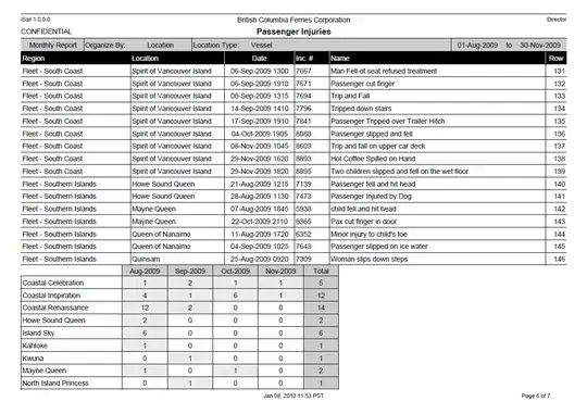
I have to draw charts as displayed in following image for an iPad app. is there any free native chart api available for it?
Or any help to draw it...

Any help would be appreciable.
I have to draw charts as displayed in following image for an iPad app. is there any free native chart api available for it?
Or any help to draw it...


Any help would be appreciable.
I would like to go with Quartz 2D. I dont think so any library will do your deal. You need to create your own. Here are my ideas.
For one kind of charts, you can take idea how speedometer works. Eeww, I didnt searched links for that, hope idea will do. You can calculate angle for your percentage and draw arc accordingly. This wont be too hard.
For droplets, oops that will be bit busy. But here is some logic for that:
I guess you will have percentage for each segment in your droplet like chart. You can calculate radius for them ! Hope image below will better explain your idea. I am just trying to share logic and not code, since SO is not about give me code kinda stuff :)
Hope this helps
I have a working project on GitHub.
#import "PlectrumView.h"

@implementation PlectrumView

- (id)initWithFrame:(CGRect)frame
{
    self = [super initWithFrame:frame];
    if (self) {
    }
    return self;
}


-(void) drawPlectrumWithPercentage:(CGFloat) percentage color:(UIColor *)color
{
    CGFloat factor = self.frame.size.width ;
    percentage*=factor;
    UIBezierPath* plectrum = [UIBezierPath bezierPathWithRoundedRect: CGRectMake(0, factor - percentage, percentage,percentage)
                                                   byRoundingCorners: UIRectCornerTopLeft | UIRectCornerTopRight | UIRectCornerBottomRight
                                                         cornerRadii: CGSizeMake(percentage/2, percentage/2)];
    [color setFill];
    [plectrum fill];
}


- (void)drawRect:(CGRect)rect
{
    [self drawPlectrumWithPercentage:1.0 color:[UIColor colorWithWhite:.9 alpha:1]];
    [self drawPlectrumWithPercentage:.75 color:[UIColor colorWithRed:245.0/255.0 green:134.0/255.0 blue:122.0/255.0 alpha:1]];
    [self drawPlectrumWithPercentage:.61 color:[UIColor colorWithRed:171.0/255.0 green:212.0/255.0 blue:105.0/255.0 alpha:1]];
}

@end
Results in

I change the plectrum code in a way that it's area will represent the percentage instead of it's width. It feels more natural.

-(void) drawPlectrumWithPercentage:(CGFloat) percentage color:(UIColor *)color
{
    static CGFloat pi = 3.141592653589793;
    static CGFloat radius100percent = 50.0;

    static CGFloat area100percent;
    static CGFloat threeFouthPiPlusOne;
    area100percent= radius100percent * radius100percent * pi *3/4 + radius100percent*radius100percent;
    threeFouthPiPlusOne = (1 + (pi*(3.0/4.0)));
    CGFloat area = area100percent * percentage;

    CGFloat newRadius = sqrt(area / threeFouthPiPlusOne);
    percentage = newRadius/ 50.0;
    CGFloat factor = self.frame.size.width ;
    percentage*=factor;
    UIBezierPath* plectrum = [UIBezierPath bezierPathWithRoundedRect: CGRectMake(0, factor - percentage, percentage,percentage)
                                                   byRoundingCorners: UIRectCornerTopLeft | UIRectCornerTopRight | UIRectCornerBottomRight
                                                         cornerRadii: CGSizeMake(percentage/2, percentage/2)];
    [color setFill];
    [plectrum fill];
}
Your example pictures are actually quite easy to draw using Quartz 2D. If you are not concerned with exactly how your charts look, I would suggest looking into what is already out there. If you need the charts to look exactly as you show (for example because they should look similar to a web app), I suggest you draw them yourself. It is not that hard, to draw the kind of simple charts you show:
Let me know if you want to try and need any more details.
If you use SVG, you can easily create the shapes with a function like:
/**
 * @param {SVGPathElement} aShape a SVG path element
 * @param {number} radius the radius of the plectrum's arc
 * @param {string} fillColor color in "#rrggbb" format
 */
function drawPlectrum(aShape, radius, fillColor) {

    // Creating a string which defines a path in SVG
    // M = moveto, A = line to, etc. See http://www.w3.org/TR/SVG/paths.html
    var ss="M "+parseInt(0)+" "+parseInt(0)+" ";         // moveto 0, 0
    ss+="L "+parseInt(0)+" "+parseInt(radius)+" ";       // lineto 0, R
    ss+="A "+parseInt(radius)+" "+parseInt(radius)+" 0 0 0 "+parseInt(radius)+" "+parseInt(2*radius)+" ";// elliptic curve to R, 2*R
    ss+="A "+parseInt(radius)+" "+parseInt(radius)+" 0 0 0 "+parseInt(2*radius)+" "+parseInt(radius)+" ";// elliptic curve to 2*R, R
    ss+="A "+parseInt(radius)+" "+parseInt(radius)+" 0 0 0 "+parseInt(radius)+" "+parseInt(0)+" ";       // elliptic curve to R, 0
    ss+="Z";                                             // closepath

    // The d attribute of the path element holds the line information
    // In XML the element will essentially be <path d="*the created string*">
    aShape.setAttribute("d", ss);

    // Give the color
    aShape.setAttribute("fill", fillColor);
}
Successive drawings looks something like this:
    // Note that 3 different path elements are used to overlap the plectrums
    drawPlectrum(node, 100, "#aaaaaa");
    drawPlectrum(node2, 75, "#33dd33");
    drawPlectrum(node3, 50, "#3333dd");
Edit 1: Added more comments in the code for better understandibility

Download this project and use this but they are using ARC for that. Hope it will help you!
I think all of the above could probably be done using transparent images with an underlying shape that increases in size/diameter using mathematical code.
With the Arc Percentages you could have the dial (available area / 100) * Amount of Progress
and then have the image rotate by the amount to get the dial in place and an underlying coloured square fill by the same amount from left to right? this will save a lot on drawing code.