761

Apparently, folk have figured out how to make xkcd style graphs in Mathematica and in LaTeX. Can we do it in R? Ggplot2-ers? A geom_xkcd and/or theme_xkcd?

I guess in base graphics, par(xkcd=TRUE)? How do I do it?

xkcd#1064

As a first stab (and as much more elegantly shown below) in ggplot2, adding the jitter argument to a line makes for a great hand-drawn look. So -

ggplot(mapping=aes(x=seq(1,10,.1), y=seq(1,10,.1))) + 
  geom_line(position="jitter", color="red", size=2) + theme_bw()

It makes for a nice example - but the axes and fonts appear trickier. Fonts appear solved (below), though. Is the only way to deal with axes to blank them out and draw them in by hand? Is there a more elegant solution? In particular, in ggplot2, can element_line in the new theme system be modified to take a jitter-like argument?

M--
  • 25,431
  • 8
  • 61
  • 93
jebyrnes
  • 9,082
  • 5
  • 30
  • 33
  • 8
    what exactly would you consider to be necessary elements of xkcd graphs? annotations? arbitrary curves, axes, and scales? hand-drawn look-and-feel? – smcg Oct 01 '12 at 14:33
  • 8
    I would focus on the hand drawn look and feel, of all the graph elements: axes, text, lines, etc. – joran Oct 01 '12 at 14:33
  • 64
    Don't forget the compulsory mouse over! – Jørgen R Oct 01 '12 at 14:36
  • 1
    I think the hand-drawn feel is what's key. Hrm. For lines it should be too much of a problem - a long-period jitter. But fonts and axes seem a bit trickier. Also, the sense of whimsy. theme_whimsy()? Ha! Then again, I think that one is up to the author. – jebyrnes Oct 01 '12 at 14:40
  • 4
    Also, fonts are taken care of http://xkcdsucks.blogspot.com/2009/03/xkcdsucks-is-proud-to-present-humor.html – jebyrnes Oct 01 '12 at 16:18
  • 2
    Just for fun you can try this. library(RXKCD); getXKCD(1064) – vinux Oct 01 '12 at 16:38
  • Is there a way to find out where axis() would put axis lines? That's the thing stopping my xkcdplot function. It emulates matplot(x,y,type="l"), which is probably enough for many use cases. – Spacedman Oct 01 '12 at 20:31
  • @Spacedman, do you mean `?axisTicks` ? – Ben Bolker Oct 01 '12 at 20:34
  • @BenBolker no, I meant axis lines - its in par()$usr - I should have known that... – Spacedman Oct 02 '12 at 06:42
  • Sacha - that just blew my mind. You must post the code at some point! What package are you using? – jebyrnes Oct 02 '12 at 18:07
  • @jebyrnes I included this style as an easter egg in the developmental version of qgraph (using XKCD=TRUE; https://github.com/SachaEpskamp/qgraph), probably still very buggy. The graph itself was made with another package I am preparing that uses qgraph to make the plots. – Sacha Epskamp Oct 02 '12 at 21:02
  • @Ben, play around with geom_ribbon and position="jitter" - it makes filling in probability distributions into some very cool illustrations. – jebyrnes Oct 03 '12 at 15:02
  • 3
    The usual standards of question asking still apply here, regardless of the xkcd fun being had over on mathematica. So...here's my obligatory mod comment: We expect you to have attempted to solve this problem by yourself rather than asking the community to arrive at a complete solution for you. When you've got some code to show us that demonstrates some effort by you (even if it's wrong) please update your question and flag to re-open – Kev Oct 04 '12 at 00:28
  • 13
    Much as I love R and xkcd, who ever started this meme should have their head dunked. Use a **pencil**, people! – naught101 Oct 09 '12 at 04:58
  • 2
    great post, it can make for some less scientific charts that could be useful in many cases, especially if we are communicating a concept and not real data – user1617979 Sep 30 '14 at 12:17
  • Now we also can make xkcd-style graphs with ggplot and bokeh 0.11: http://bokeh.pydata.org/en/latest/docs/gallery/xkcd_density.html – Dudnikof Jan 17 '16 at 13:46
  • really, nobody mentioned matplotlib yet? [fixed](https://nbviewer.jupyter.org/url/jakevdp.github.com/downloads/notebooks/XKCD_plots.ipynb) – jena Oct 15 '19 at 13:09

7 Answers7

465

You might want to consider the following package:

Package xkcd: Plotting ggplot2 graphics in a XKCD style.

library(xkcd)
vignette("xkcd-intro")

Some examples (Scatterplots, Bar Charts):

  • Scatterplot:

Scatterplot

  • Bar Chart:

Bar Chart

233

Thinking along the same line as some of the other answers, I've "un-ggplotted" the chart and also added on the flexibility of the x-axis label locations (which seems to be common in xkcd) and an arbitrary label on the chart.

Note that I had a few issues with loading the Humor Sans font and manually downloaded it to working directory.

enter image description here

And the code...

library(ggplot2)
library(extrafont)

### Already have read in fonts (see previous answer on how to do this)
loadfonts()

### Set up the trial dataset 
data <- NULL
data$x <- seq(1, 10, 0.1)
data$y1 <- sin(data$x)
data$y2 <- cos(data$x)
data$xaxis <- -1.5

data <- as.data.frame(data)

### XKCD theme
theme_xkcd <- theme(
    panel.background = element_rect(fill="white"), 
    axis.ticks = element_line(colour=NA),
    panel.grid = element_line(colour="white"),
    axis.text.y = element_text(colour=NA), 
    axis.text.x = element_text(colour="black"),
    text = element_text(size=16, family="Humor Sans")
    )

 ### Plot the chart
 p <- ggplot(data=data, aes(x=x, y=y1))+
      geom_line(aes(y=y2), position="jitter")+
      geom_line(colour="white", size=3, position="jitter")+
      geom_line(colour="red", size=1, position="jitter")+
      geom_text(family="Humor Sans", x=6, y=-1.2, label="A SIN AND COS CURVE")+
      geom_line(aes(y=xaxis), position = position_jitter(h = 0.005), colour="black")+
      scale_x_continuous(breaks=c(2, 5, 6, 9), 
      labels = c("YARD", "STEPS", "DOOR", "INSIDE"))+labs(x="", y="")+
      theme_xkcd

ggsave("xkcd_ggplot.jpg", plot=p, width=8, height=5)
Denys Séguret
  • 372,613
  • 87
  • 782
  • 758
Mark Bulling
  • 2,239
  • 2
  • 12
  • 3
197

Basic line-drawing function:

xkcd_line <- function(x, y, color) {
  len <- length(x);
  rg <- par("usr");
  yjitter <- (rg[4] - rg[3]) / 1000;
  xjitter <- (rg[2] - rg[1]) / 1000;
  x_mod <- x + rnorm(len) * xjitter;
  y_mod <- y + rnorm(len) * yjitter;
  lines(x_mod, y_mod, col='white', lwd=10);
  lines(x_mod, y_mod, col=color, lwd=5);
}

Basic axis:

xkcd_axis <- function() {
  rg <- par("usr");
  yaxis <- 1:100 / 100 * (rg[4] - rg[3]) + rg[3];
  xaxis <- 1:100 / 100 * (rg[2] - rg[1]) + rg[1];
  xkcd_line(1:100 * 0 + rg[1] + (rg[2]-rg[1])/100, yaxis,'black')
  xkcd_line(xaxis, 1:100 * 0 + rg[3] + (rg[4]-rg[3])/100, 'black')
}

And sample code:

data <- data.frame(x=1:100)
data$one <- exp(-((data$x - 50)/10)^2)
data$two <- sin(data$x/10)
plot.new()
plot.window(
    c(min(data$x),max(data$x)),
    c(min(c(data$one,data$two)),max(c(data$one,data$two))))
xkcd_axis()
xkcd_line(data$x, data$one, 'red')
xkcd_line(data$x, data$two, 'blue')

Produces:

Example chart

user295691
  • 7,108
  • 1
  • 26
  • 35
144

Here's an attempt at the fonts, based on links from the xkcd forums and the extrafont package:

As noted above there is a forum discussion about fonts on the xkcd site: I grabbed the first one I could find, there may be other (better?) options (@jebyrnes posts another source for possible fonts in comments above -- the TTF file is here; someone reported a 404 error for that source, you might alternatively try here or here, substituting those URLs appropriately for xkcdFontURL below; you may have to work a bit harder to retrieve the Github-posted links)

   xkcdFontURL <- "http://simonsoftware.se/other/xkcd.ttf"
   download.file(xkcdFontURL,dest="xkcd.ttf",mode="wb")

(This is for quickie, one-off use: for regular use you should put it in some standard system font directory.)

   library(extrafont)

The most useful information about fonts was on the extrafont github site -- this is taken from there

font_import(".")   ## because we downloaded to working directory
loadfonts()

Example taken more or less verbatim from the github site:

library(ggplot2)
p <- ggplot(mtcars, aes(x=wt, y=mpg)) + geom_point() +
  ggtitle("Fuel Efficiency of 32 Cars") +
  xlab("Weight (x1000 lb)") + ylab("Miles per Gallon") +
  theme(text=element_text(size=16, family="xkcd"))

ggsave("xkcd_ggplot.pdf", plot=p,  width=4, height=4)
## needed for Windows:
##   Sys.setenv(R_GSCMD = "C:/Program Files/gs/gs9.05/bin/gswin32c.exe")
embed_fonts("xkcd_ggplot.pdf")

enter image description here

Ben Bolker
  • 211,554
  • 25
  • 370
  • 453
34

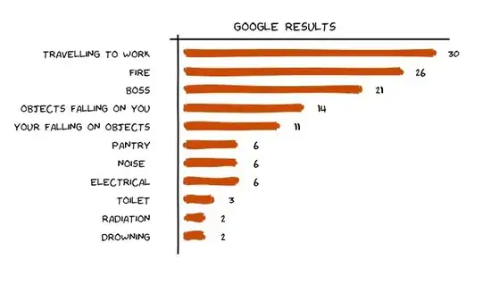
I designed a xkcd themed analytics calendar just using RStudio. Here is an example of bar plot xkcd style

  • Font used = HumorSans.ttf [link given above]
  • Package used [xkcd]

To generate this plot Bar plot proxy for 'Dangers at Work'

Here is the code used

#using packages xkcd, ggplot 
library(xkcd)
library(ggplot2)
font_import(pattern="[H/h]umor")
loadfonts()

### Set up the trial dataset 
d1 <- data.frame('type'=c('DROWNING','RADIATION','TOILET',"ELECTRICAL",'NOISE','PANTRY','YOUR    FALLING ON OBJECTS','OBJECTS FALLING ON YOU','BOSS','FIRE','TRAVEL TO WORK'),'score'=c(2,2,3,6,6,6,11,14,21,26,30))

# we will keep adding layers on plot p. first the bar plot
p <- NULL
p <- ggplot() + xkcdrect(aes(xmin = type-0.1,xmax= type+0.1,ymin=0,ymax =score),
                     d1,fill= "#D55E00", colour= "#D55E00")  +
     geom_text(data=d1,aes(x=type,y=score+2.5,label=score,ymax=0),family="Humor Sans") +   coord_flip()

#hand drawn axes
d1long <- NULL
d1long <- rbind(c(0,-2),d1,c(12,32))
d1long$xaxis <- -1
d1long$yaxis <- 11.75

# drawing jagged axes
p <- p + geom_line(data=d1long,aes(x=type,y=jitter(xaxis)),size=1)
p <- p + geom_line(data=d1long,aes(x=yaxis,y=score), size=1) 

# draw axis ticks and labels
p <- p +  scale_x_continuous(breaks=seq(1,11,by=1),labels = data$Type) +
     scale_y_continuous(breaks=NULL)

#writing stuff on the graph
t1 <- "GOOGLE RESULTS"
p <- p + annotate('text',family="Humor Sans", x=12.5, y=12, label=t1, size=6) 

# XKCD theme
p <- p + theme(panel.background = element_rect(fill="white"),
           panel.grid = element_line(colour="white"),axis.text.x = element_blank(), 
           axis.text.y = element_text(colour="black"),text = element_text(size=18, family="Humor   Sans") ,panel.grid.major = element_blank(),panel.grid.minor = element_blank(),panel.border = element_blank(),axis.title.y = element_blank(),axis.title.x = element_blank(),axis.ticks = element_blank())

print(p)
d2a2d
  • 1,176
  • 10
  • 12
14

This is a very, very rough start and only covers (partially) the hand-drawn look and feel of the lines. It would take a little bit of work to automate this but adding some AR(1) noise to the response function could make it seem slightly hand drawn

set.seed(551)
x <- seq(0, 1, length.out = 1000)
y <- sin(x)

imperfect <- arima.sim(n = length(y), model = list(ar = c(.9999)))
imperfect <- scale(imperfect)
z <- y + imperfect*.005
plot(x, z, type = "l", col = "blue", lwd = 2)
Dason
  • 60,663
  • 9
  • 131
  • 148
13

Here is my take on the lines with ggplot2 using some of the code from above:

ggplot()+geom_line(aes(x=seq(0,1,length.out=1000),y=sin(x)),position=position_jitter(width=0.02),lwd=1.5,col="white")+
  geom_line(aes(x=seq(0,1,length.out=1000),y=sin(x)),position=position_jitter(width=0.004),lwd=1.4,col="red")+
  geom_line(aes(x=seq(0,1,length.out=1000),y=cos(x)),position=position_jitter(width=0.02),lwd=1.5,col="white")+
  geom_line(aes(x=seq(0,1,length.out=1000),y=cos(x)),position=position_jitter(width=0.004),lwd=1.4,col="blue")+
  theme_bw()+theme(panel.grid.major=element_blank(),panel.grid.minor=element_blank())

Not sure how to replace the axes, but could use the same approach with jitter. Then it's a matter of importing the font from XKCD and layering with geom_text.

jslefche
  • 4,379
  • 7
  • 39
  • 50