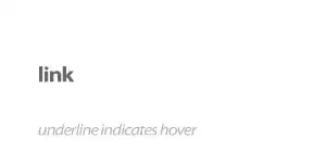
Is there a way to fade elements (at least just text) in and out going left to right or vice-versa using only CSS?
Here is an example of what I mean:
Actually, if it requires jQuery, I'll accept that too, just as a second priority.
Is there a way to fade elements (at least just text) in and out going left to right or vice-versa using only CSS?
Here is an example of what I mean:
Actually, if it requires jQuery, I'll accept that too, just as a second priority.
Yes, you can do it with CSS3 animations (check browser support here).
Here's a simple demo for text-fading.
HTML:
.text {
        position:relative;
        line-height:2em;
        overflow:hidden;
    }
    .fadingEffect {
        position:absolute;
        top:0; bottom:0; right:0;
        width:100%;
        background:white;
        -moz-animation: showHide 5s ease-in alternate infinite; /* Firefox */
        -webkit-animation: showHide 5s ease-in alternate infinite; /* Safari and Chrome */
        -ms-animation: showHide 5s ease-in alternate infinite; /* IE10 */
        -o-animation: showHide 5s ease-in alternate infinite; /* Opera */
        animation: showHide 5s ease-in alternate infinite;
    }
    @-webkit-keyframes showHide { /* Chrome, Safari */
        0% {width:100%}
        40% {width:0%}
        60% {width:0%;}
        100% {width:100%;}
    }
    @-moz-keyframes showHide { /* FF */
        0% {width:100%}
        40% {width:0%}
        60% {width:0%;}
        100% {width:100%;}
    }
    @-ms-keyframes showHide { /* IE10 */
        0% {width:100%}
        40% {width:0%}
        60% {width:0%;}
        100% {width:100%;}
    }
    @-o-keyframes showHide { /* Opera */
        0% {width:100%}
        40% {width:0%}
        60% {width:0%;}
        100% {width:100%;}
    }
    @keyframes showHide {
        0% {width:100%}
        40% {width:0%}
        60% {width:0%;}
        100% {width:100%;}
    }
<div class="text">
There is some text here!
<div class="fadingEffect"></div>
</div>CSS:
As you can see, there's a sharp contrast on the borders. If you use an image gradient instead of a pure white background it will render better.
Then, you can use a jQuery fallback for IE9 and below.
In photoshop or other image editing software, create a circular area that is transparent in the middle and on all sides fades out to solid white. Feel free to crop the top/bottom as needed. You can then use css transitions to animate the graphic from left to right to achieve the effect in your demo. For browsers like IE that don't support transitions, use the cssHooks feature in jquery to perform the animations with jQuery.
You could create this effect using css gradients, but you run into browser support issues, and using transitions on css gradients is very bad in terms of performance. However, simply animating a png24 is very easy and makes the same effect.
I found a plugin which contains multiple text animations.
https://tobiasahlin.com/moving-letters/
Demo : https://jsfiddle.net/Danzoftw/hp8qL1e3/7/
var textWrapper = document.querySelector('.demo');
textWrapper.innerHTML = textWrapper.textContent.replace(/\S/g, "<span class='letter'>$&</span>");

anime.timeline({loop: true})
  .add({
    targets: '.demo .letter',
    opacity: [0,1],
    easing: "easeInOutQuad",
    duration: 2250,
    delay: (el, i) => 150 * (i+1)
  }).add({
    targets: '.demo',
    opacity: 0,
    duration: 1000,
    easing: "easeOutExpo",
    delay: 1000
  });
<script src="https://cdnjs.cloudflare.com/ajax/libs/animejs/2.0.2/anime.min.js"></script>
<h1 class="demo">Text animation demo</h1>Hope this helps others. Cheers.